A complete transformation by Harvey Jones creates a family-sized kitchen space
By Linda Parker
 Melissa Klink, Head of Design at Harvey Jones designed a multi-functional and spacious kitchen for a couple and their two children. The original house footprint was re-configured and extended by MVL Architects, and Melissa and her team were brought in early on to ensure the new space would accommodate the couple’s perfect kitchen.
Q: What were the stand-out priorities your clients wanted for this kitchen?
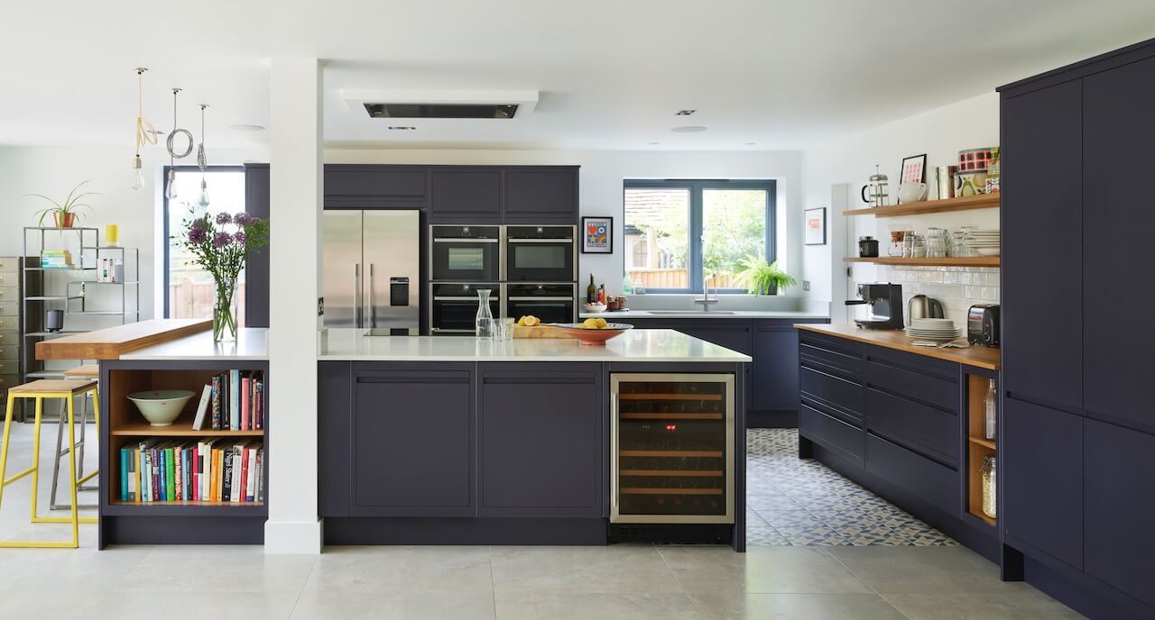
The kitchen was part of a total renovation, which included a two-storey rear extension. The original kitchen was small and dated and it was separate from the dining room and living room. As a young couple with two children, our clients wanted a contemporary and informal open-plan space that would suit family life. They also wanted to improve connection and outlook to their south-facing garden and make the most of all available light.
Q: How did you set about answering that brief?
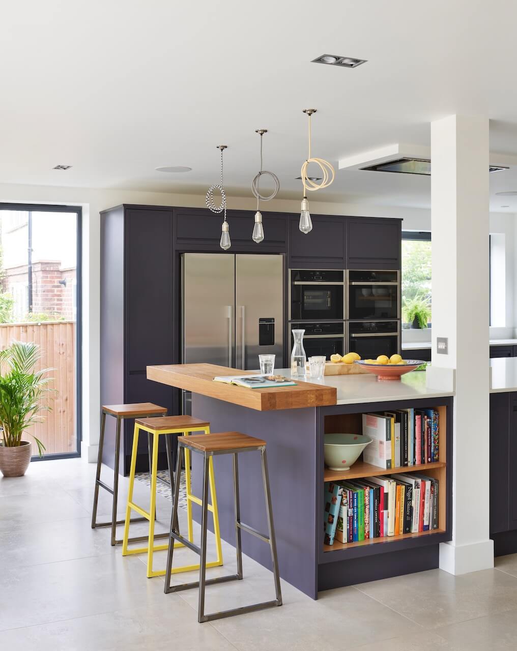
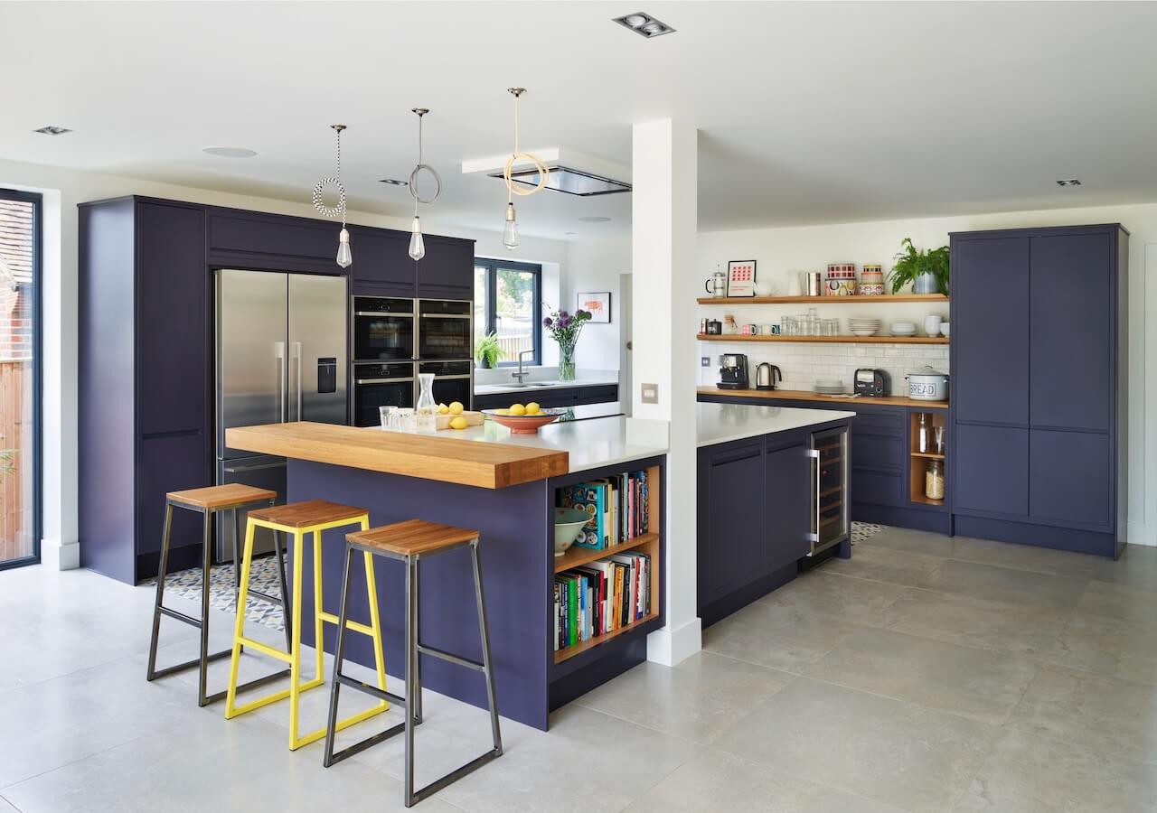
Our clients worked with MVL Architects to design the initial layout and we helped refine it and create the relaxed space they wanted. The space feels bright and open, with a large central island perfect for food prepping as well as entertaining plus room for the kids and space for guests to mingle and chat whilst things are being organised! We achieved the informality of the space by mixing open shelving and cabinets and by combining different materials for the worktops, shelves and stools. The statement flooring also helps to give the room a modern yet welcoming feel and to section the kitchen from the rest of the space, while also adding a lovely, bright feature. We wanted to create a kitchen that was interesting, with splashes of colour and a mix of materials.
Q: What were the reasons behind the choices of cabinetry and work surfaces …
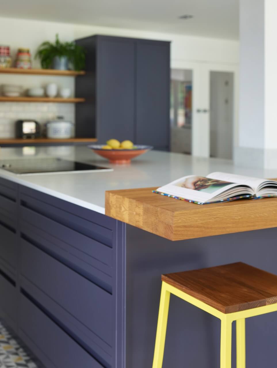
Linear Edge is our most contemporary range, with sleek lines and handle-less cabinetry. Our clients wanted to give their home a general update to make it look modern and contemporary, so Linear Edge was the perfect choice, and it also fitted in with their general taste and style.
Contemporary kitchen cabinets can sometimes feel a little sterile, so it’s important to add character and warmth through other features. In this case, the colour scheme is dark, so the quartz worktops for the island and for the sink units help to brighten it. For the other units and the breakfast bar we opted for wood, as it can really bring warmth into the space.
Q: As this was a brand new space, had there been any restrictions or limitations that you had to work around?
The kitchen was part of a total renovation. The clients decided to add a two-storey rear extension, which is where the kitchen is located. The renovation was planned and designed by the architectural team, so we weren’t involved until the later stages. We were all very impressed with the whole project though, it has definitely made the best possible use of the available space!
Q: What design elements do you think make the scheme so successful?
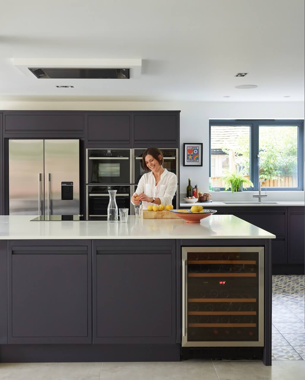
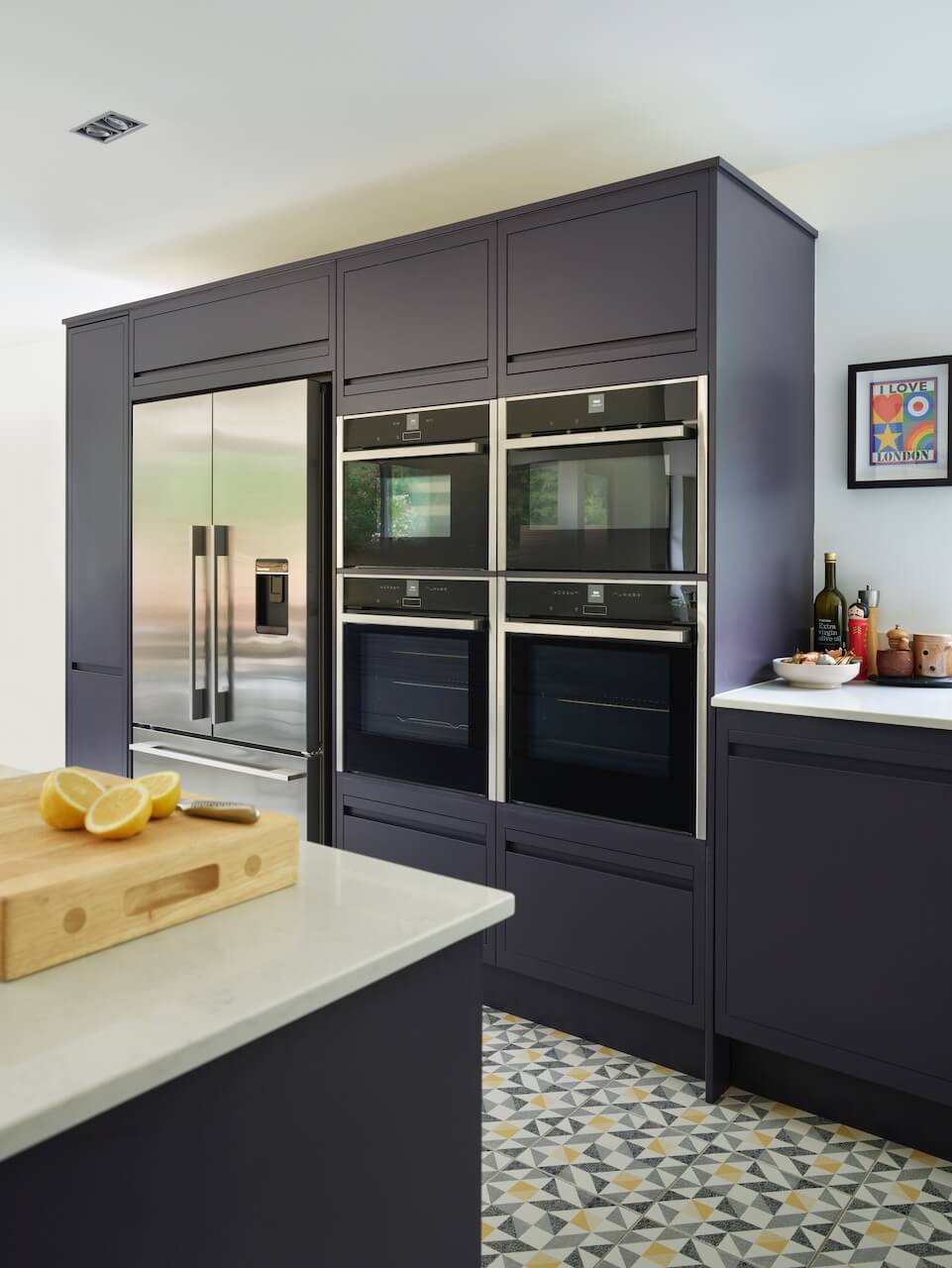
I love the fact that the overall scheme is modern yet it still has so much character. Dark kitchens can sometimes look a little gloomy but they can also definitely pack a punch, especially if paired with other statement features. The beautiful Original Style flooring we used is a bold statement choice that brings the scheme to life and also provides the opportunity to echo the colours throughout the whole room. The bank of ovens looks particularly striking too, and I like the symmetry of that area.
Q: Now the project is finished, what aspects are you most pleased with?
We are pleased with all the elements! The breakfast bar is a particularly nice area, and I love the fact that we’ve planned the storage elements so well. Our clients love the amount of surface space available – they even have an office area at the end of the kitchen where they can research recipes and do general admin tasks. It’s close enough to the kitchen that one can still finish up working while the other starts cooking.
Q: What is your best advice for someone who is planning a new kitchen – it’s the age-old question, but is always relevant!
I always remind everyone concerned that the kitchen needs to work for the homeowner … so each client must think about how they will use the space in reality and they mustn’t be afraid to say what they want. Something that may seem difficult or impossible to achieve can usually be worked out! The most important thing to consider is that the space has to be easy to navigate. And this, of course, is where the working triangle comes in, with sink, cooking and fridge zones all in relatively close proximity. There should be a good-sized and totally accessible area of worktop run for preparation, preferably next to or opposite the hob zone. Thinking about how you as the homeowner will use the space in reality is very important. Also consider whether there will be one or two or more people cooking at the same time, and whether young children or guests need to have seats at the breakfast bar.
Q: Do you have a secret ‘style signature’ or feature that you find you use in most of your kitchen projects?
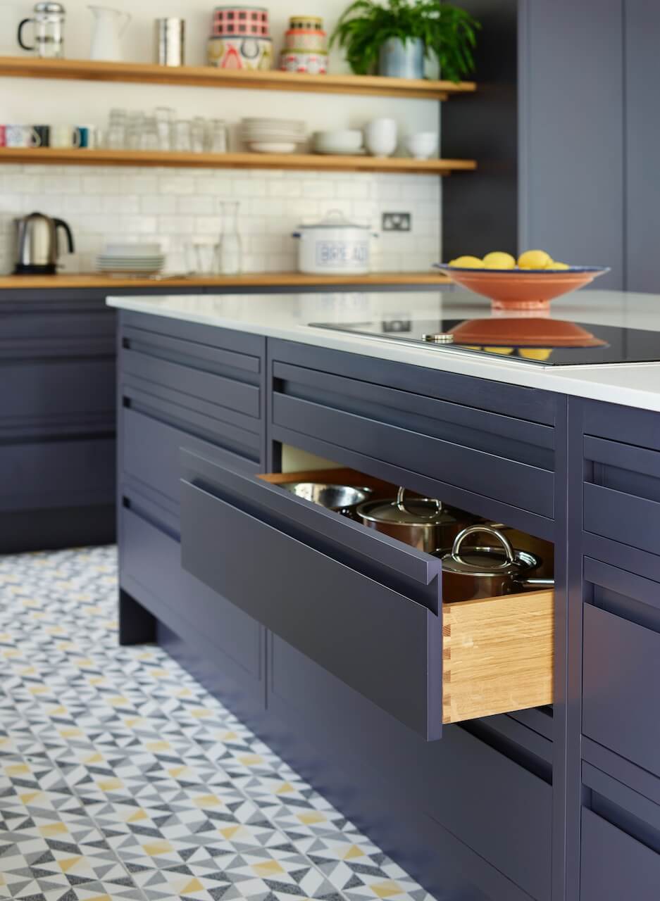
A functional kitchen is all about having the right thing in the right place. I always like to include lots of drawers, as it’s the quickest route to an organized kitchen. Drawers will allow you to store everything where it’s best needed e.g. pans below the hob and dried goods next to the food prep area. Drawers are also easier to access than cupboards, as they store more items in a space (or spaces) that are easier to organise, open and view the contents.
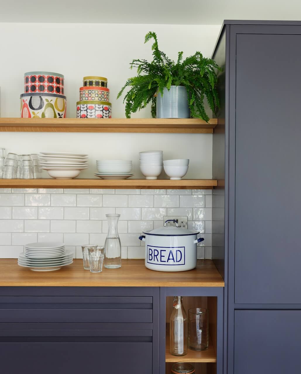
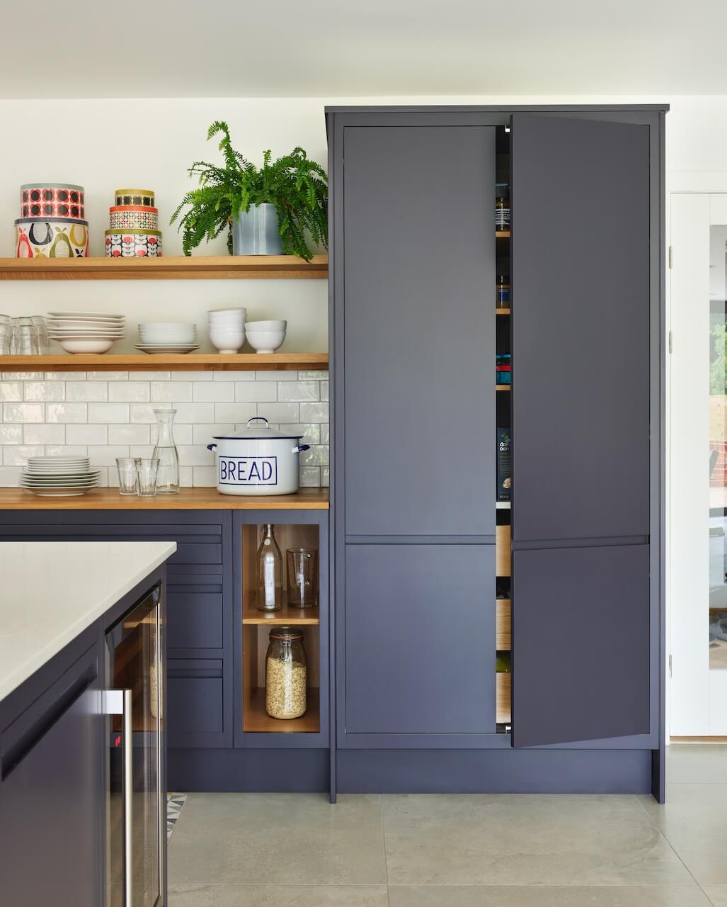
We Love: The combination of such a strong statement colour for the cabinetry, Evening Coat by Valspar, and the patterned Original Style floor tiles. Plus that larder cupboard alongside the open shelves …
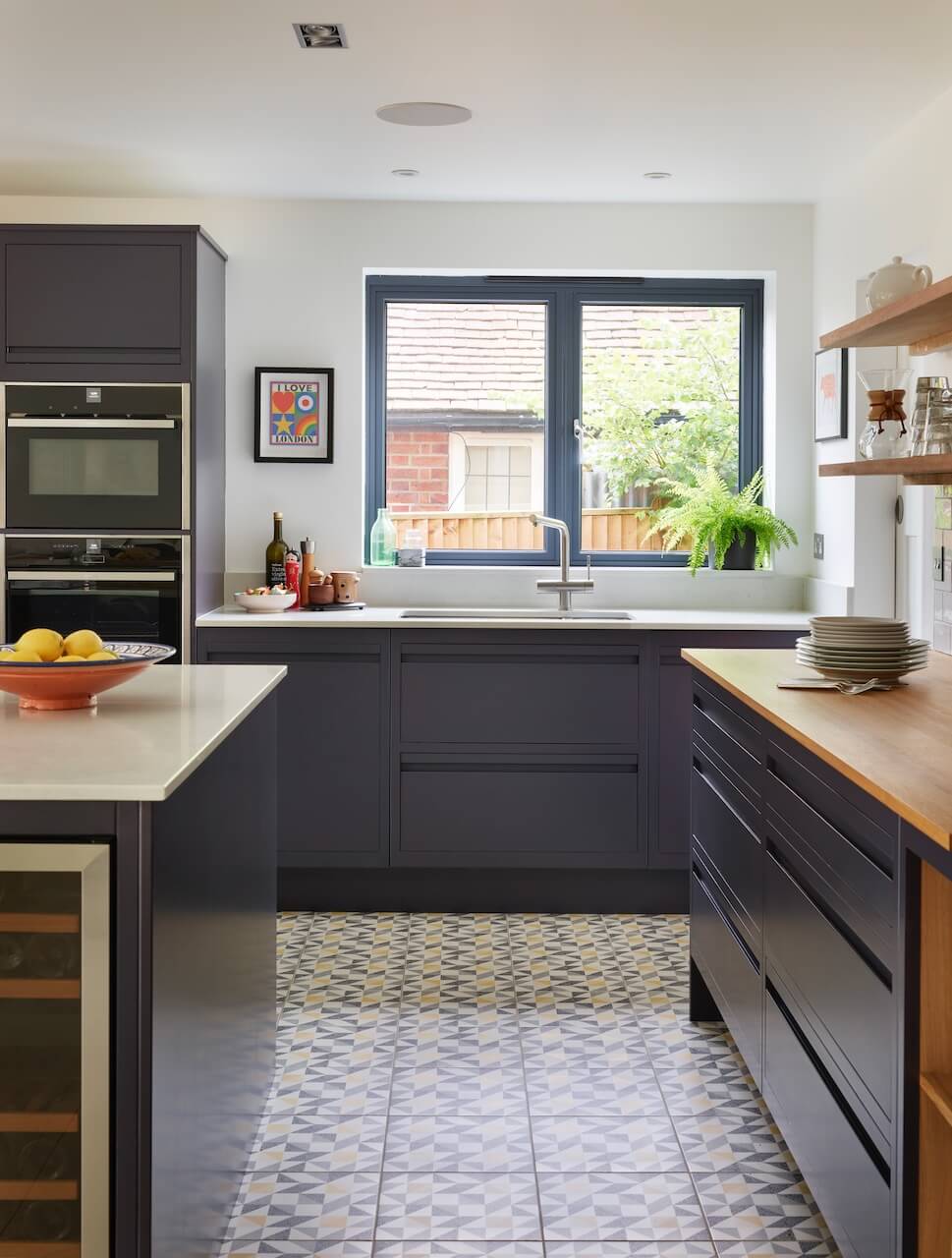
Cabinetry: Linear Edge by Harvey Jones, which is a handleless version of the Linear range, prices are from £20,000. Work surfaces are Royal Oak by Spekva, supplied by Harvey Jones, and SG Cararra Quartz, from Surrey Marble & Granite
Paint: The almost-black Evening Coat by Valspar
Flooring: Saltram tiles in Yellow & Black on Chalk by Original Style
Undermount Sink: Franke
Tap: Grohe
Appliances: Slide & Hide Ovens, Flex Induction Hob, Built-Under Fridge, all Neff
Wine Fridge: CDA
Bar Stools: Consec in a variety of colour options, Cult Furniture




Leave a comment