In the frame & on the shelf…
By Linda Parker
We’ve noticed a lot of interesting and creative kitchen ideas coming through this year, so this month we’re having a look at the concept of adding a framed look within the kitchen – from open shelves with integral uprights, glazed doors with distinctive darker frames and of course, multi-panelled glazed walls and doors.
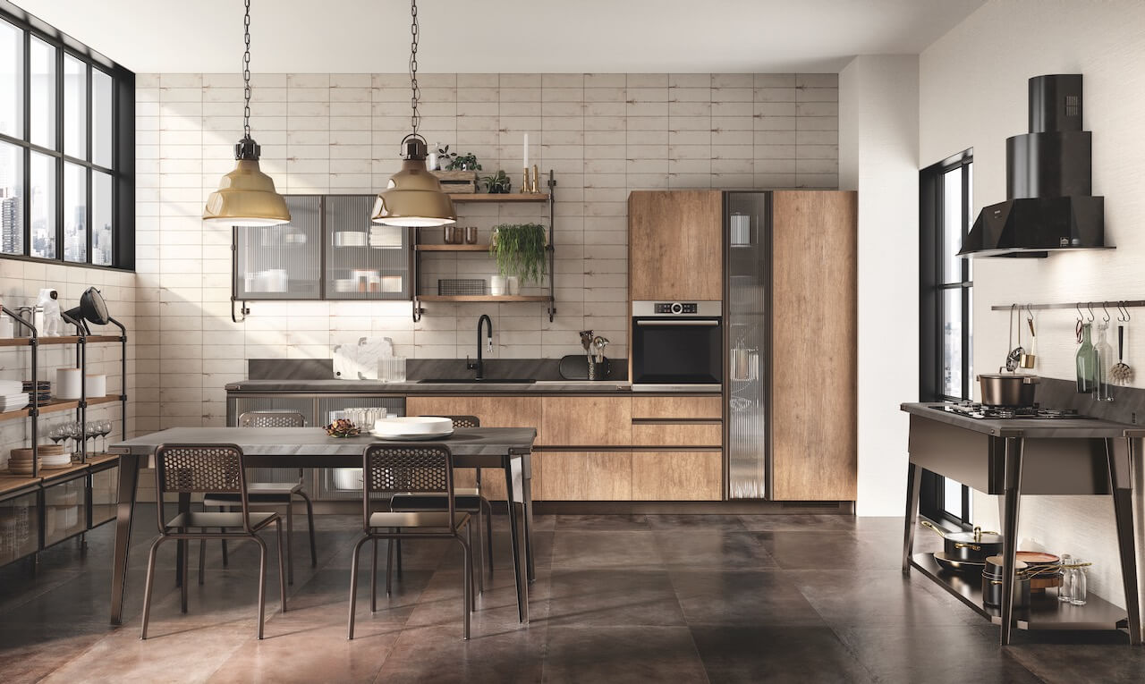
This is the Diesel Open Workshop kitchen from Scavolini – this collection was originally launched in 2018, and it’s now been refreshed and updated for August 2020 … so we just had to have a second look! The overall theme is industrial style entwined with a vintage air, and the new collection now includes some new cabinet finishes, including Pinstripe Oak, Concrete Harlem and Earth Grey. It’s a strong look, ageless but with contemporary and vintage accents – including the open shelves with industrial-style metal frames and textured door finishes. Above, we introduce the Diesel Open Workshop Kitchen with Landscape Oak textured melamine doors and Bronze framed doors with Ribbed Glass, a console cooking area to the right, Mune Grey laminate work surfaces and Stock Rack open shelving, also in Bronze.
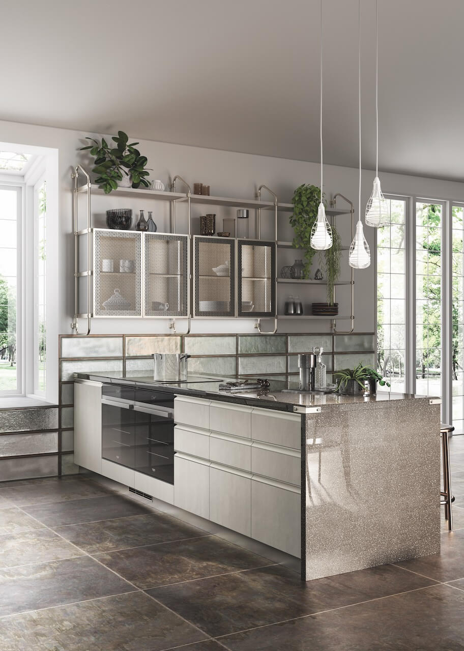
This kitchen layout shows how the Concrete Jersey textured base cabinets look perfectly at home with wall-mounted Stock Rack open shelves, combined with Soft Steel and Smokey Glass doors. A combination that can be mixed-and-matched for a highly individual look – here it’s perfect combined with greenery and a group of pendants; we can also visualise it with some splashes of colour too – perhaps a bright shade for added drama used behind the open shelves. All from the Diesel Open Workshop collection by Scavolini
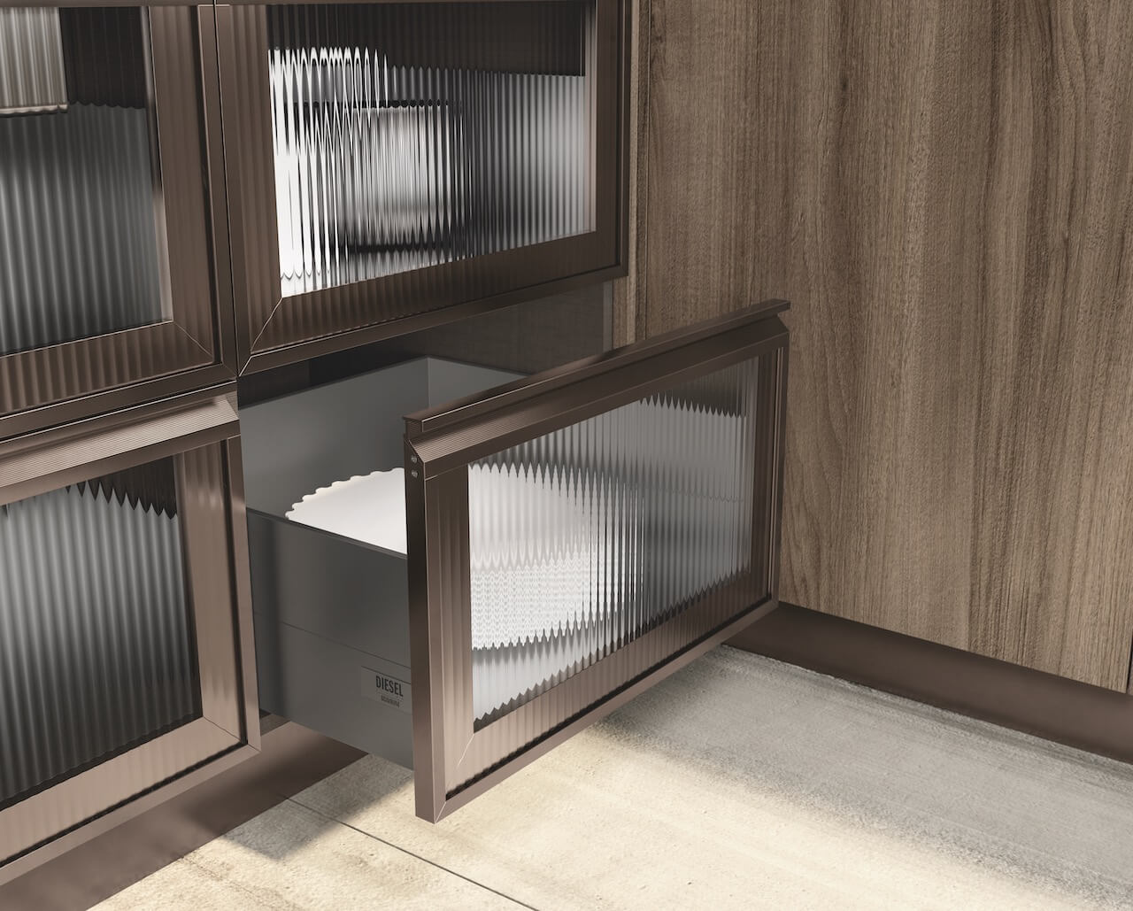
As always, it’s the interesting details that make a difference. The retro-1960s style of the ribbed glass combined with dark framework is a great mix – slightly reminiscent of those early 60s freestanding kitchen cabinets with sliding glass doors! (But oh, so much more stylish!) All by Scavolini as before.
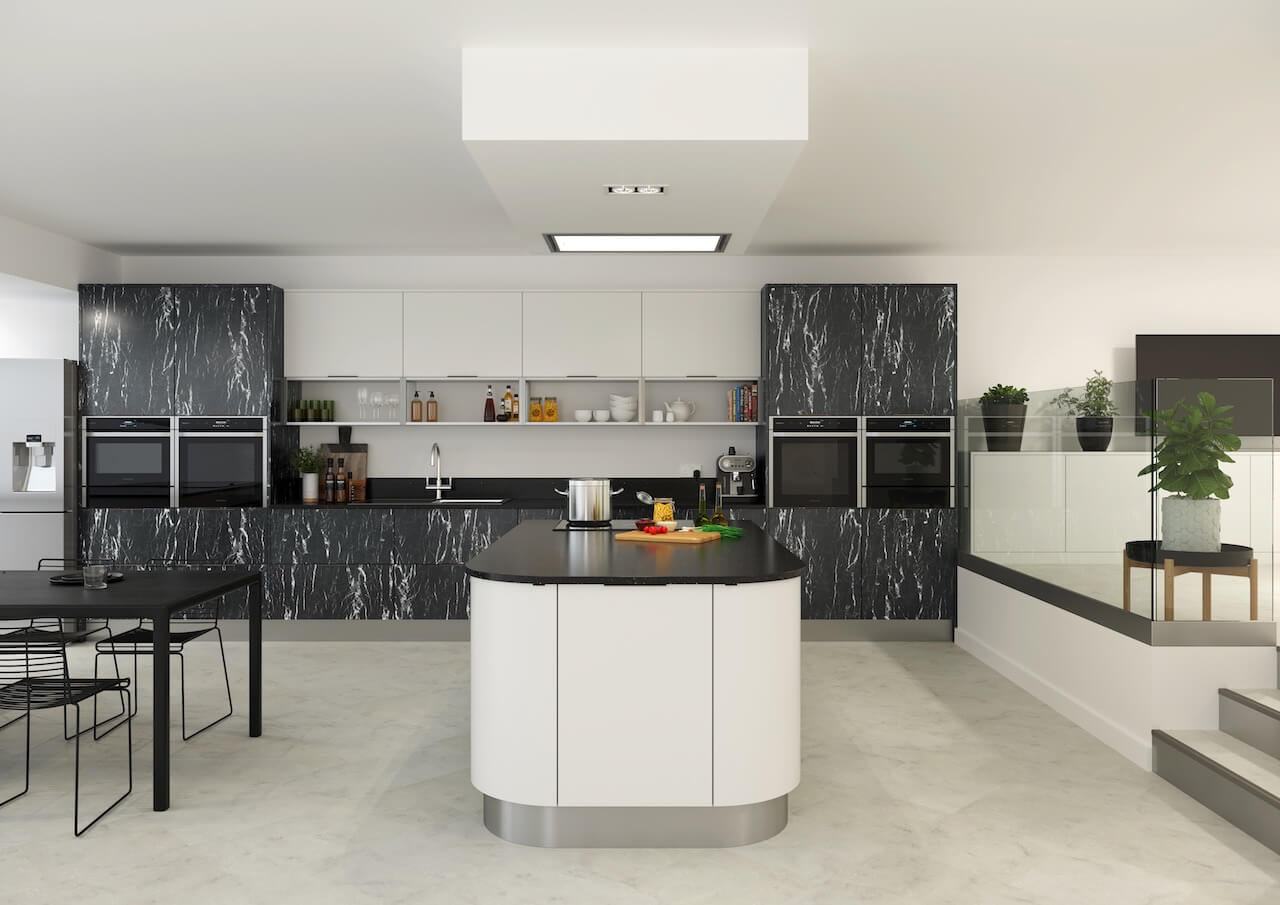
From Crown Imperial, the Meteor collection is not only extremely striking, it’s totally practical too. The collection is of six stone-look finishes that are designed to be teamed up with plain neutrals or design-statement colours in matt or glossy finishes. The handleless look is available with TIP-ON push-to-open and soft-close movement technology, naturally. Or preferred, there’s a huge selection of handles too. The cabinet doors here are shown in Nero, other finishes include marble-style Bianca and Caffe, and a very simple stone-style Granite. We’re loving the open shelves here too – part of their Frameworks and Boxworks accessory systems, and perfectly positioned here to add a bit of interest to a bank of plain cabinets.
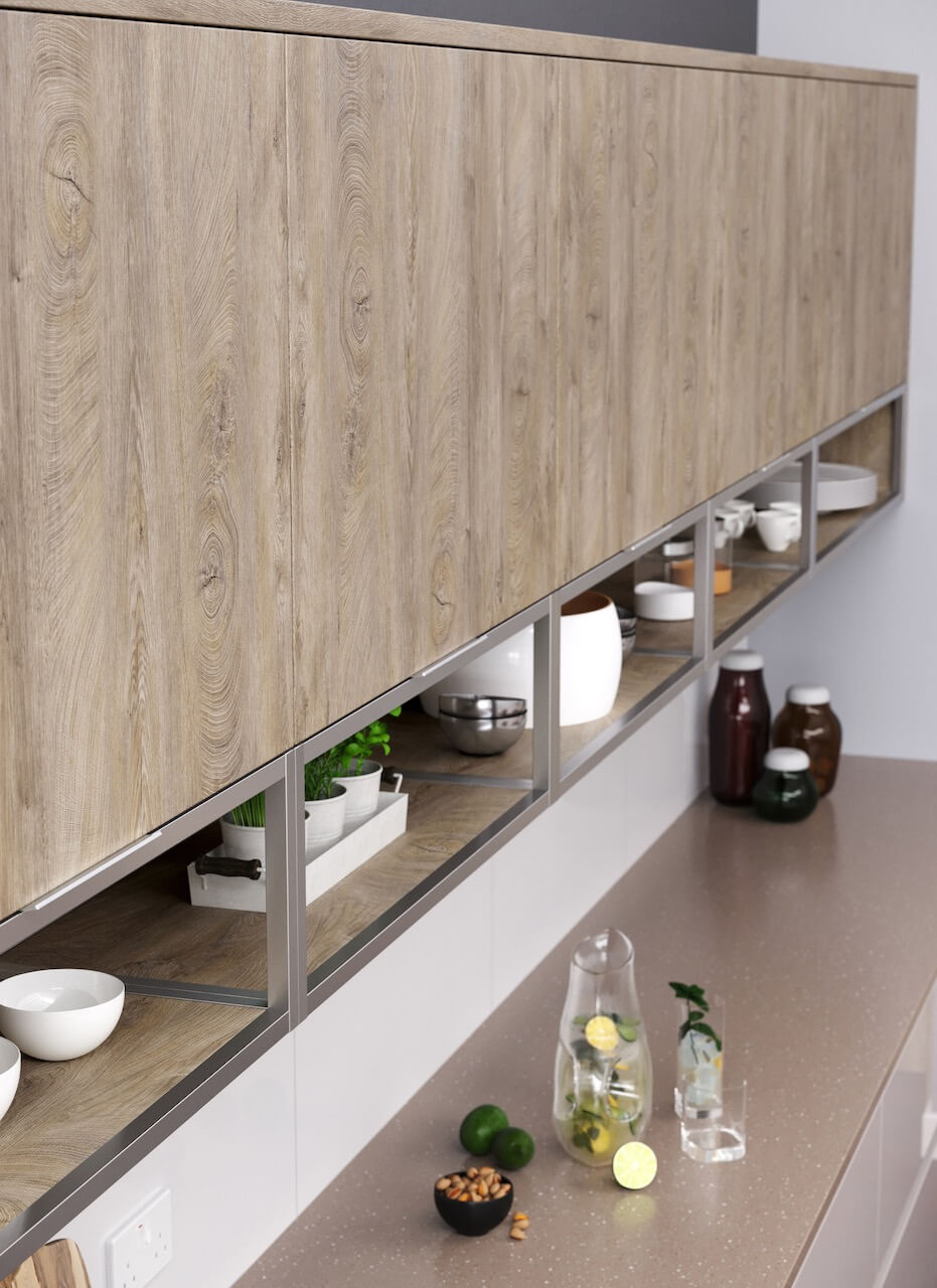
Take a close look at the sleek shelves, again by Crown Imperial. These are from the Frameworks system, in End Grain Oak – and once again, add just the right amount of practical open storage to a wall that is chock-a-block with practical cupboards that hide all the boring/messy stuff away!
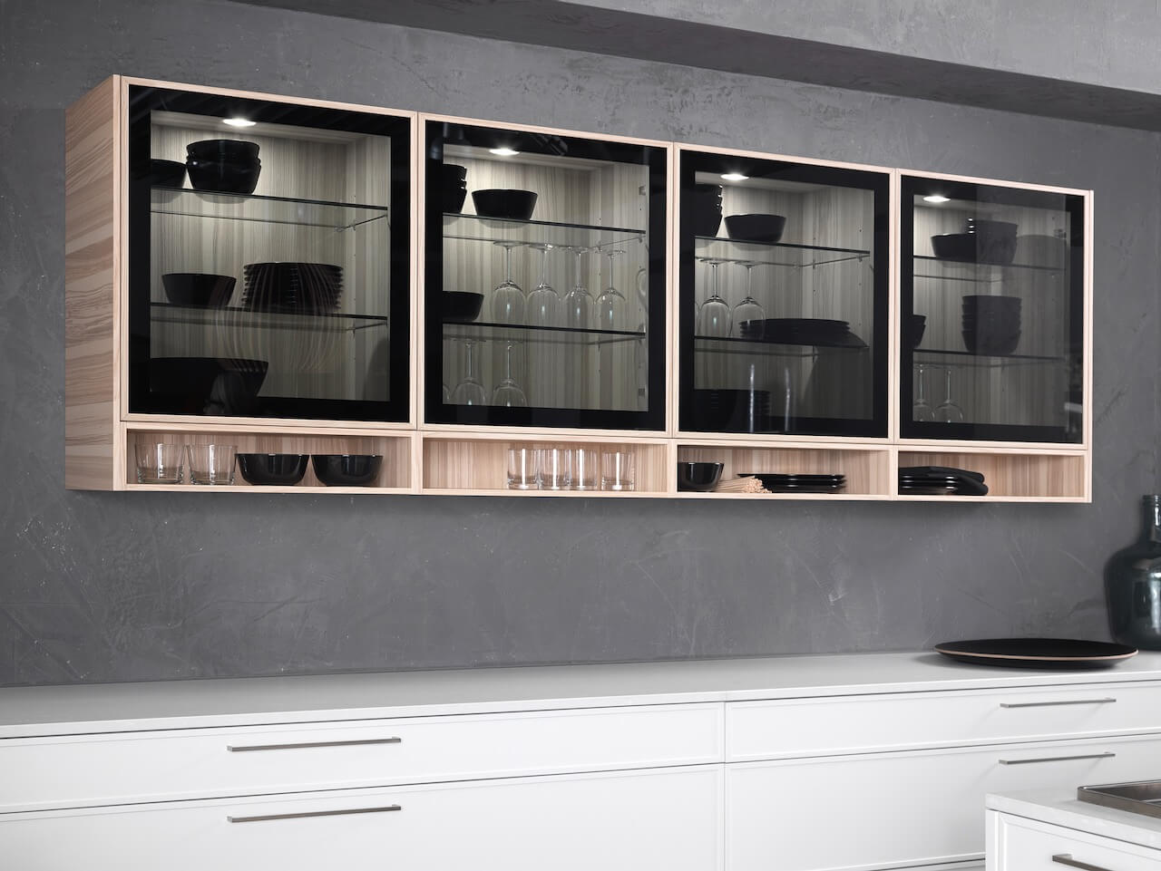
A great example of contrast, framing, glazing and open shelving combined in a perfectly practical manner, this time from Rational; the Cadre range. The frames of the glass doors can be specified in soft lacquer colours, or different veneers. Once again, under-cabinet shelving options add a new, brisk and regimented look.
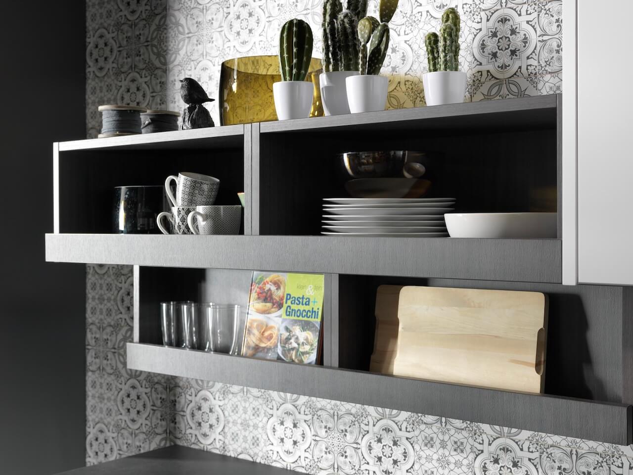
Another open-shelf suggestion, this time with a more emphatic lower edge, which gives the look a bit more ‘oomph’ and also provides a useful leaning-ledge for books and boards. This is from the Mahlzeit kitchen concept by Rational– there are tons of interesting shelf-storage systems to think about.
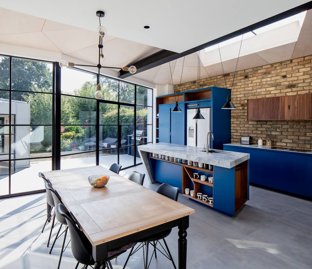
This project, from Minifie Architects embraces so many ideas we don’t know where to start! Naturally, the glazing is a complete dream, and the way the kitchen, living space and garden room combines so many concepts yet creates a coherent whole is admirable. The owners vision was to overhaul an existing conventional kitchen-living set up with something more spacious, useful and beautiful and which enhanced the connection between indoors and outdoors. Those open shelves on the island are a delight too – adding interest to what is often left as a blank space.
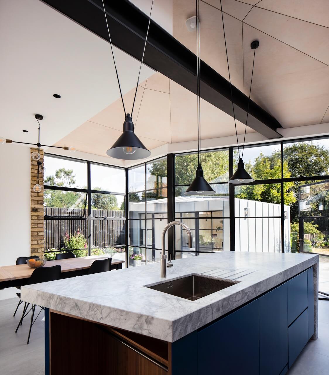
The Minifie team worked closely with the homeowners, contractors and craftsmen to experiment with the aim of producing a truly extraordinary project. The result is a textural living space with a striking blue bespoke kitchen and an expertly crafted angular roof, clad externally in zinc and internally in ply wood. The high ceiling and vast expanse of black-framed glazing is emphasised by the suspended pendants over the island and the central light over the dining table.
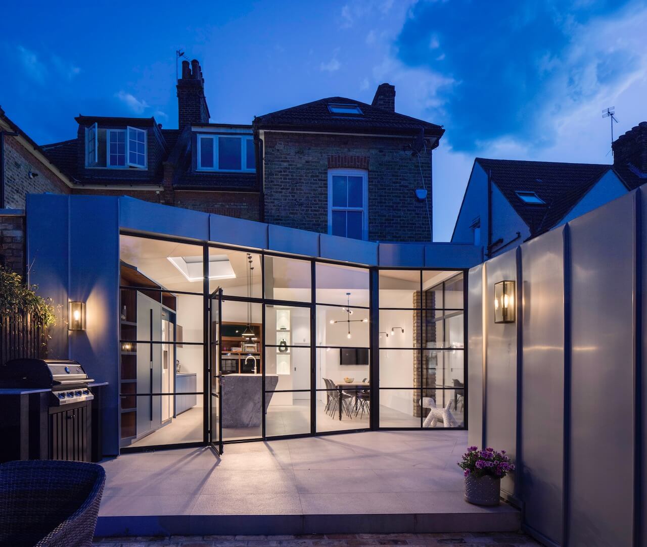
The view from the garden, with the exterior of the garden room seen on the right hand side of this shot. Ben Minifie, Director, sums up the project perfectly: ‘This is a unique project resulting from the ideas of a highly-skilled team and a client who was willing to embrace them. The new extension and garden room are exciting, crafted spaces to be in, but also have a sense of serenity, connecting the interiors with the outside area. It’s a place where the client can feel comfortable and settled, a place that’s functional, whilst still providing intrigue at every angle’.




Leave a comment