The perfect kitchen by Koivu for an architect-designed house
By Linda Parker
Douglas Sutherland, Design Director of Koivu was invited to design a kitchen for an architect-designed house that needed updating whilst staying true to the original style. Needless to say, the kitchen was the priority as the owners saw it as the key to family life, and a Koivu kitchen fitted the style perfectly.
Q: What were the stand-out priorities in your brief from the client?
This was a great project to work on, our clients had quite clear ideas from the start. As a couple with a young children, they knew they wanted something fresh and modern but something that was also suitable for family life. A breakfast bar with room for four was a must, including practical seating for quick meals and a sociable area for entertaining, or for the kids to do homework.
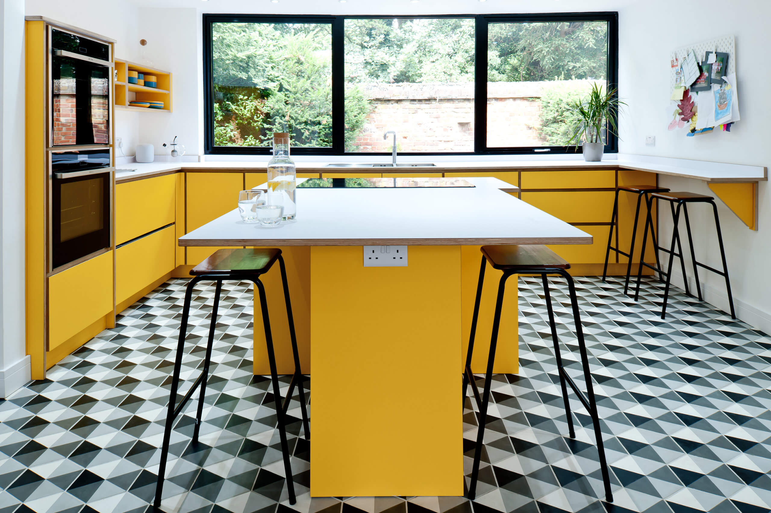
They were also keen on bold colour and loved the modern retro look. They had seen some of our other projects using bright bold colours on our website, and loved the fact we use the highest quality Finnish plywood which is created from sustainably forested birch trees. To keep the look clean, the brief was also to avoid tall units if possible.
Q: How did you approach this project?
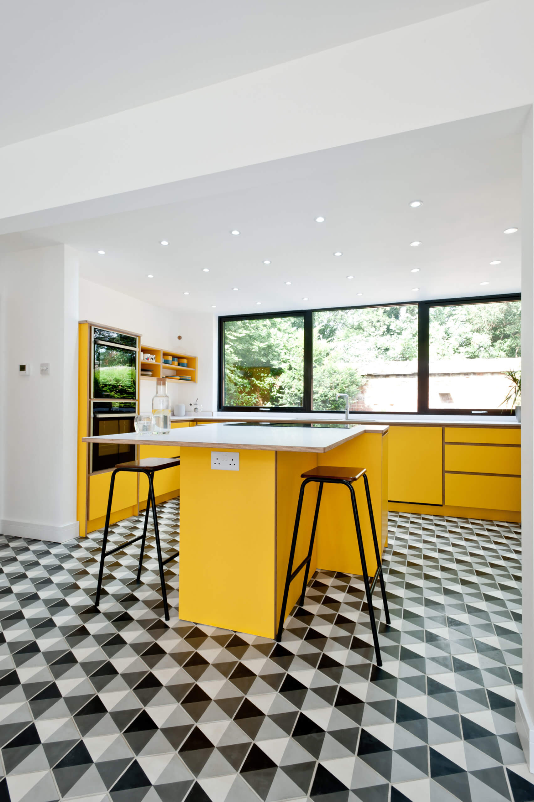
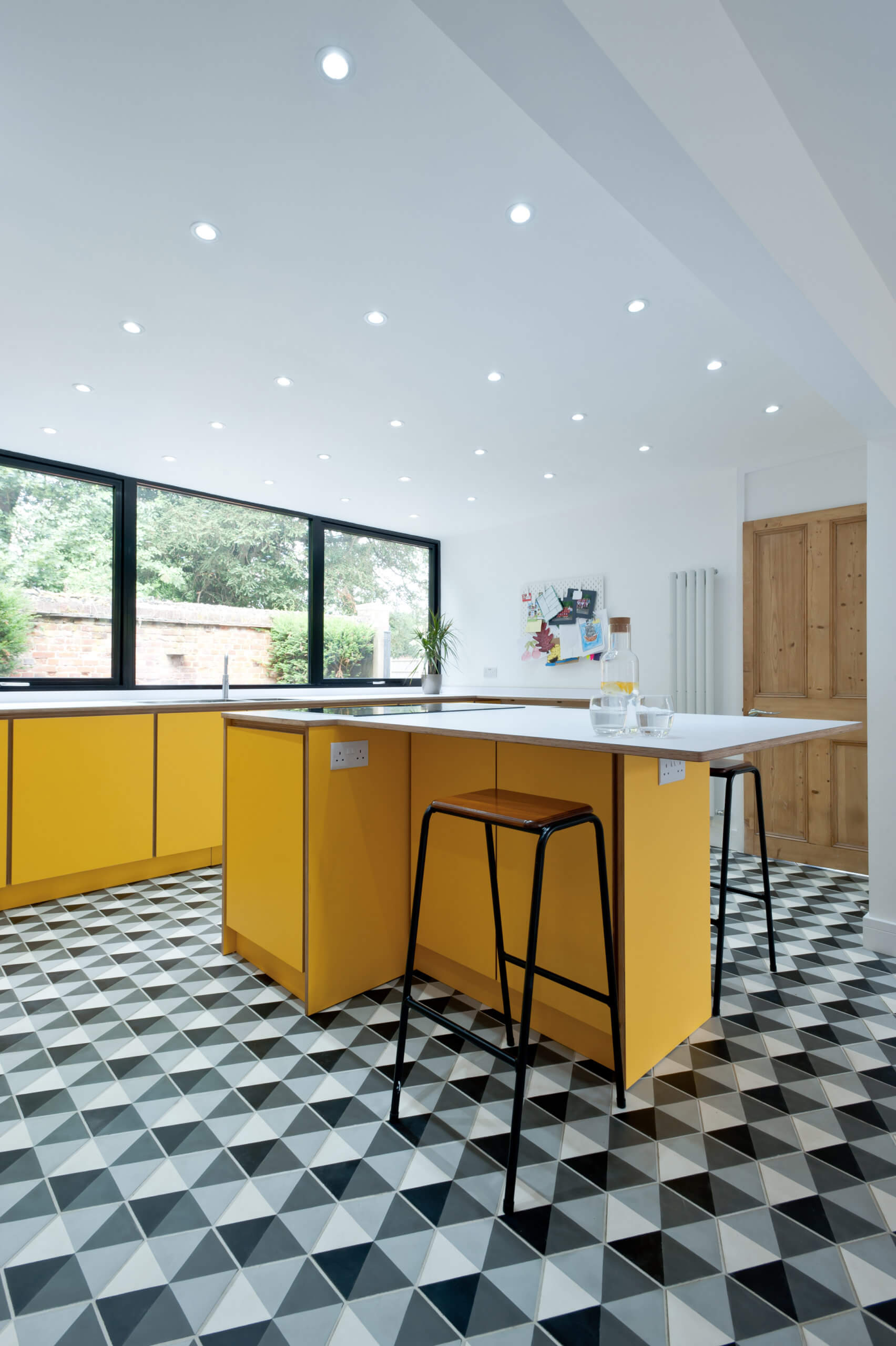
After the first design discussion, we came up with a layout which was then tweaked a couple of times before we arrived at the final result. A wall jutting into the main kitchen area had to be taken into account, as it meant a traditional square island would make the room too small to move around in. The solution was to do a T-shaped island which still provided plenty of workspace plus some of the requested breakfast bar seating.
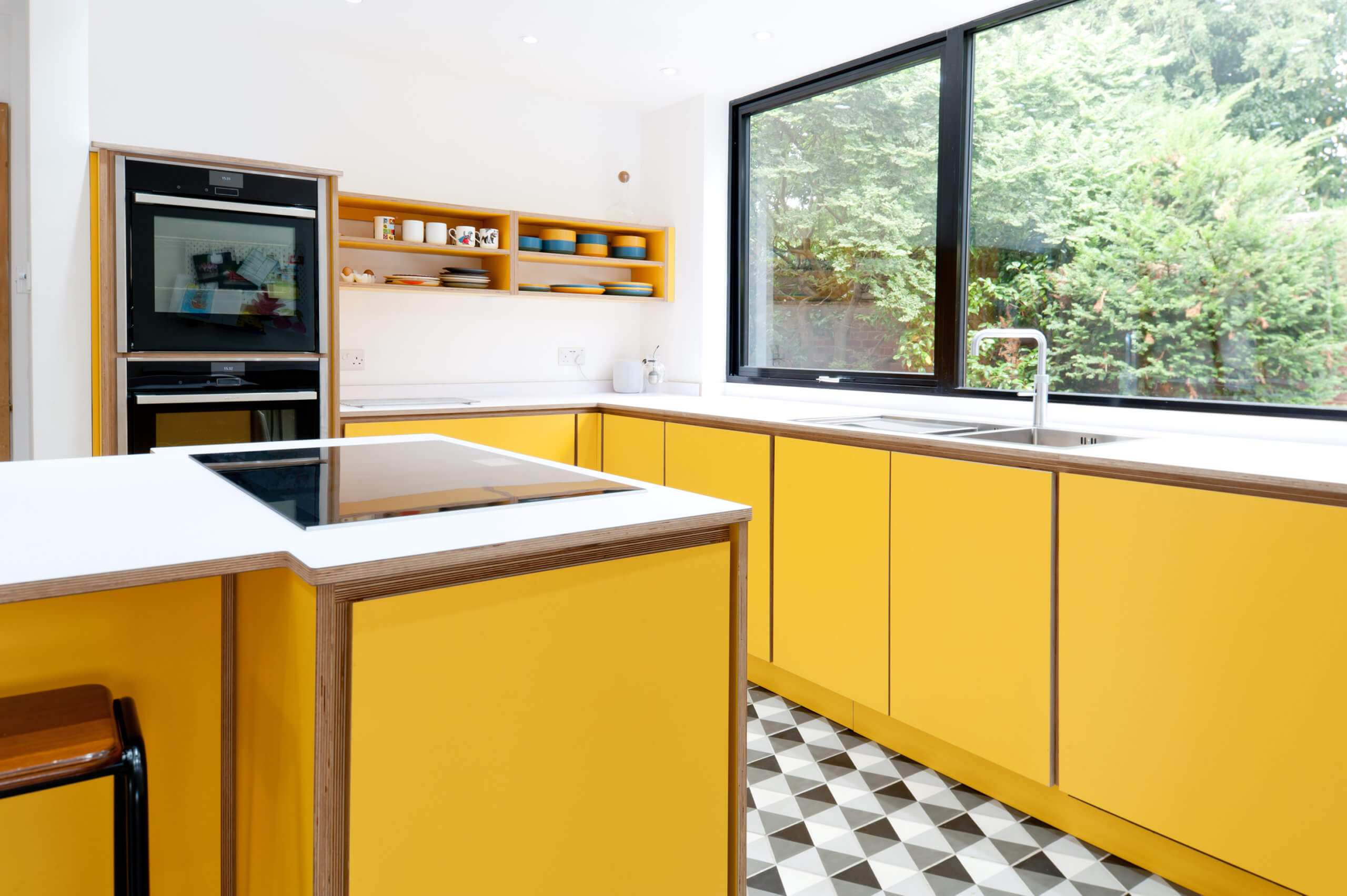
As it’s a busy family kitchen, we wanted to ensure there was plenty of storage and to achieve this without the tall housing units, open shelving was incorporated into the design. This is a great option for clients that want to keep the look ‘light’ and uncluttered and also gives the chance to show off colourful crockery and kitchen equipment.
Q: What are the reasons for the colour and work surfaces choices?
Colour was hugely important to the overall design and our clients were pleased with the choice of colours offered by Formica. There’s a great selection of bright and bold shades, and they deliberated for a few days before plucking up the courage to go with the Spectrum Yellow, after which they didn’t look back! Combined with the black frame of the kitchen windows, and the black and white geometric flooring, it was the perfect way to achieve their desired bright, retro look. It was used for all the cabinetry, oven housing and island unit to create a bold, cohesive look.
For the worktops, a Formica Polar White laminate was chosen, which we bonded onto the plywood. This kept the overall look fresh and clean, whilst still showing off the plywood on the edging. Laminate worktops are very popular in the UK and by having them bonded onto plywood rather than chipboard, they are likely to last much longer.
Q: What building work had been involved? Did you have any features that you had to work around?
In terms of building work, this had all been completed by the client’s builder before our involvement began. The kitchen had already had a new window installed and part of a wall had also been removed, to make the space work better. When it came to fitting the kitchen, the encaustic black and white tiled floor had already been laid.
Q: What design elements do you think make the scheme so successful?
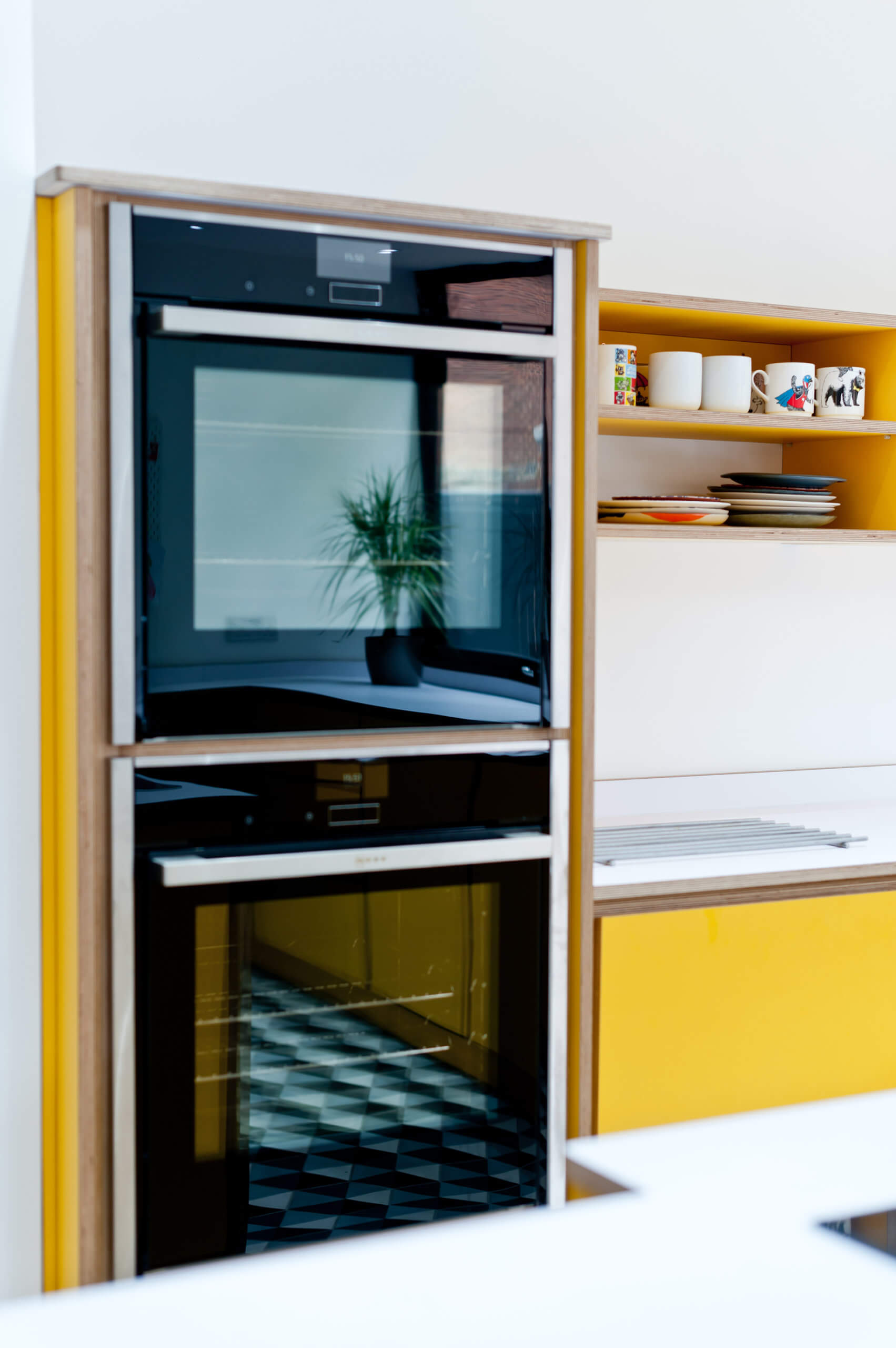
I think the fact that we were able to keep everything low level in the design works really well and was an important part of the client’s original brief. We were able to create plenty of storage without any tall larder-type units, and low-level fridge drawers were an ideal solution to avoid unnecessary height.
Our clients liked the practicality of having the ovens at eye level, and with no cupboard above them, even these were kept to a minimum height. By keeping all of the cabinetry low level, and using white on the walls, the whole room remains light and airy, helped by the large kitchen window.
The open shelving also works really well and is ideal for day to day crockery. Open shelving is a popular trend at the moment, and allows homeowners to introduce another level of colour and pattern to the scheme.
Q: What aspects are you all most pleased with?!
Our clients love the Spectrum Yellow colour, and we also think it works really well with the sleek handless cabinetry. It stands out brilliantly against the black and white of the flooring and really makes a statement. Personally, I am also pleased with the seating areas, as we were able to create plentiful space without making the room seem cluttered. People are socialising at home more and more, so this is an important aspect in a lot of our kitchen designs, and it is great when the ‘chef’ is not cut off from the rest of the group. Having the hob on the island unit makes it easy for food preparation and socialising or everyday family life to be combined – provided you have a ‘calm’ chef of course! Our clients were also keen to point out how much they love that the room is spacious and uncluttered, giving an overall relaxed feel.
Q: What is your best advice for someone who is planning a new kitchen?
I tend to advise my clients not to get hung up on having lots and lots of small wall units but instead to go for fewer but larger units. This keeps the design lines looking much cleaner and is also much better in terms of practical storage space.
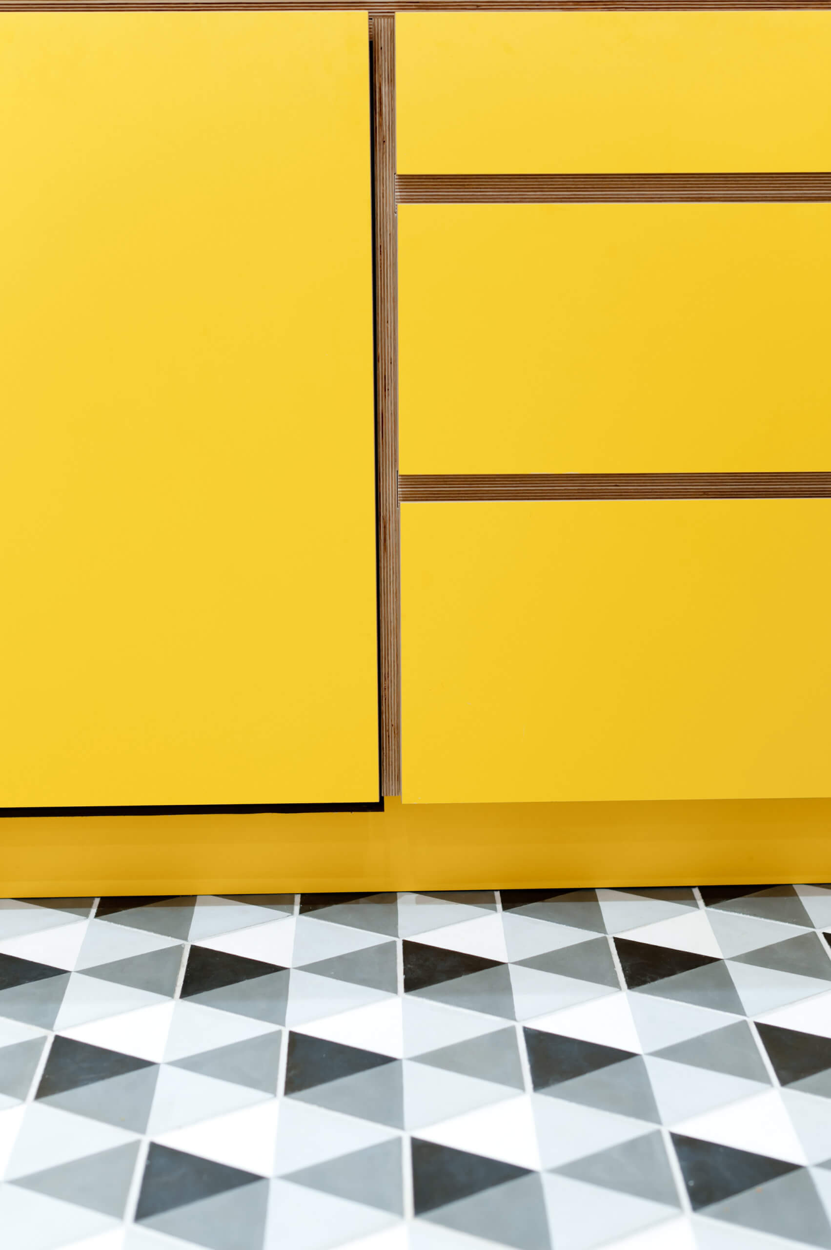
Drawers are also great for kitchens and clients shouldn’t be put off just because they are slightly more expensive – they are worth it in terms of practicality. Drawer inserts and dividers make for neat storage and as seen in this example, fridge drawers are also a great option for those who want to avoid tall appliances in their design.
A lot of clients also assume they need acres of worktop space but for most people this simply isn’t the case and it can become a dumping ground for everyday items, which then makes the kitchen look more cluttered.
Finally, don’t skimp on quality, remember cheap units and cheap appliances are cheap for a reason! If you’re budget is tight, opt for less units for of a higher quality to ensure a design that will last.
Q: Do you have a ‘style signature’ or feature that you find you use in most of your kitchen projects?
Each of our kitchens is completely bespoke to our customer’s needs. However all our designs have a modern look with clean lines, celebrating the beauty of the exposed plywood edges. I think open shelf units work well from a practical point of view and I like the spacious feeling they provide.
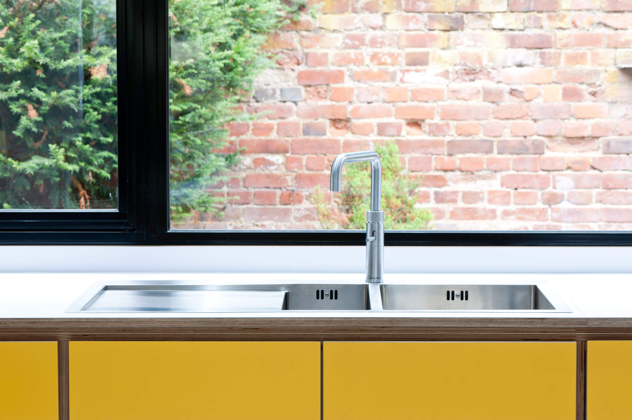
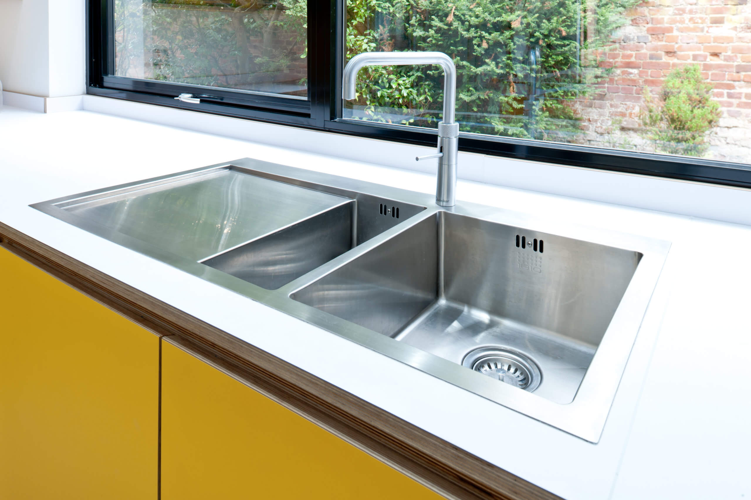
As sink areas can often get messy, I tend to prefer these to be designed against a wall rather than in an island unit in the middle of the room. This way the eye is not naturally drawn to the washing up and instead the hob can be placed in the island which gives a much neater look.
Finally, I always think of extraction as part of the design process. In the past I have seen this left to the builder who doesn’t always understand the needs and will put in inadequate ducting which isn’t suitable for the job.
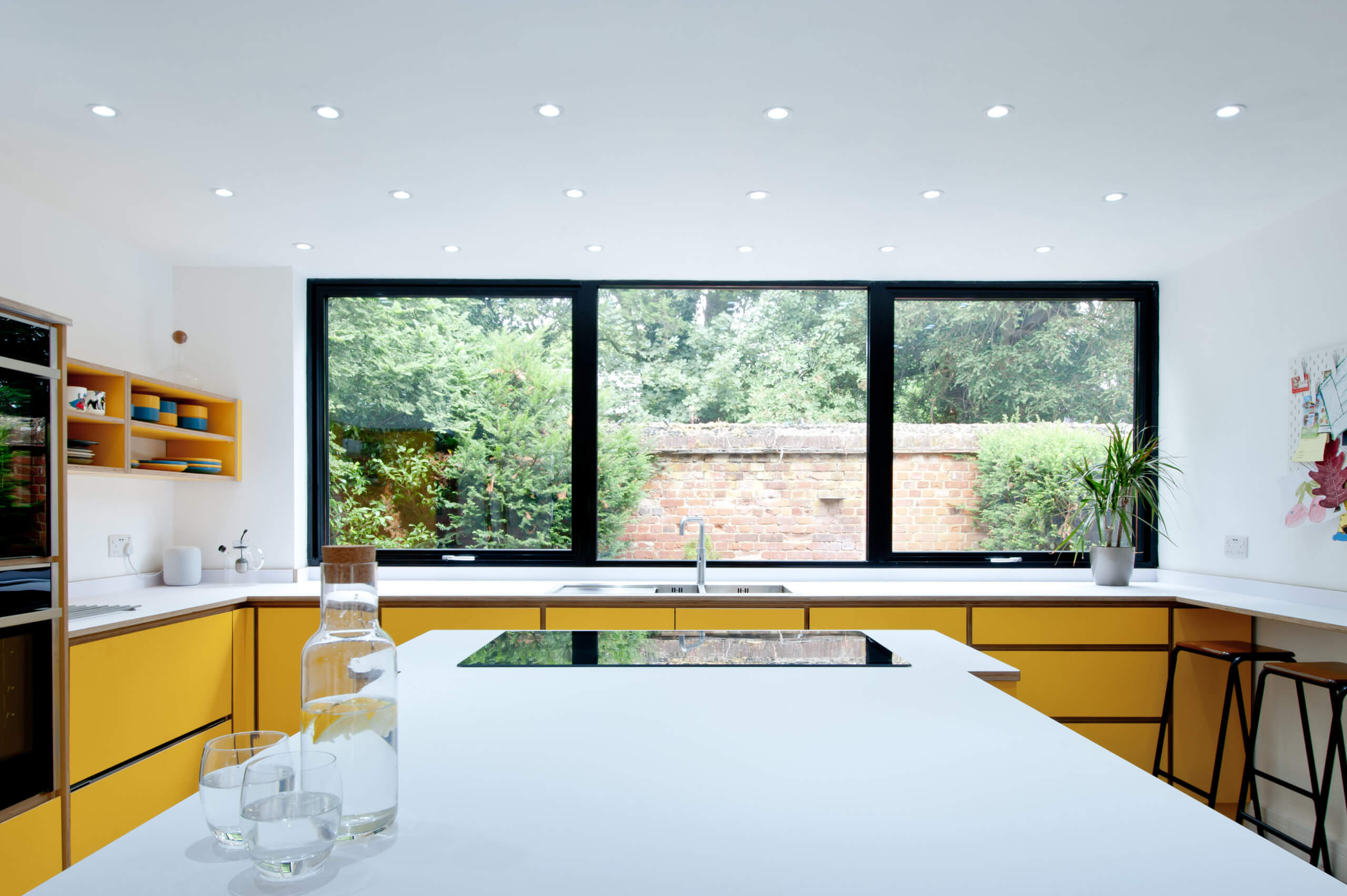
We Love: The super-simplicity of this layout, and in particular, the positioning of the induction hob opposite the crisp lines of the double sink and drainer. Full marks!
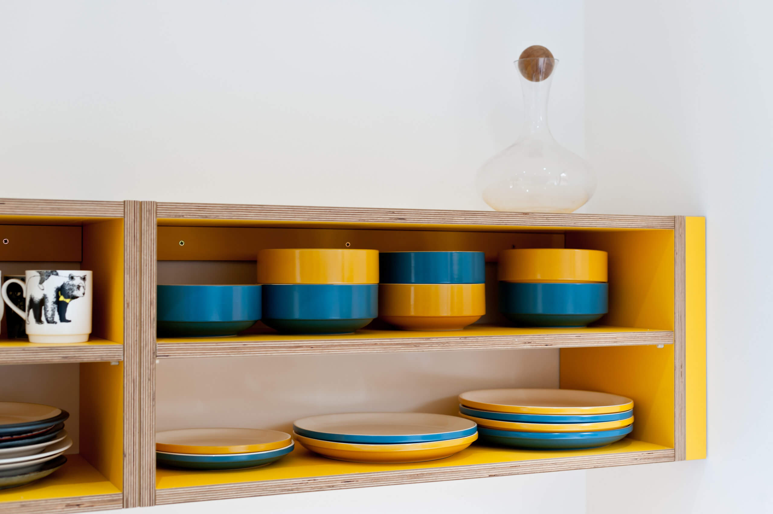
Bespoke kitchen and cabinetry in birch plywood and Formica by Koivu, 18 Riding Lane, Hildenborough, Tonbridge, Kent TN11 9HY 01732 459964.



Leave a comment