DELIGHTFULLY DARK: Bespoke almost-black kitchen by John Lewis of Hungerford
By Linda Parker
 This dramatic kitchen by John Lewis of Hungerford is a masterpiece, featuring subtle design skills and clever planning. The furniture features traditional proportions and classic features, but the end result is a fabulous project that sits beautifully within a completely re-furbished and extended period home. Rebecca Nokes, Senior Designer at the John Lewis of Hungerford Fulham showroom, led us through the process.
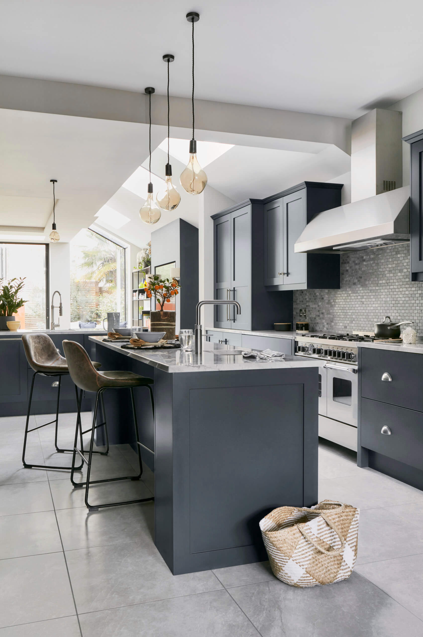
Q: What were the most important points raised in the brief from this client?
This particular kitchen was a design-led project, with the client being very aesthetically driven. The house had a Victorian side-return, and with these we find most clients want to put the kitchen at the back. However this kitchen was slightly different to the norm, as the house was extra wide. Consequently, the kitchen was able to fit within the middle section, which the clients choose as the best location. Usually this space isn’t wide enough for a practical working kitchen and often it ends up being used as a walk-through space. Happily, our clients were able to have the luxury of making the most of all the space in this large and generously proportioned extension.
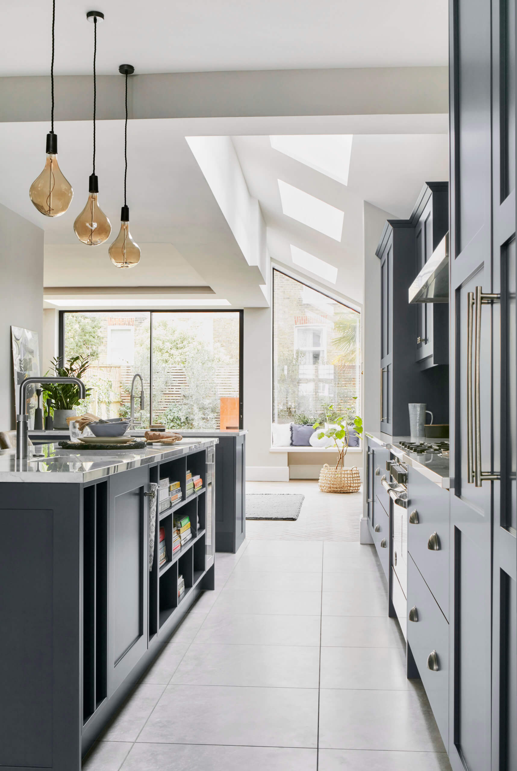
Although wider than usual, there were still limitations on what we could do, so the priority was making sure we could fit everything in – and this included designing a slim island. The space needed to be very practical and workable for everyday use, so we included a prep sink and Quooker tap on the island, separate from the main sink. Our American clients wanted to embrace the fact that in the US it’s a big trend to have the major appliances on display, rather than hidden or integrated, so we also suggested a large range cooker, extractor and big focal-point taps.
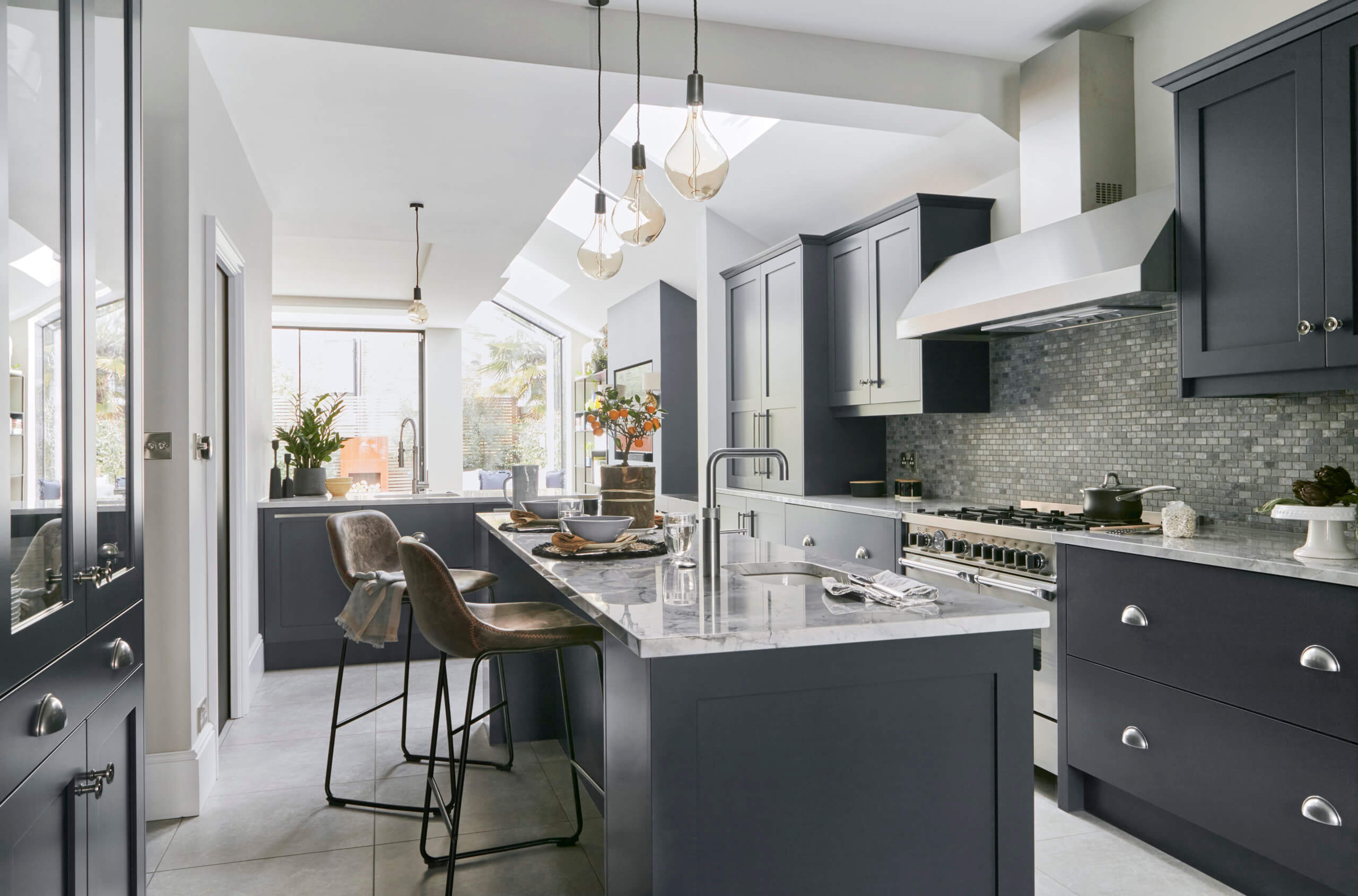
Q: How did you set about answering that brief? Were you given a strict budget?
Budget was not a really issue with these clients, however they were very stringent regarding getting the best value for money. Our clients were heavily involved in the design throughout, and we had many productive and interesting design discussions! We had a series of meetings to ensure that our design answered the brief accurately and met all the clients requirements.
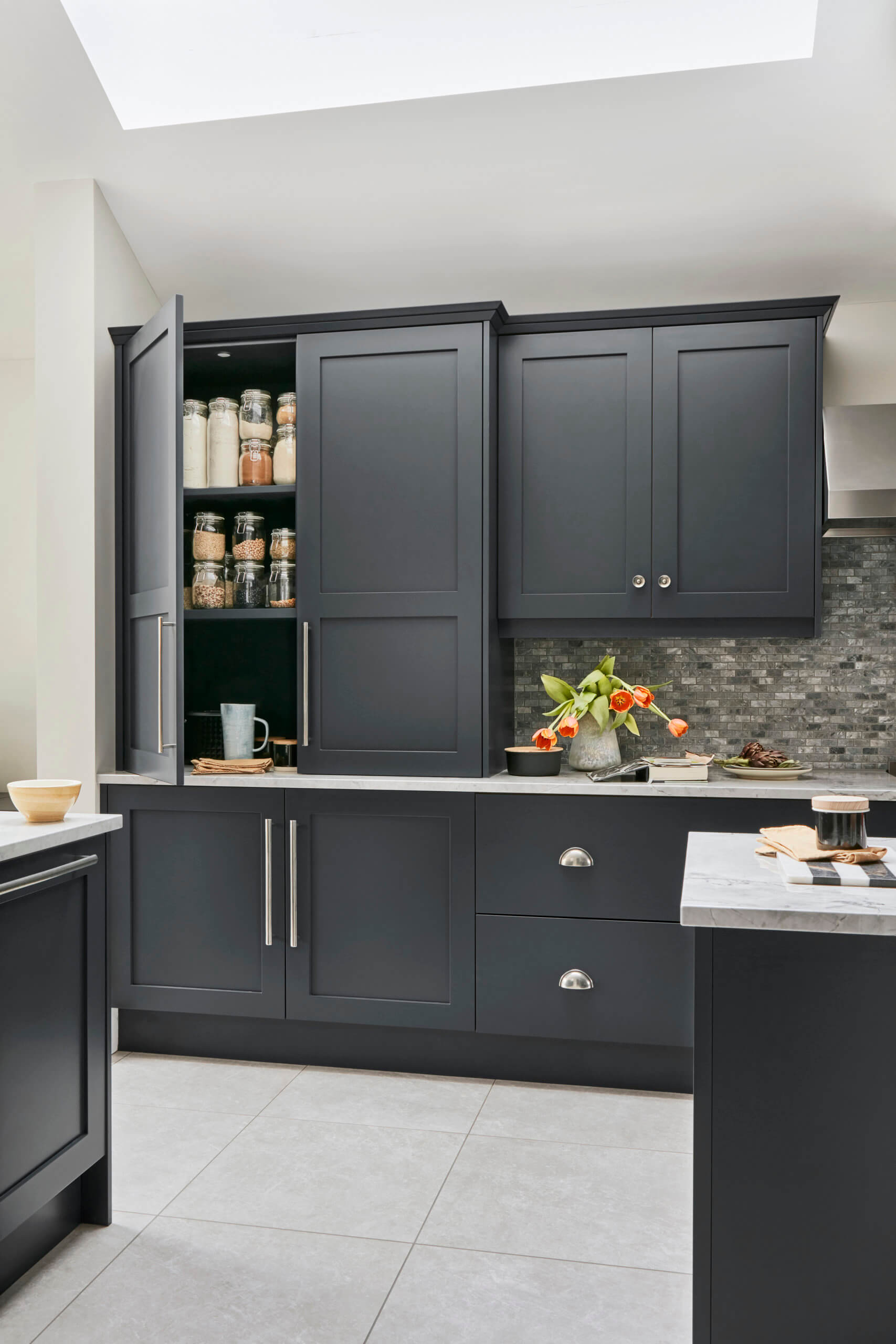
Q: Can you explain the reasons behind the choices of cabinetry and work surfaces?
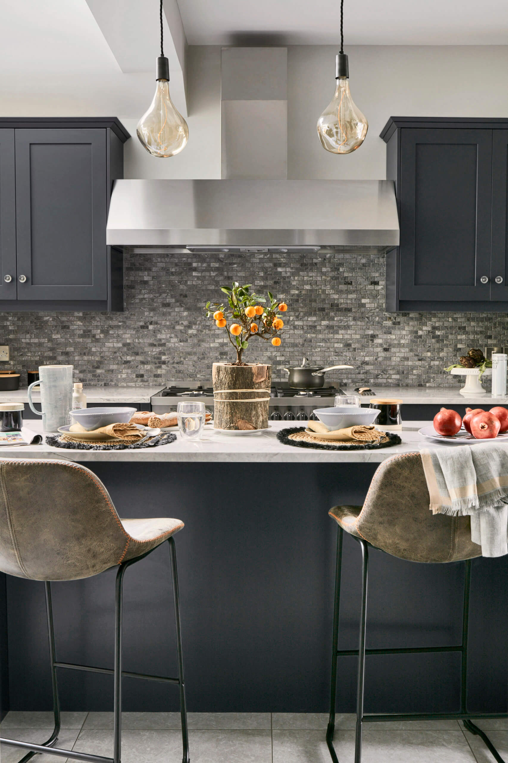
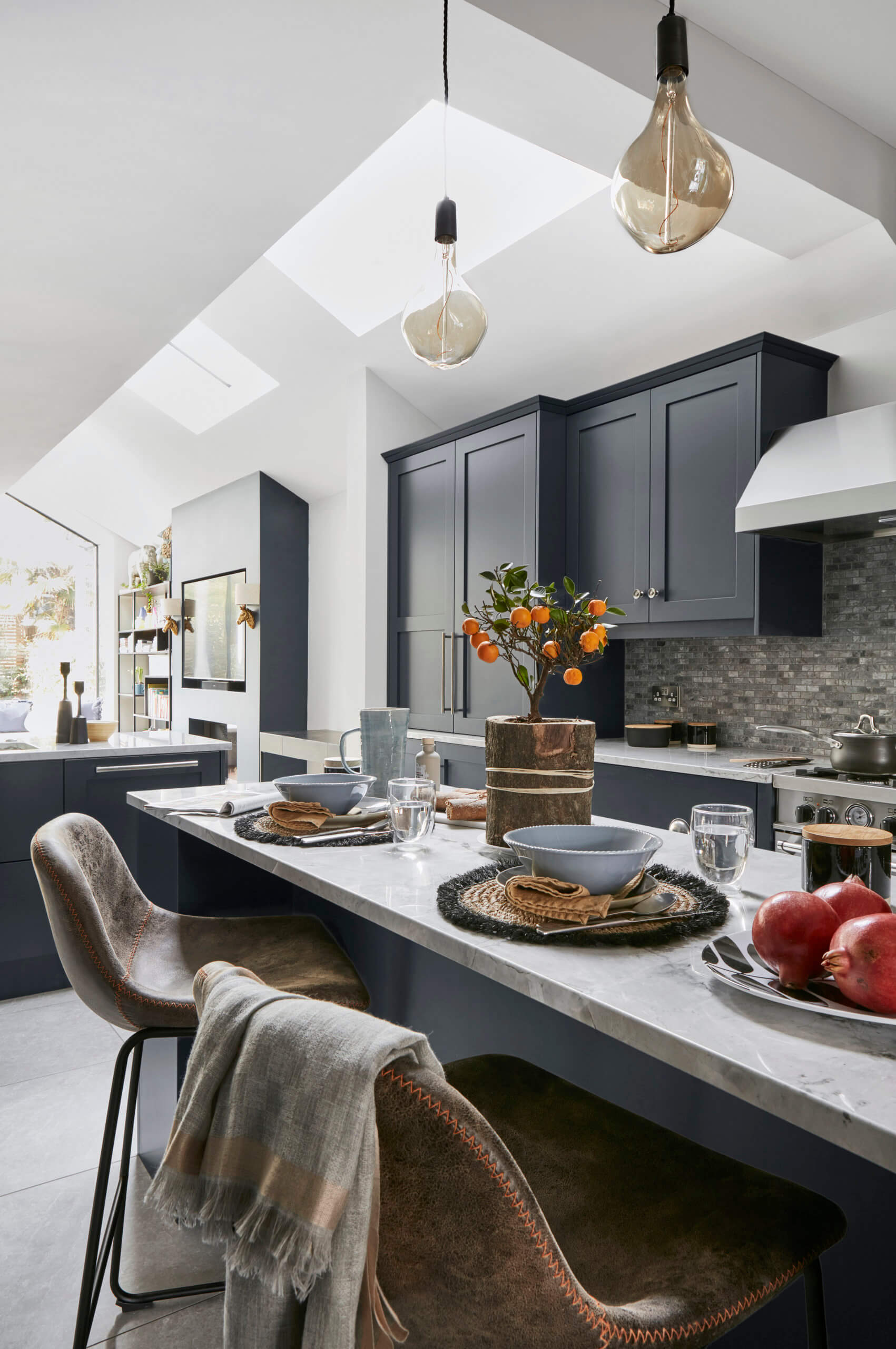
The cabinetry was always going to be classic Shaker and because it was a Victorian house the clients wanted an industrial look – but with a nod to the older and original features of the house. Our lay-on Shaker design was the best option for this. Colour choice for the cabinets initially was navy and then we had a few discussions between turquoise and navy, but eventually came back around to navy. We used Blake Blue, a colour from our own paint range.
Regarding the work surfaces, our client fell in love Bianco Perfecto Quartzite as soon as she walked into our Fulham showroom and saw it! It’s a natural stone which is stronger than marble in composition, it also doesn’t stain or scratch as easily as marble. We find a lot of our American clients prefer to have natural stone worktops rather than manmade, manufactured versions.
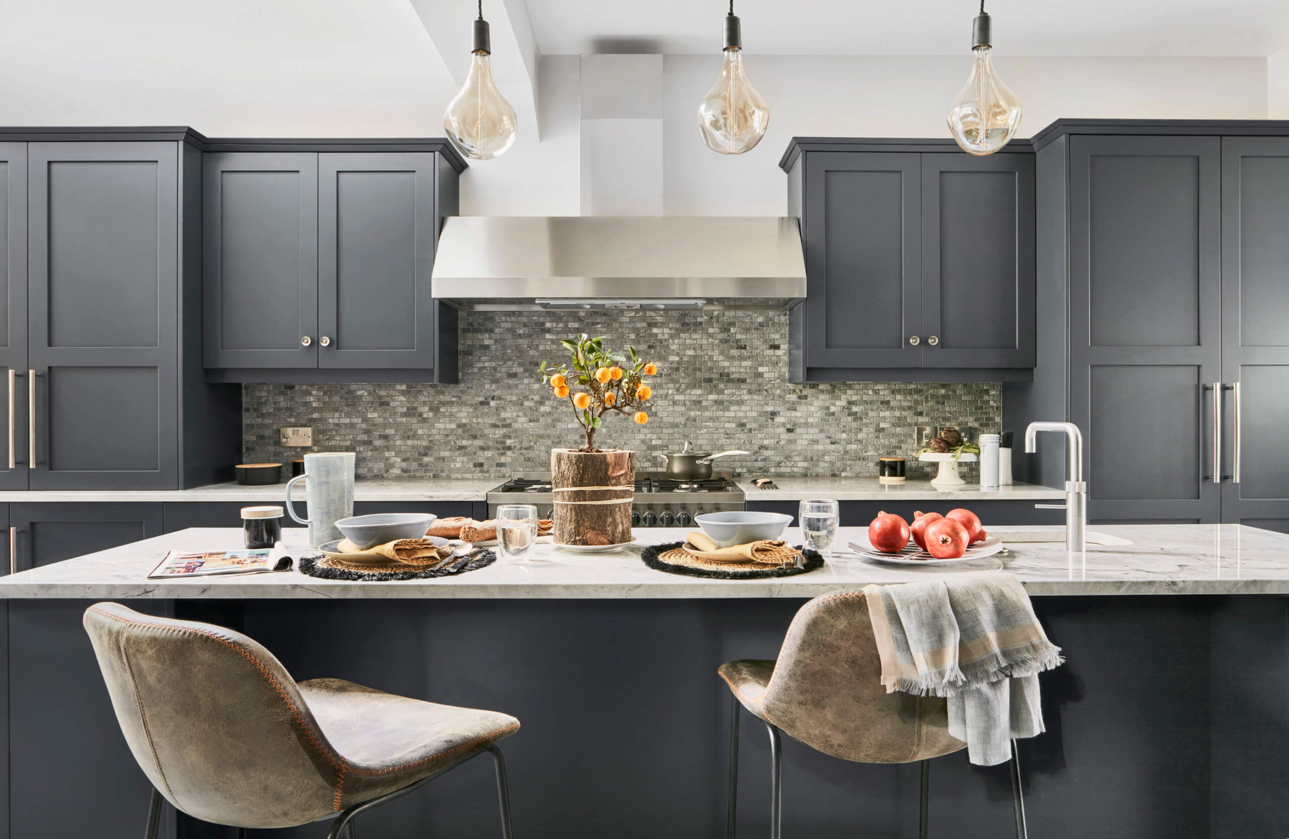
Q: Was there any building/renovation work involved? Did you have any restrictions or limitations that you had to work around?
Yes, there was a huge building project on the go, involving the whole ground floor, and side and back extension! This is quite typical of the projects we work on around Fulham, Putney, Wandsworth areas, so our design teams are familiar with these types of homes.
The clients were very detail orientated so we had to make sure things like the cabinetry was perfectly in-line with the roof lights above. We worked very closely with building team during the process to make sure everything aligned correctly. We produced multiple CAD drawings to show the clients different visuals, to make sure they were completely happy at all the different stages of the project.
Q: What design elements do you think make the scheme so successful?
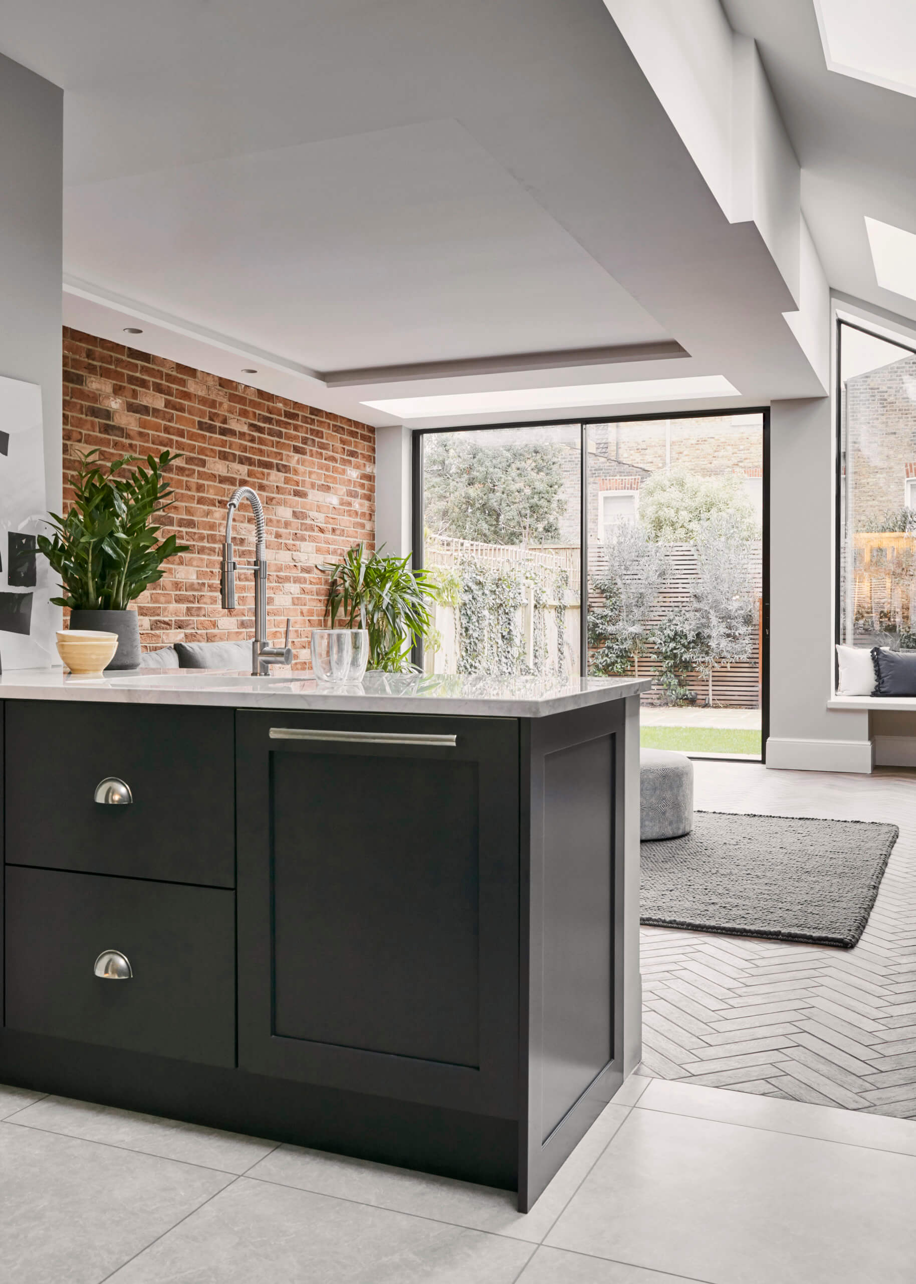
There were a few! The prep sink was a really great element, and contributed to the overall success of the design. Due to the nature of the space, we had to design a slim kitchen and the main sink worked out being away from the range cooker. So it made a lot sense to include a separate sink on the island along with a boiling water tap. It makes the ideal prep sink and is perfect for practicality and proximity to the hob.
The dresser cabinet is also a stand out element. There was a lot of detailed planning that went into the design of this piece. We tailored it completely to the clients needs, making the base unit exactly the right depth for her plates. She also wanted to use her own mirrored tiles in the top glass cabinets so we had to design around these dimensions as well.
Now the project is finished, what aspects do you consider to be most successful?
Our client was really pleased with the work surface mounted larder which is on the left-hand side of the range. Again, like the dresser, this piece was specifically tailored for them. They had a particular coffee machine that had to fit in there, so we made it extra deep and little bit higher than usual to accommodate this.
Personally, I was really pleased with how good the long, slim island actually looked. It really accentuates the space and makes the overall look smart and stylish.
I also really like the nature of how symmetrically balanced the integrated fridge/freezer and the worktop mounted larder are, it makes the overall kitchen design look well thought out and very pleasing to the eye. Balance and symmetry are vital elements of all successful kitchen projects.
Q: What is your best advice for someone who is planning a new kitchen ?
The first question to ask is, what is driving the decision, is it practicality or aesthetics. Usually a client will lean more towards one than the other. Once this decision is made, ask yourself again at each stage of decision-making, is this choice driven by practicality or aesthetics?
So … if you run with practically make sure you’ve thought about the ideal positions for your sink, dishwasher, bins and hob. Will you be able to move between them easily when each element is in use? Always check that there will be enough plug sockets where you need them – not just for the major appliances but for small gadgets and chargers etc.
Aesthetically, make sure everything either balances or doesn’t. So, run with asymmetry or symmetry. Think about a feature splashback and work surfaces, which colours you want to use and whether or not cabinetry colour will complement or match the work surface. Also consider accessories such as handles, lights, taps and whether they will need to match the cabinetry fittings. Of course your chosen designer will be able to help and advise on these elements, but it’s a good thing to have some of your own ideas to hand!
Q: Do you have a secret ‘style signature’ that you find you use in most of your kitchen projects?
Yes! I always try to include detail in the end panels of an island, to make it more of a feature rather than simply a blank slab. I also tend to avoid wall units as a rule in a lot of my designs. In this particular project there are only two, either side of the extractor. I generally find worktop mounted storage and larger, full height cabinets work better. But of course, each project is totally individual!
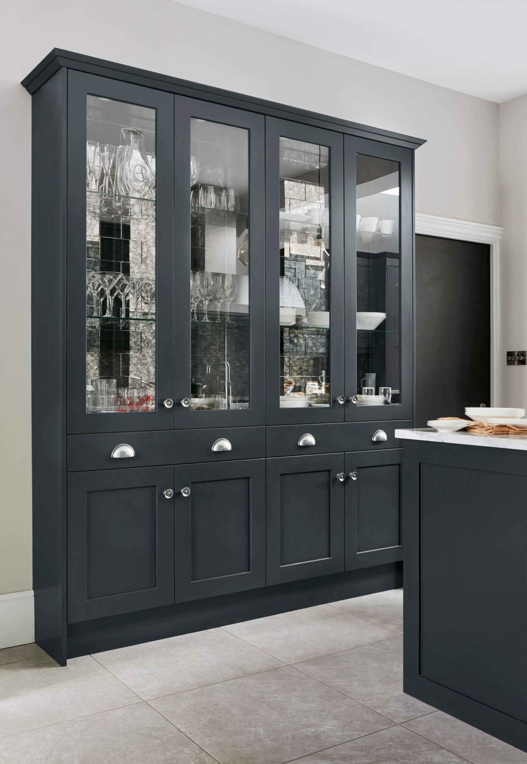
We Love: Actually, we love everything about this kitchen, but stand-out features included the dresser cabinet with mirrored back panels and the breakfast/larder cupboard to the left of the range cooker.
Kitchen by John Lewis of Hungerford, there are thirteen showrooms in the UK, including Chiswick, Muswell Hill and Fulham in London. Call 0700 278 4726 for a brochure, or contact individual showrooms for an appointment.



Leave a comment