Shaker Style in Bold Black: New kitchen with classic looks by Harvey Jones
By Linda Parker
 This dramatic kitchen is brand new, and also sits within a newly built home, but thanks to the careful decisions and recommendations made by Harvey Jones designer Graham Leach, it has a very refined look with a sense of longevity.
Q: What were the stand-out priorities in your brief from the client?
The property is brand new but the use of period paint colours and Georgian architectural references means it already has an established sense of history and heritage. The owners, who have grown-up children living in London, wanted the kitchen to feel similarly grounded. The overall look had to resonate with the traditionally inspired architecture – from the high ceilings to the generous sash windows. However, the layout was to be much more modern and able to cater for the requirements of a both a family home when all family members were around and yet also be cosy and peaceful when the couple where at home ‘alone’.
Q: How did you set about answering that brief? Were you given a strict budget?
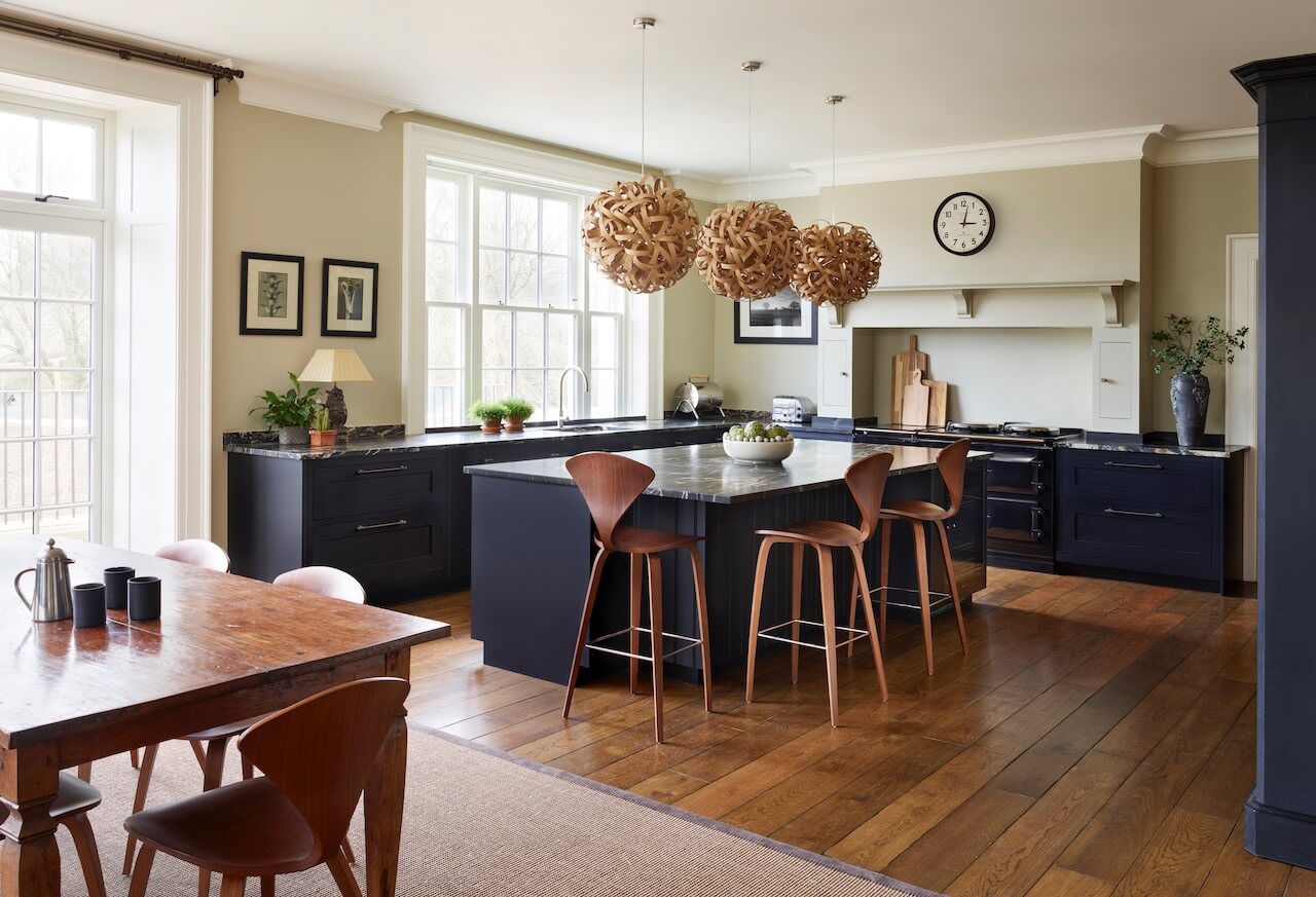
We embraced the relatively new ‘broken plan’ trend, which involves flexible areas that can be shut off when required. Open-plan living is very sociable but leaves nowhere to go when you need peace. By dividing the room with Crittall-style glazing, the owners can enjoy a cosy room to relax, without losing the sense of space and togetherness that has made open-plan kitchens so popular. We weren’t given a strict budget, so we felt able to make suggestions that were absolutely correct for the space and the owners requirements.
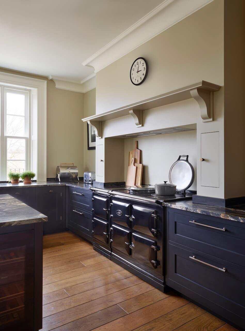
Q: Explain the reasons behind the choices of cabinetry and work surfaces …
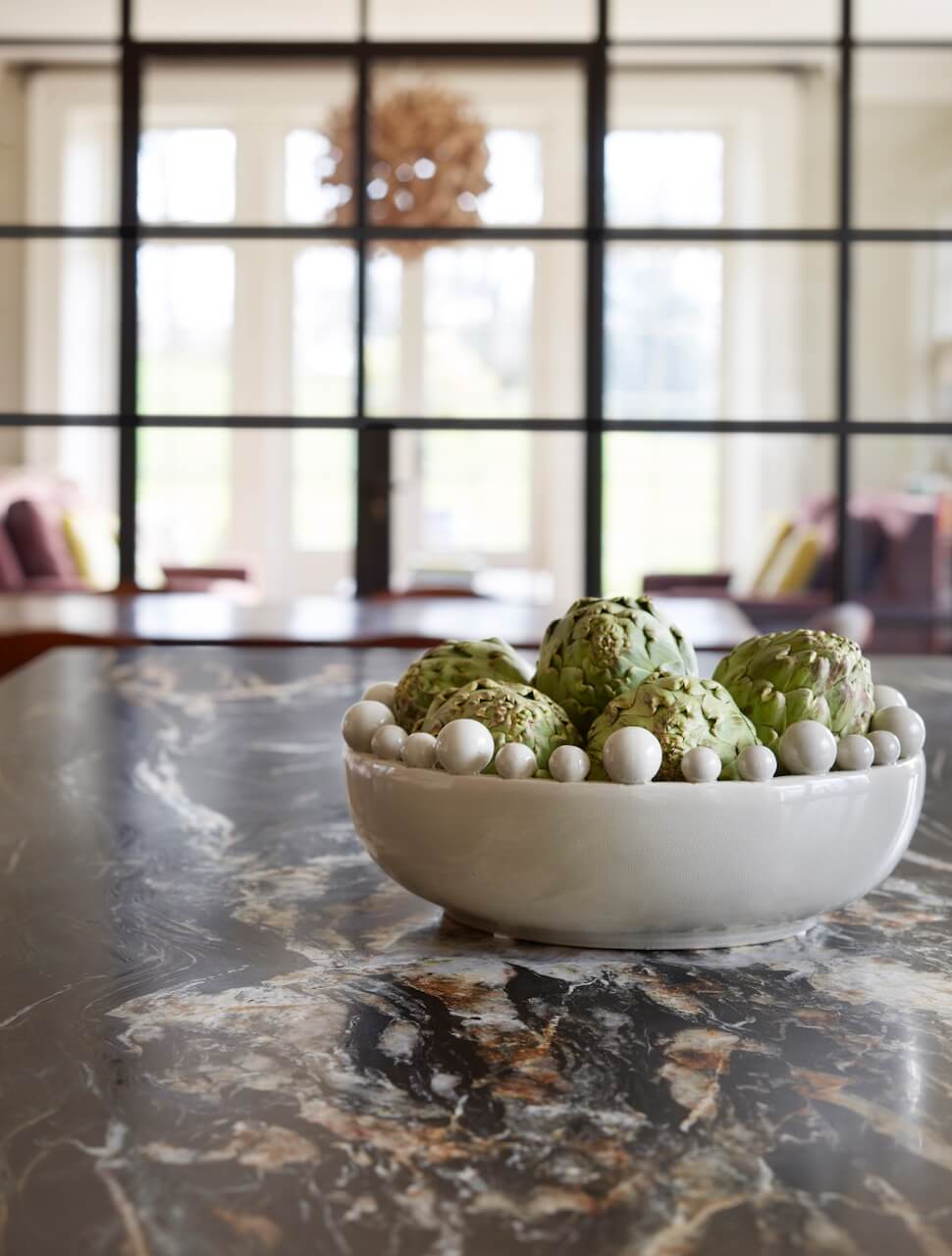
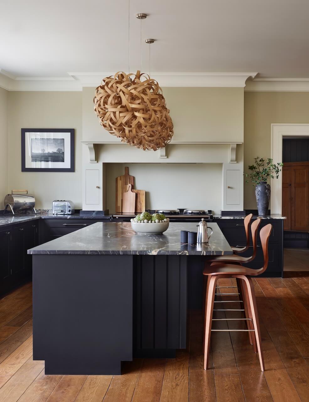
We wanted a dark, brooding ‘heritage’ colour to tie-in with the period features of the property. The room has plenty of natural light, so we had the scope to go darker, and felt that this was the right design direction to head for. The rich dark oak flooring was a stunning choice, and we ensured the focus of that choice wasn’t taken away by the worktop and cabinetry. The white quartz veining in the worktop provides a neat accent with the wall colour and mantle shelf.
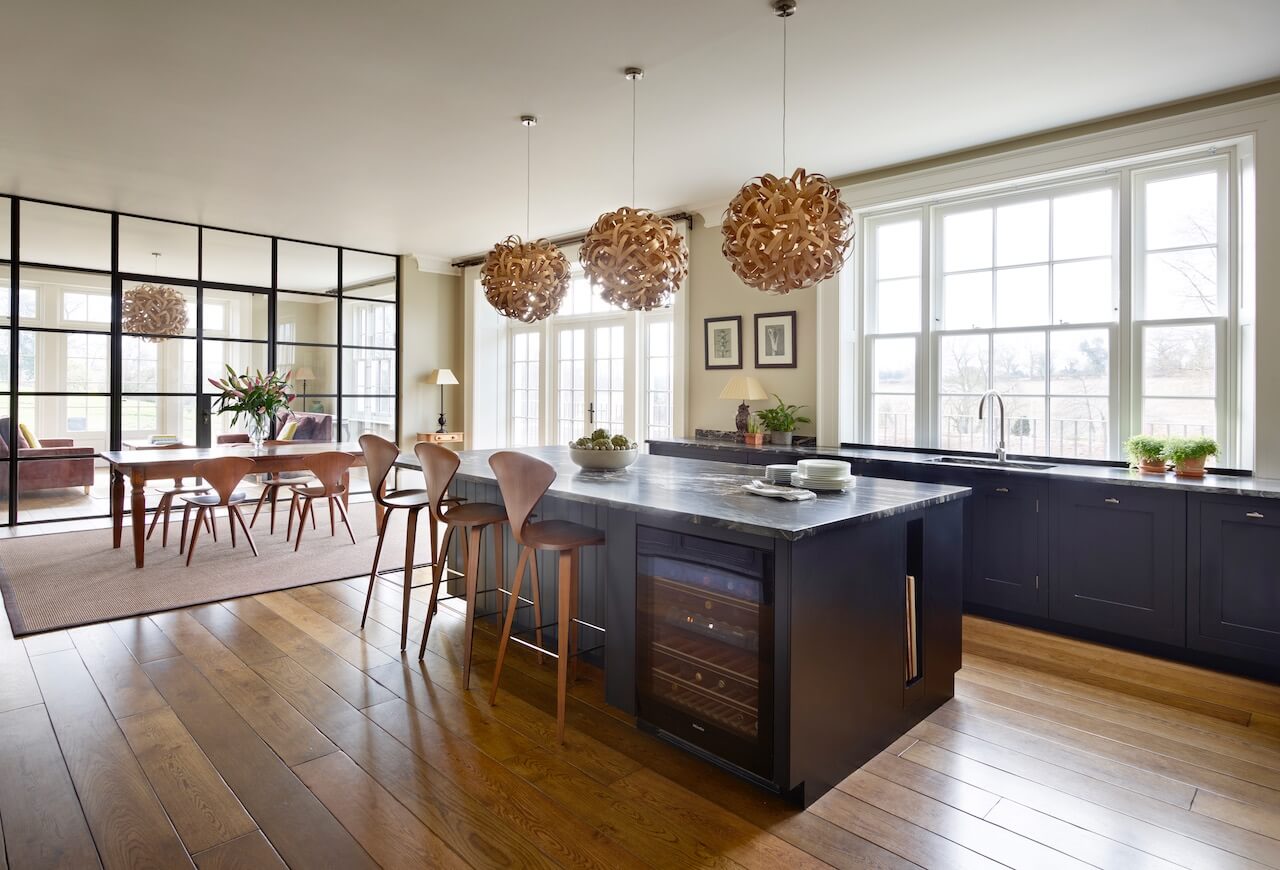
Q: Did you have any restrictions or limitations that you had to work around?
The house is a complete new build, so we had no restrictions other than the size. We wanted the space to be open plan but to still have different sections for food prep and dining as well as a cosy snug. It was interesting and productive to have more or less a complete ‘blank canvas’ to work with, that doesn’t happen that often actually!
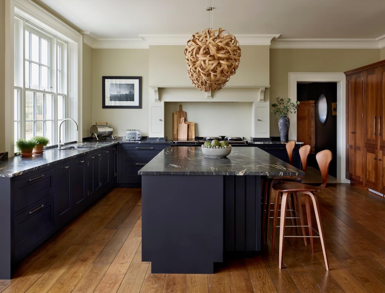
Q: What design elements do you think make the scheme so successful?
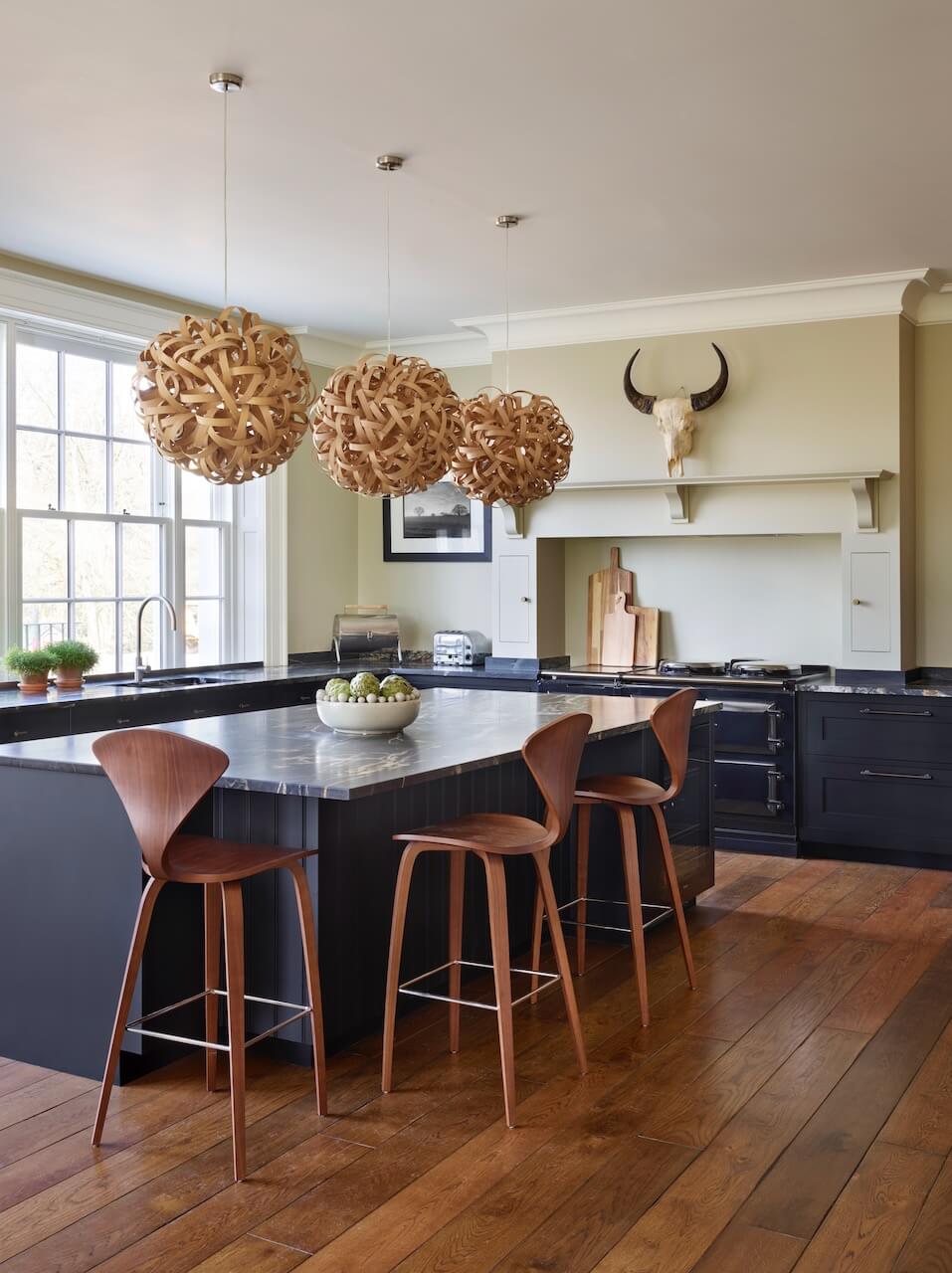
Given the scale (6m x 9m approx) and lightness of the room, we used dark low-level cabinets to give the kitchen a sense of gravitas. Coupling this with a bold black countertop enhances this effect and makes the kitchen a real feature, rather than trying to blend it into the colour palette. The whole dark/light concept is striking and ambitious, and we feel that the choices of accessories – such as the pendants and the chairs, add natural elements to the scheme, and link beautifully with the timber flooring.
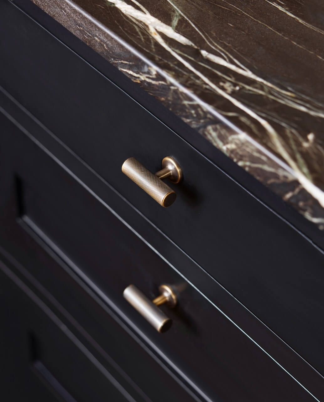
Q: Now the project is finished, what aspects are you (or the client) most pleased with?
The managed connectivity between the kitchen, informal dining and snug area, which sits behind the glazed Crittal-style screen. This overall space really is the heart of the house, and fulfils all the requirements the owners requested.
Q: What is your best advice for someone who is planning a new kitchen … what should they look for and ask about?
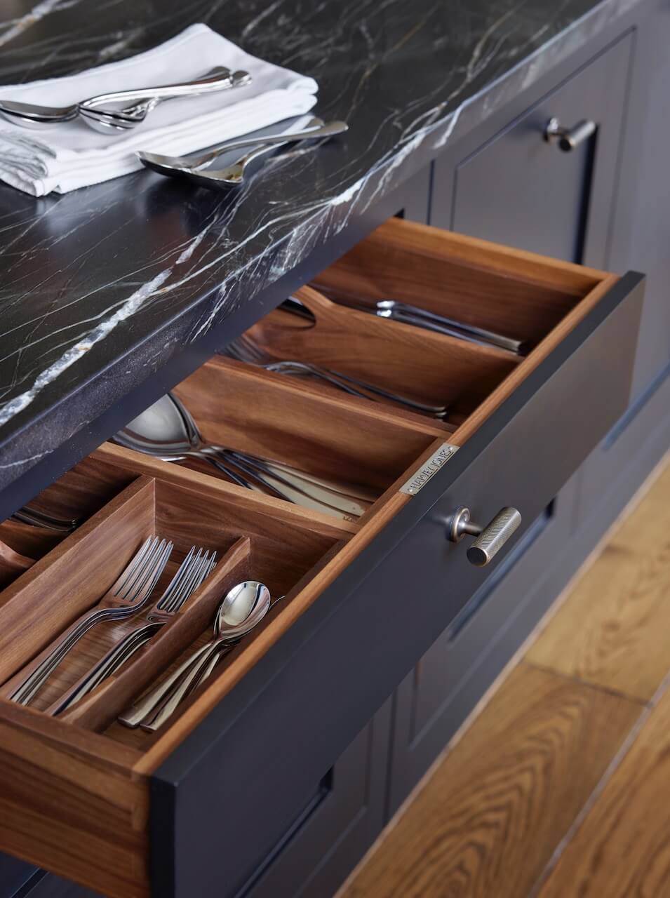
With the emphasis on entertaining and socialising in a kitchen nowadays, one of the most important things is to try to incorporate casual seating with a good area of worktop for both food preparation and versatile set-down. Try to ensure as much practical worktop space between the hob and sink as can be, as this is often a well-used area for food preparation and drinks making. Try to plan-in deep versatile drawers where possible, to accommodate storage for crockery and pans. They make access easier and help keep walls clear of cupboards … which creates a sense of fluidity and ease of movement in and around an open-plan space.
Q: Do you have a secret ‘style signature’ or item/feature that you find you use in most of your kitchen projects?
I tend to plan extractors into canopies to prevent breaking the flow of cabinetry, and help prevent a kitchen risking looking dated with an old extractor on display. The use of a faux chimney breast where possible helps create a focal point in an otherwise simple kitchen design and also carries enough weight aesthetically without the need to plan for or add wall cabinetry. Lots of versatile drawers for crockery, serving dishes and pans under the worktop help minimise the impact of wall furniture. This usually creates a lighter feel to a kitchen, and flows well within an open-plan living space.
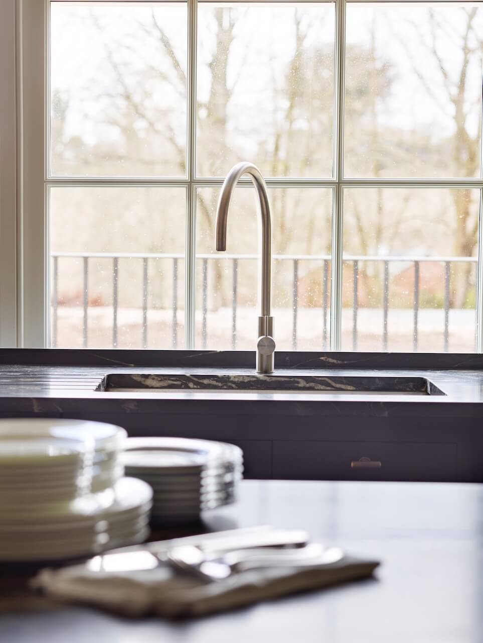
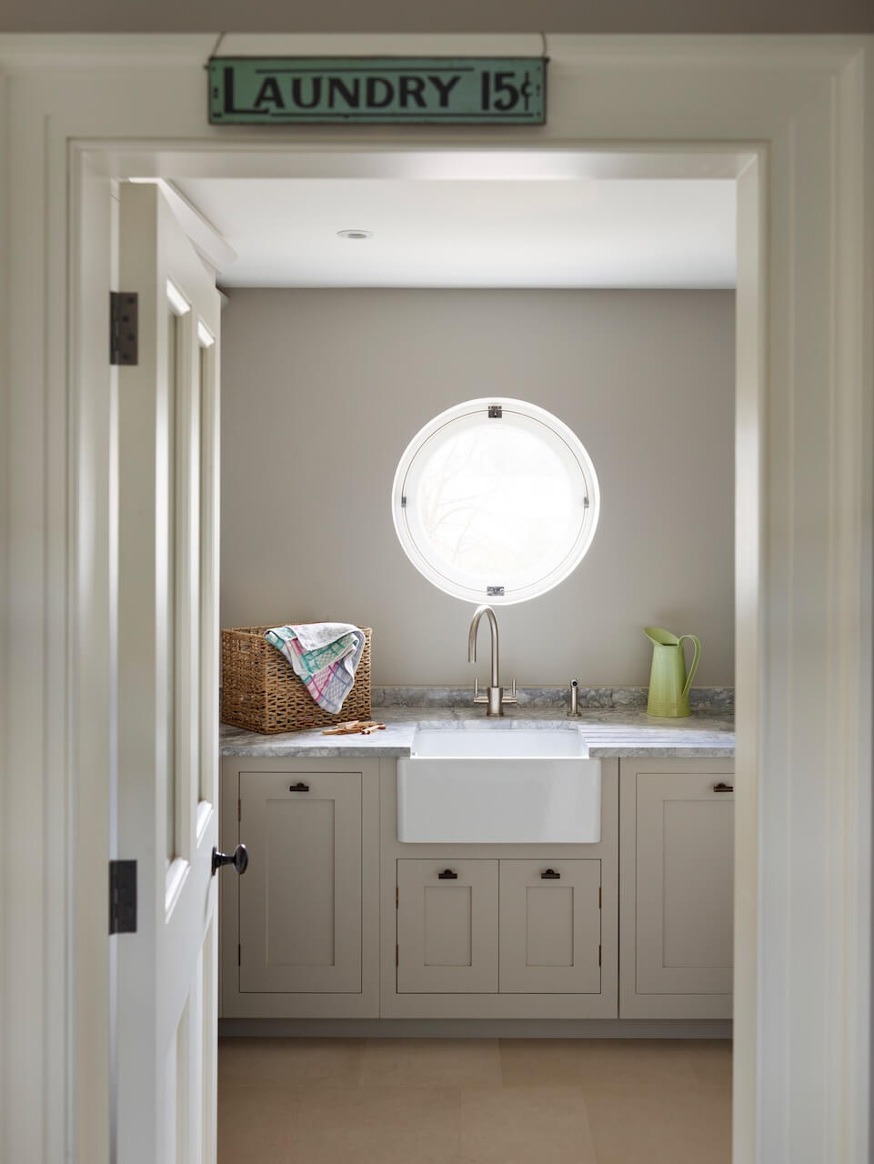
We Love: The contrasting elements – the cabinetry against the flooring, the pendant lights and stools glimpsed again pale walls, and the dark work surfaces with the white veining. We’re also very envious of the utility room too!
Shaker kitchen in walnut and painted finish by www.harveyjones.com, 0800 389 6938
Paint: Pitch Black oil-based eggshell for the cabinets, Bone estate emulsion for the walls, by Farrow & Ball
Range cooker: 5 Oven Total Control in Black by AGA
Integrated fridge-freezer and dishwasher, both by Miele
Sink, Blanco
Pendant lights, Tom Raffield
Stools, Cherner
Quartz work surfaces, Levantina




Leave a comment