Bespoke Framed Shaker Kitchen By Higham Furniture

The designer: Tim Higham at Higham Furniture (www.higham.co.uk)
The story: Founded in 2004, Higham Furniture specialises in designing and manufacturing high quality, bespoke furniture. From its London studio, the company works with customers to put together designs before being realised in their Hampshire workshop.
Designer Q&A:
Q) What was your brief from the client?
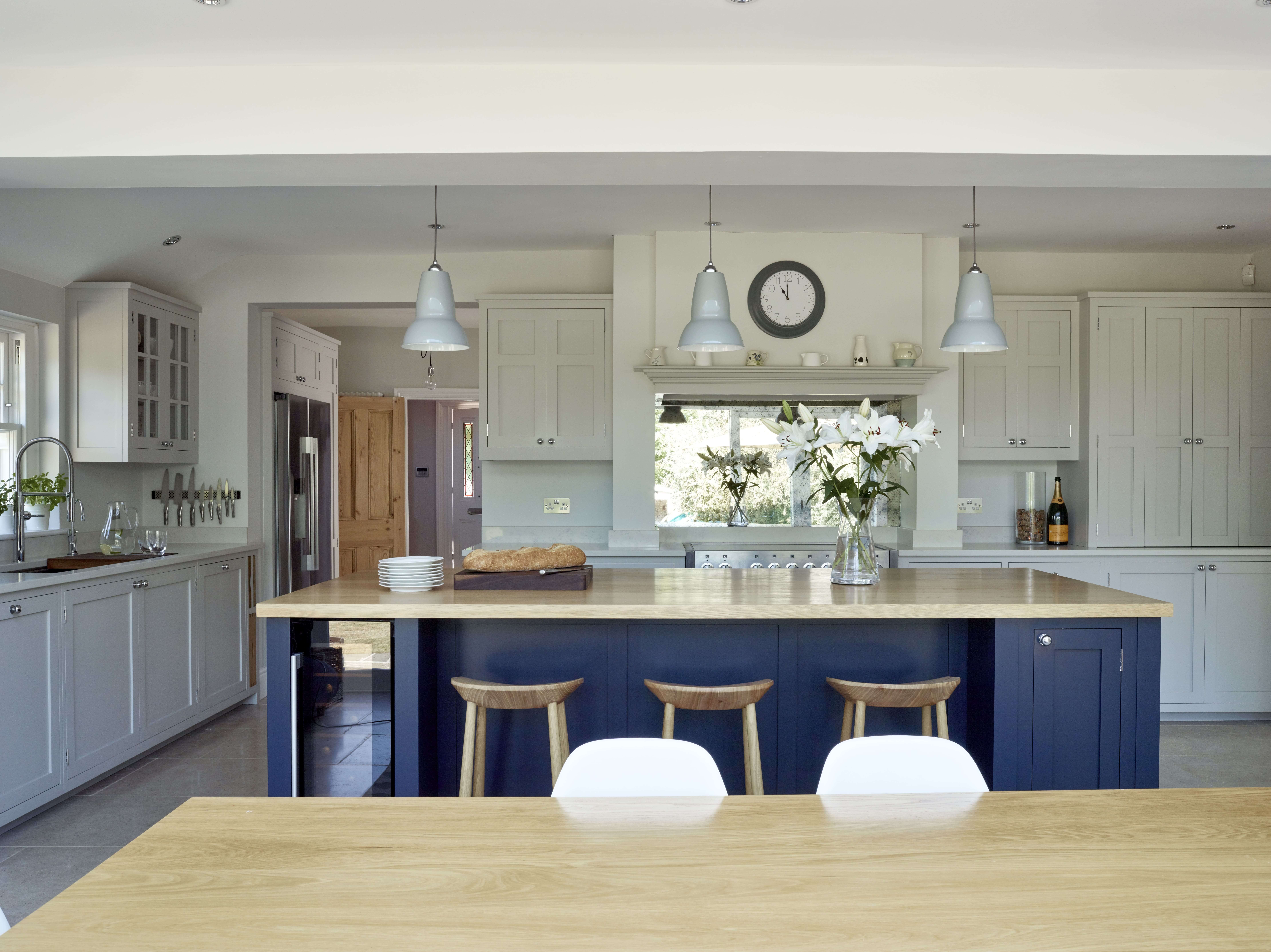
Although the layout changed quite a lot during the design process, the client had a clear vision for the overall look of the kitchen from early on. They live in a classic Edwardian house and wanted a Shaker-style design in keeping with the overall style of the house. However, they did not want it to look overly traditional but instead, wanted a contemporary twist. They asked for slim rails and stiles on the doors to create an elegant, more delicate and refined look as opposed to having very chunky doors. They also asked for pale units with a contrasting island and a combination of quartz and oak for the worktops. Plenty of storage was also a must.
Q) How did you answer the client’s brief?
Initially when the client contacted us, the space we were working with was quite different to what it is now. At the time, they were not planning on extending the kitchen as the previous owners had already added a small extension at the back of the house. Therefore, our task was to re-design the existing kitchen by adding more storage and making it more functional; as well as replacing a long peninsula with an island. We visited the client’s home to get a better sense of the space and continued to refine the design to come up with the best layout.
Q) Were there any challenges along the way?
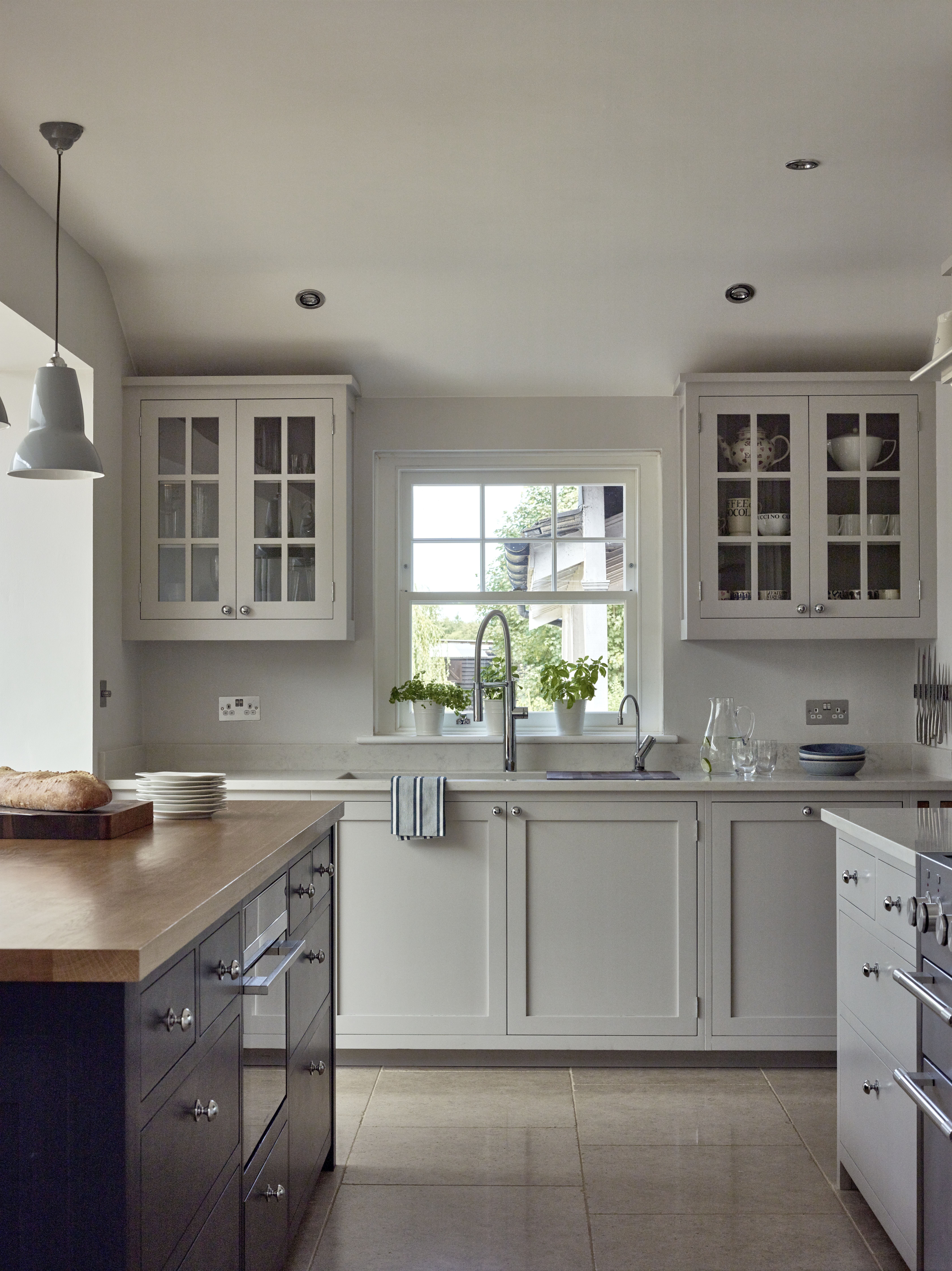
One challenge was that there was a window where the client wanted to have a range cooker. They were reluctant to block it off as it would have removed the lovely views to the garden and would have meant less natural light. Our recommendation was to move the range elsewhere, as it was not ideal having it in front of the window, mainly due to the oil and dirt that the window architraves would collect over time. The client was happy with our advice and we came up with a practical and aesthetically pleasing design that the client was very happy with.
Q) Was there any building/renovation work involved?
The client encountered an obstacle with their project and they were now having to rebuild the foundations of the existing extension. At this point they started thinking about building out the house since they were going to have to get planning permission anyway and this of course meant that we would have to re-think the kitchen design that we had already come up with.
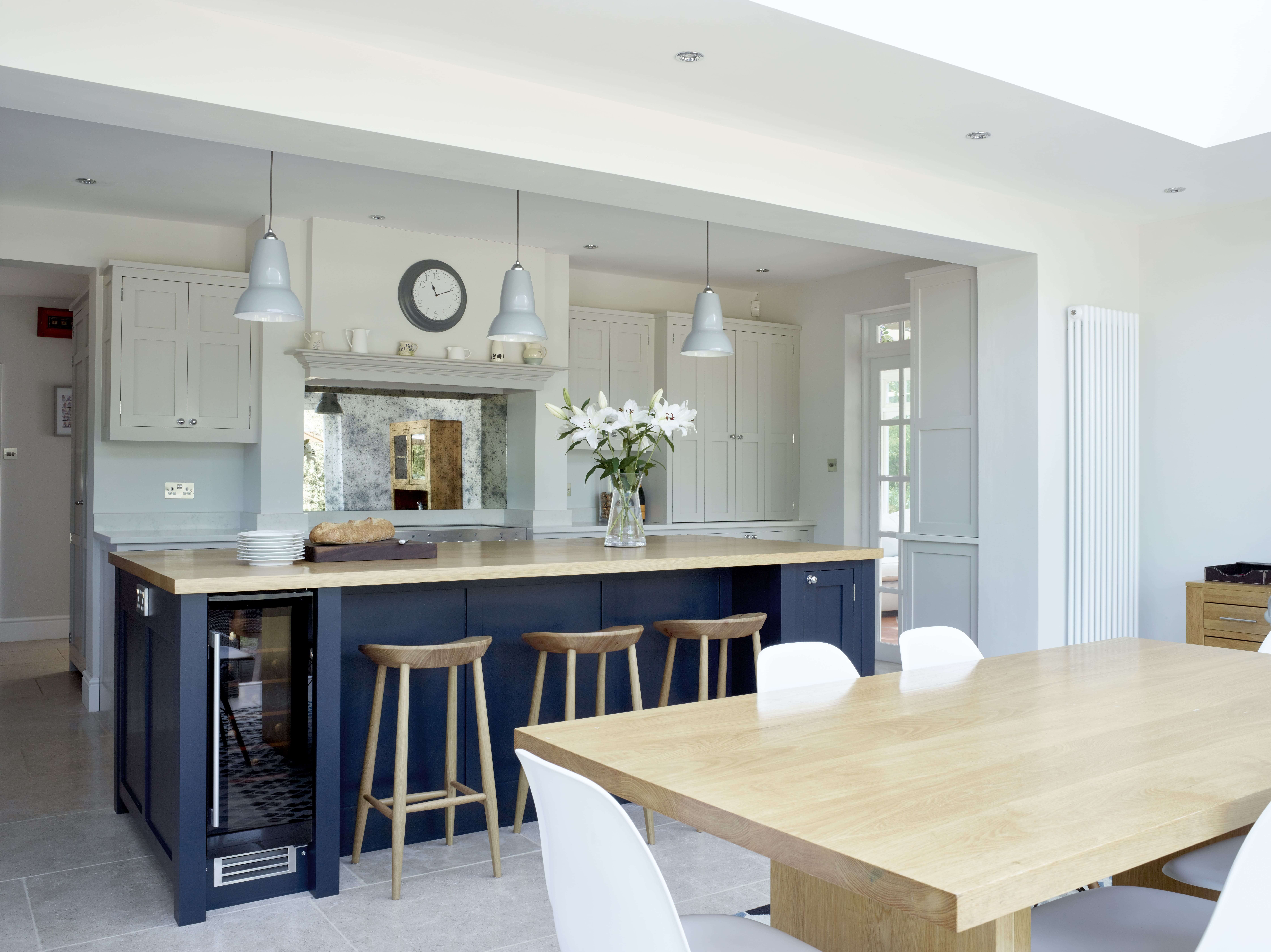
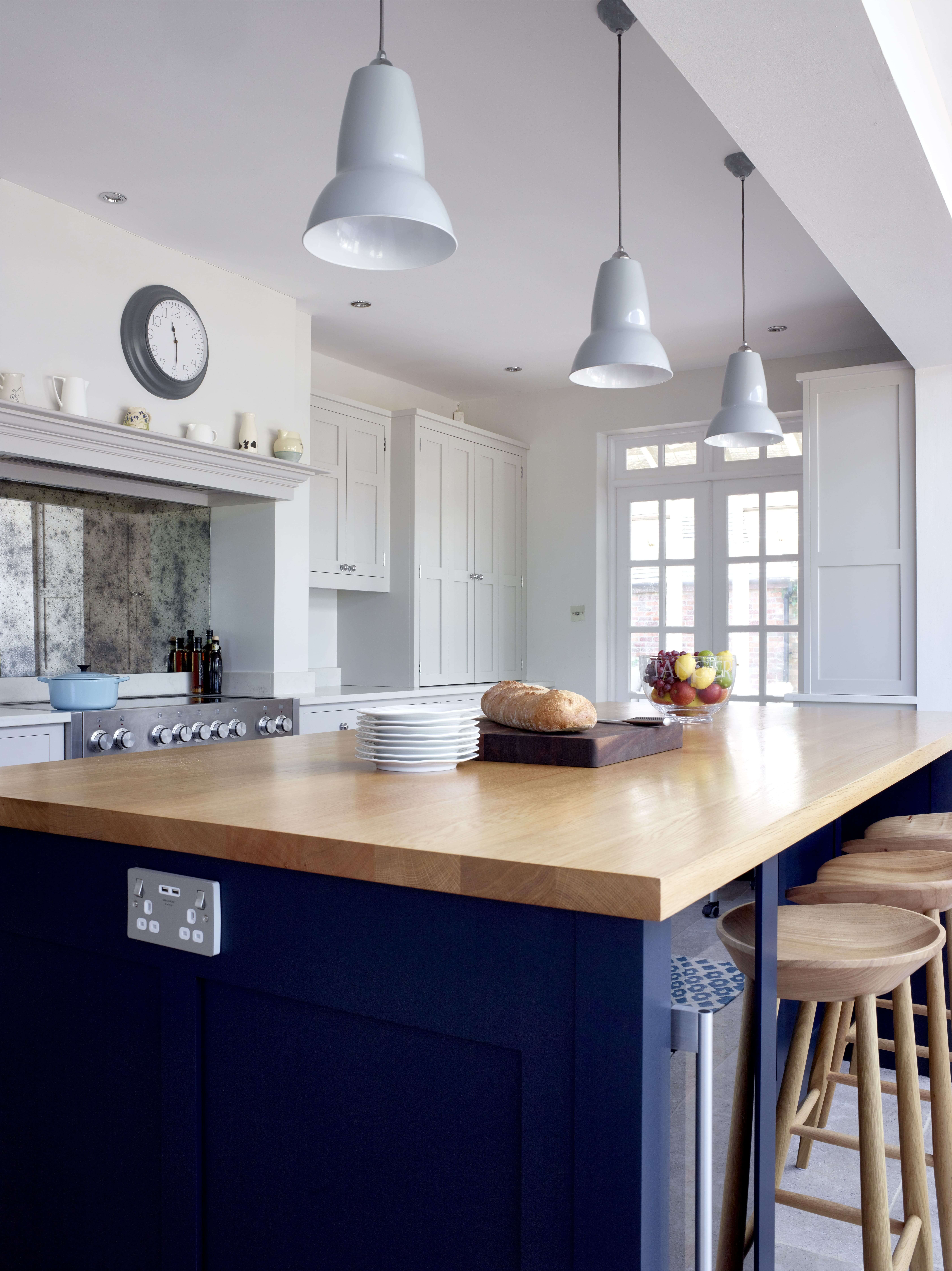
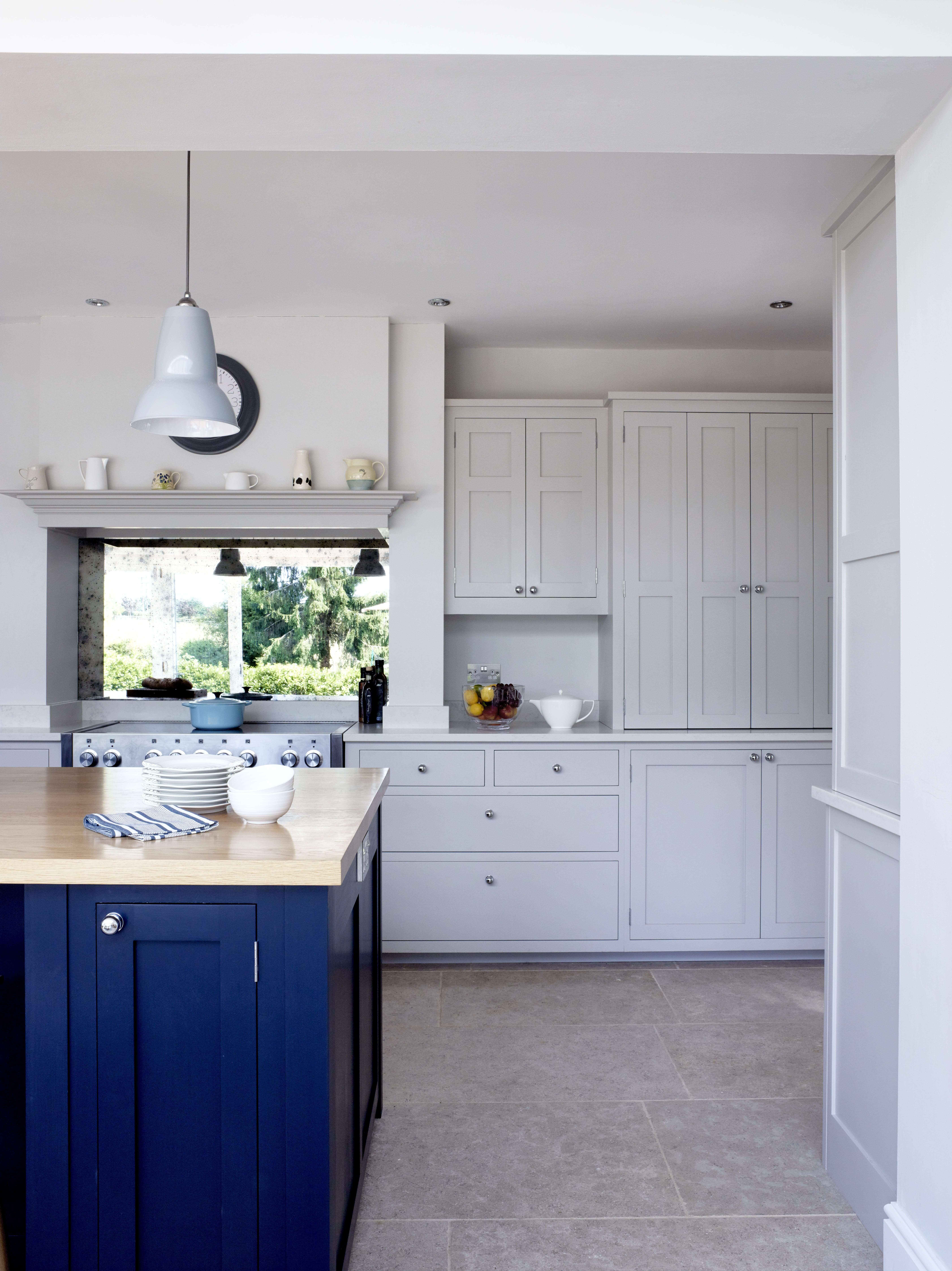
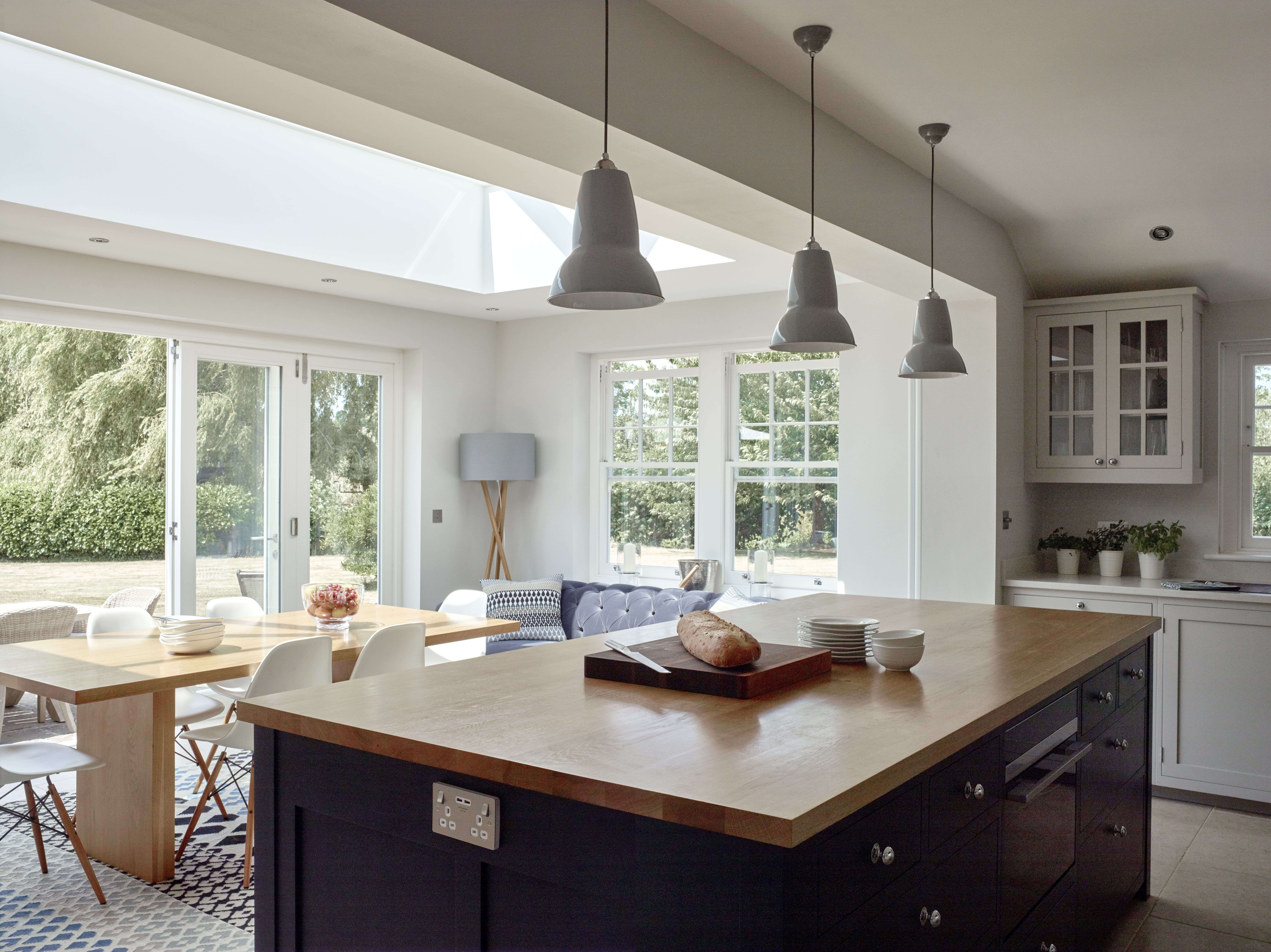
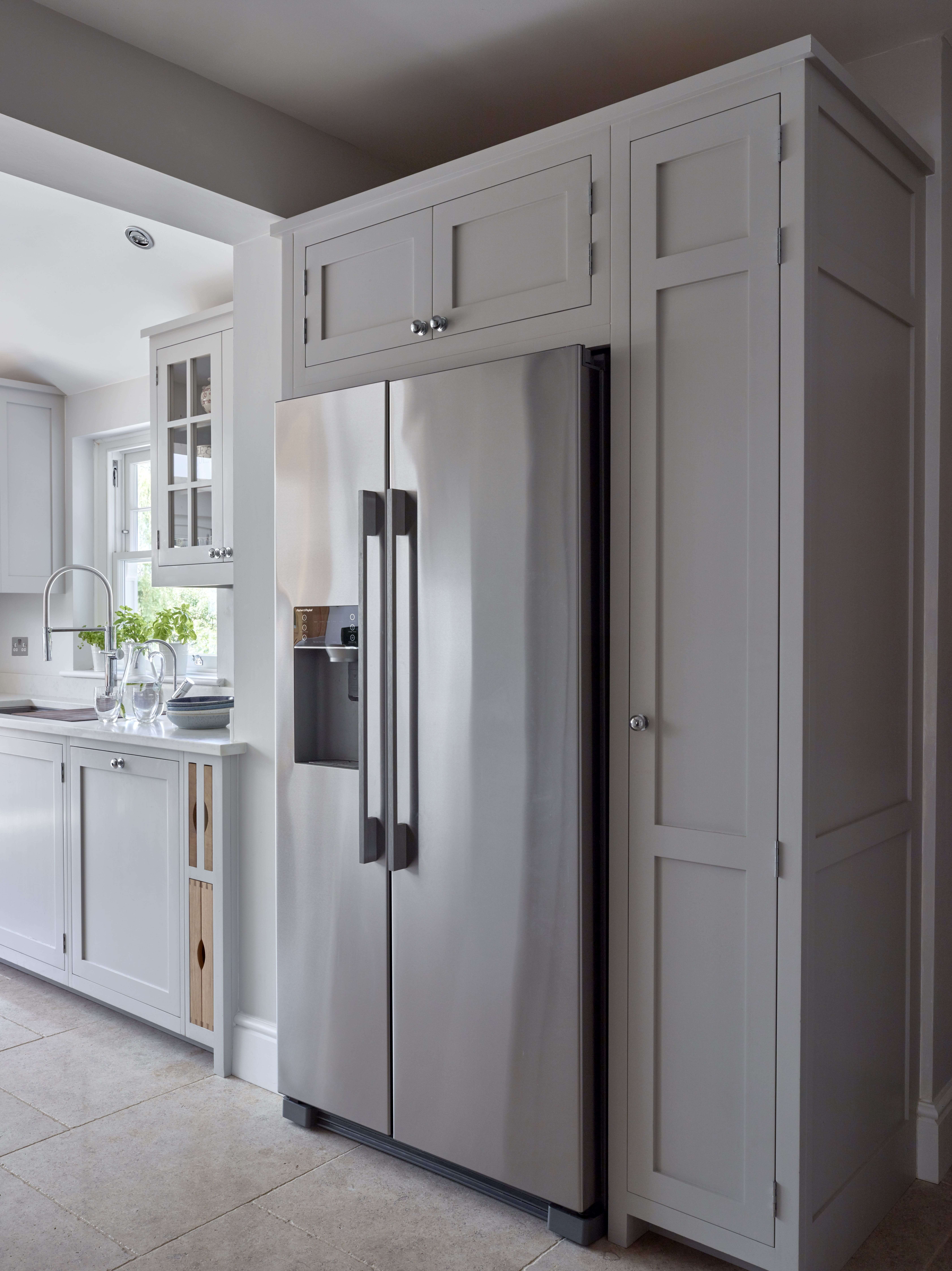
A new layout started to take shape. We kept the kitchen in the existing part of the house but because the dining table was now going into the new extension, this gave us much more room to play with. We settled on keeping the sink in the same spot as in the old kitchen, in front of a window that had lovely views towards the garden. The range cooker now found a new home along the wall next to the conservatory and enabled us to add a lot more storage and to create nice symmetry with the cabinetry. We were also able to make the island bigger than in our original design, with additional storage and seating for three.
Q) What elements do you think make the scheme so successful?
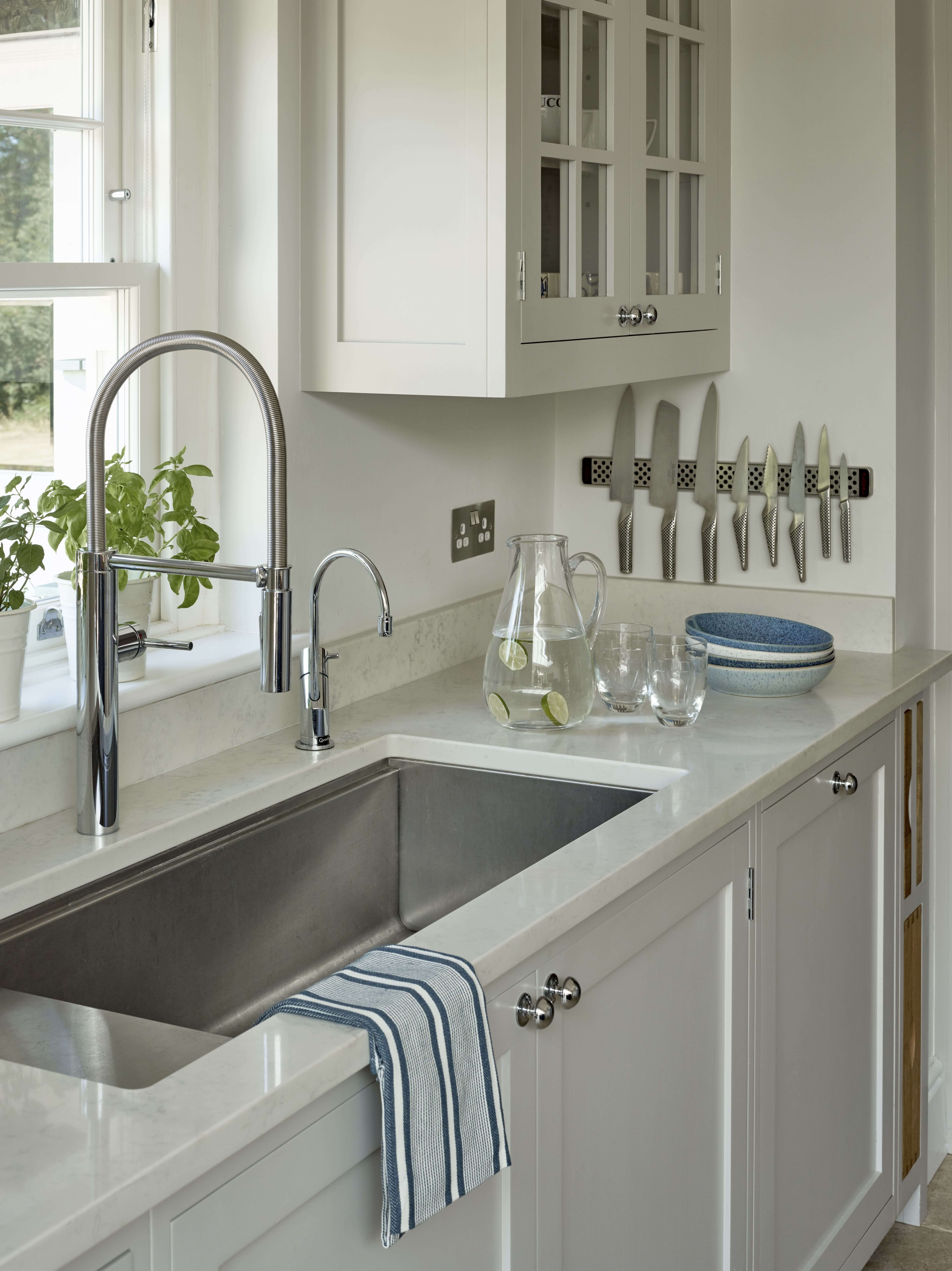
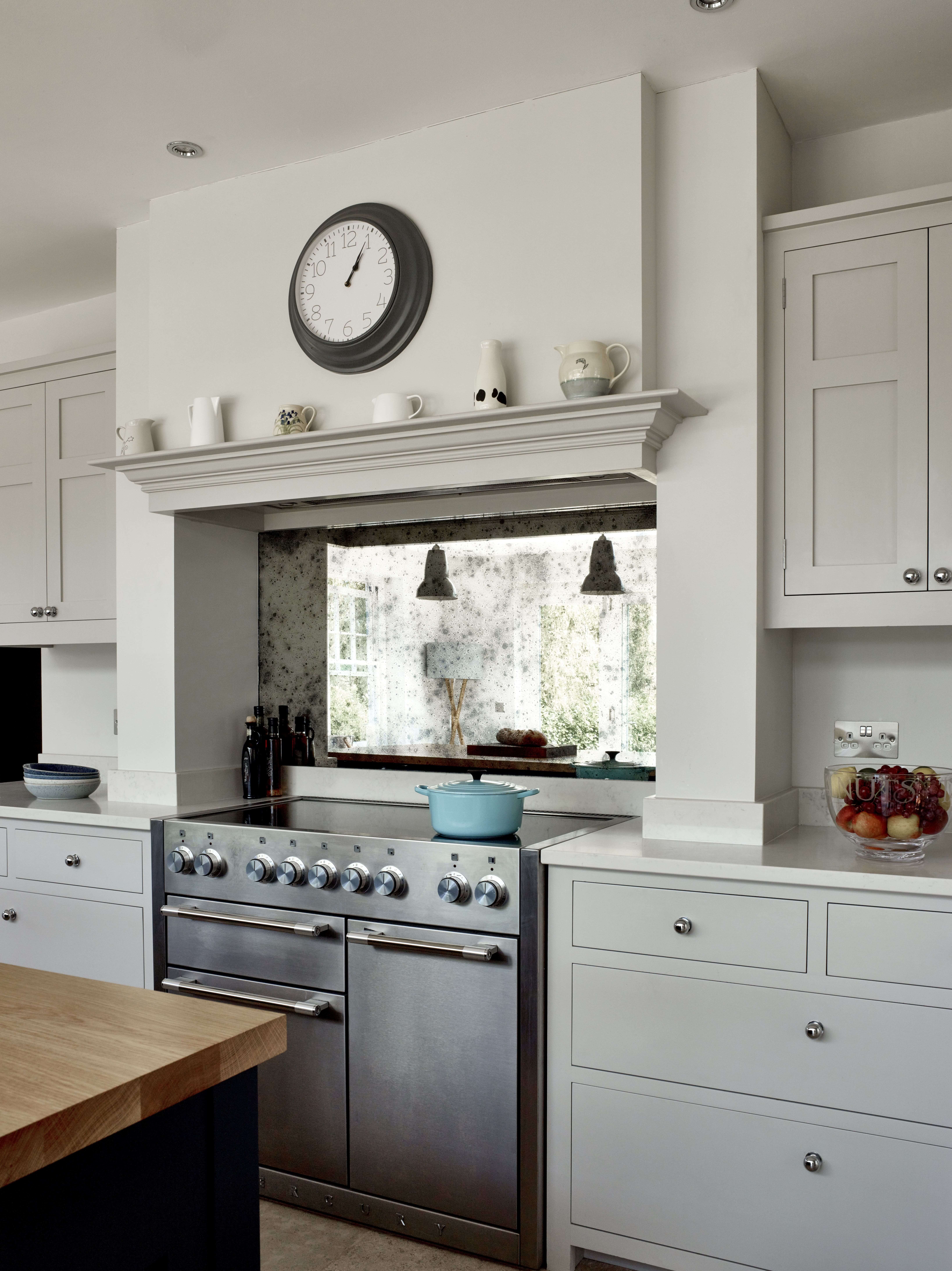
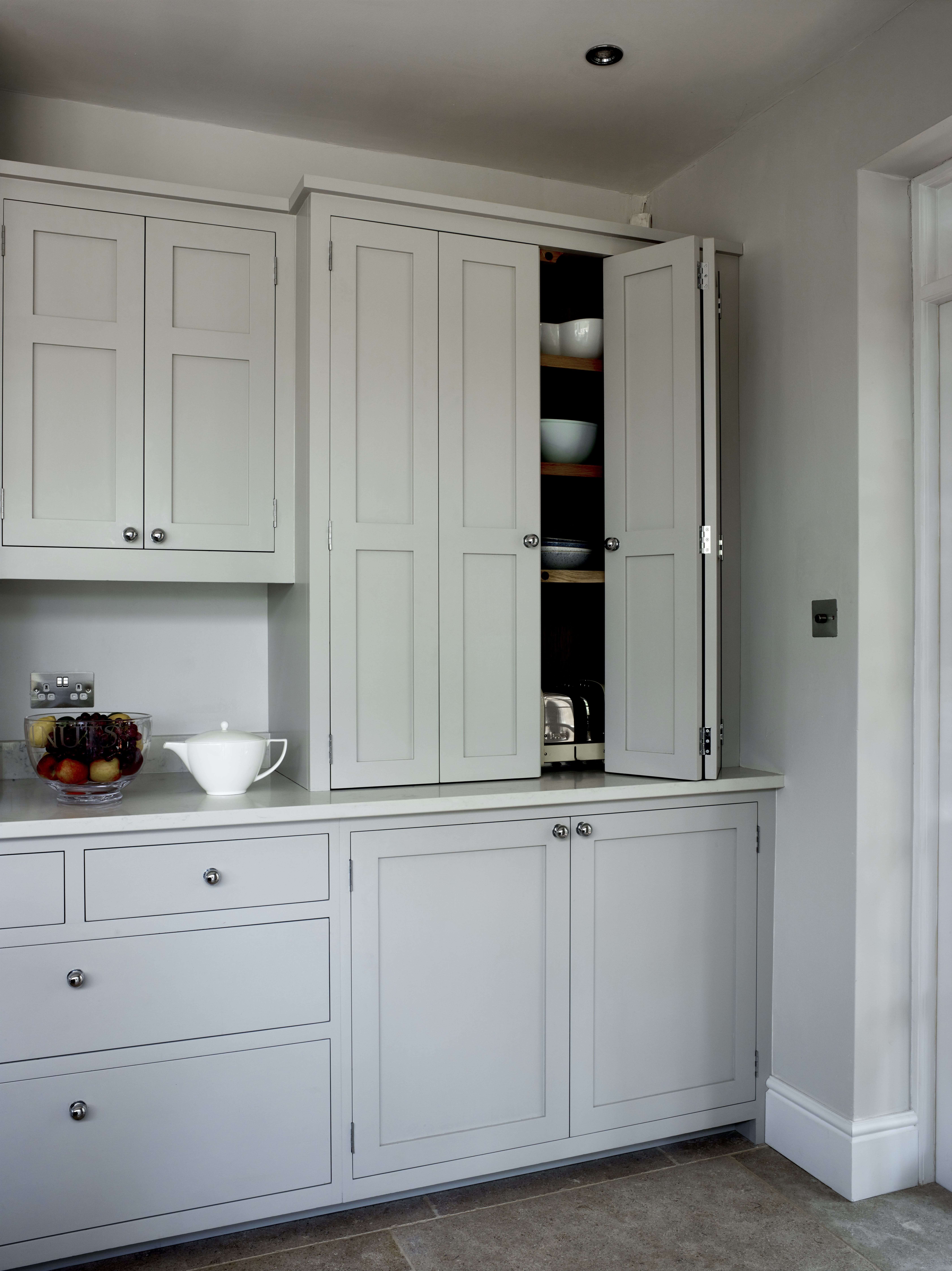
The final design is a combination of functionality and aesthetics. The client had specifically wanted somewhere to store smaller appliances at worktop level, which the bi-fold dresser is ideal for. The client chose a very large sink and we were initially concerned with its size, however there is still plenty of worktop space either side so it works well and looks stunning. We added an oak worktop on the island, which adds warmth to the space and ties in with the dining table and other furniture in the room. The client chose an antique mirror splashback, which bounces off the light from the garden nicely.
The details:
Appliances by Fisher & Paykel, Mercury, Caple, Westin and Siemens, www.fisherpaykel.com/uk, www.mercuryappliances.co.uk, www.caple.co.uk, www.westin.co.uk and www.siemens-home.bsh-group.com
Sink by Kohler, www.kohler.com
Taps by Franke and Quooker, www.franke.co.uk and www.quooker.com
Hayley loves: how the different coloured cabinetry works so well to create a contemporary twist on a classic Shaker look.



Leave a comment