Martin Moore: Vibrant Colours in a classic kitchen with a contemporary edge that embraces light and space
By Linda Parker
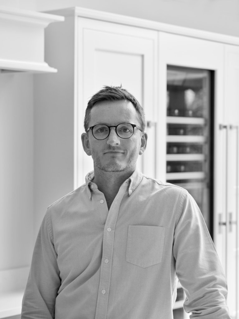
Design Director Richard Moore, son of Martin and Barbara Moore, who started the family handmade bespoke furniture business in 1975, (his brother Michael also works in the family business) designed this stunning kitchen for clients who wanted to feature bright colours in a new open plan kitchen-living space.
By Linda Parker
Q: What were the stand out priorities in your brief from the client?
A: There were essentially two parts to the starting brief; one practical and one aesthetic. Our clients were clear that although they wanted an open plan kitchen/living space, the cooking zone had to be the sole province of the cook, without other people underfoot blocking access to essential areas. On the aesthetic front, it was always clear that the kitchen would be colourful! Orange and green came into the equation right from the beginning. They brought me both this clear brief and good ideas of their own. These formed an excellent starting point for our subsequent collaboration and I really enjoyed working with them; it was stimulating and fun, they trusted my knowledge and experience and it became an extremely smooth-running project because we all worked together so harmoniously.
Q: How did you set about fulfilling all the aspects of the brief?
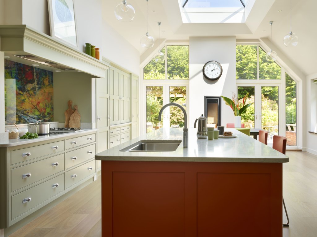
A: Generally, two key features defined the footprint of the kitchen; the first being the extensive garden views and the second being the enormous roof light, which means the room is bathed natural daylight. Based on this, my plan for efficient zoning evolved from fitting the clients’ requirements within the pre-existing features of the new extension, which had already been built. It then became a speedy project … from the day they came into the showroom to the day they unpacked everything into their 100% completed kitchen, the entire process took under five months. It all ran incredibly smoothly, and I think they were impressed by just how quickly each step fell naturally into place.
Q: What design elements do you think make the scheme so successful
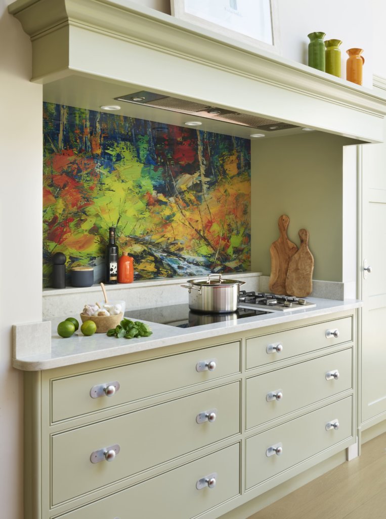
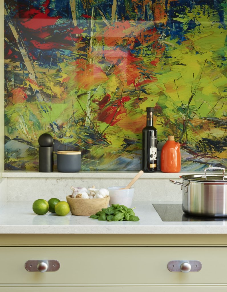
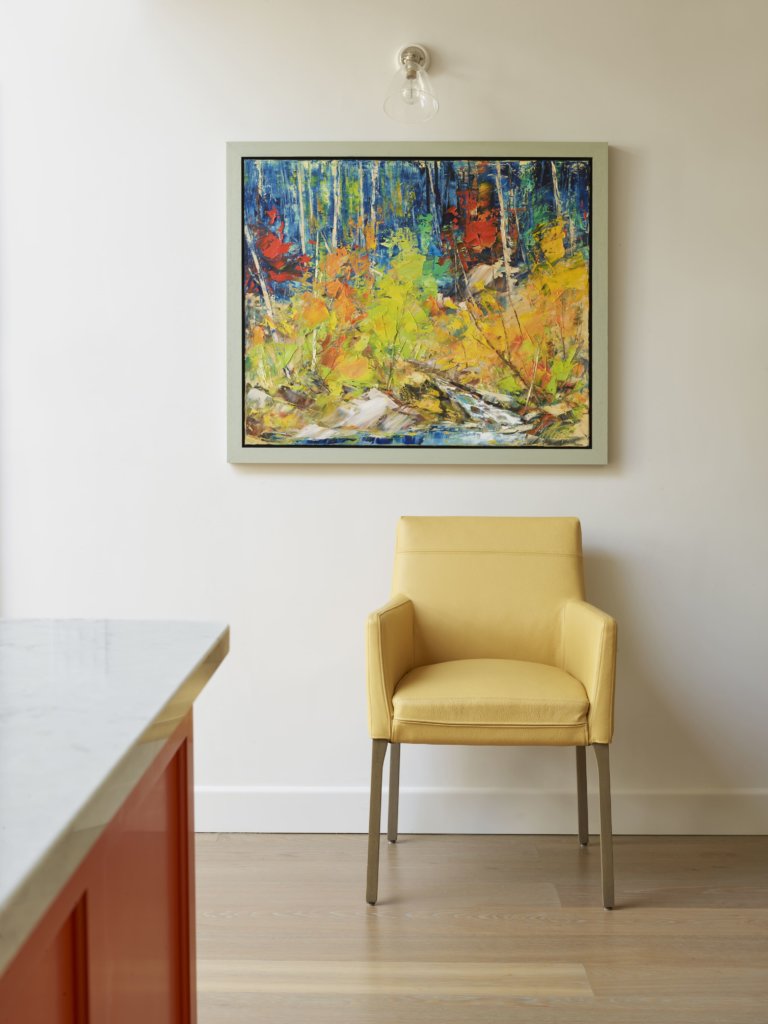
A: The colour palette – which was meticulously planned. It unites two inspirations; the garden outside and an amazing painting which our clients had bought several years before. It ended up being reproduced for the glass splashback. It’s unique to have a work of art at the heart of a kitchen design. Having it hung within the space and reproduced on the opposite wall for the splashback means it takes centre stage. Everything else that we put into this kitchen-living space relates to this powerful image, defining the room’s personality in an intimate and personal manner.
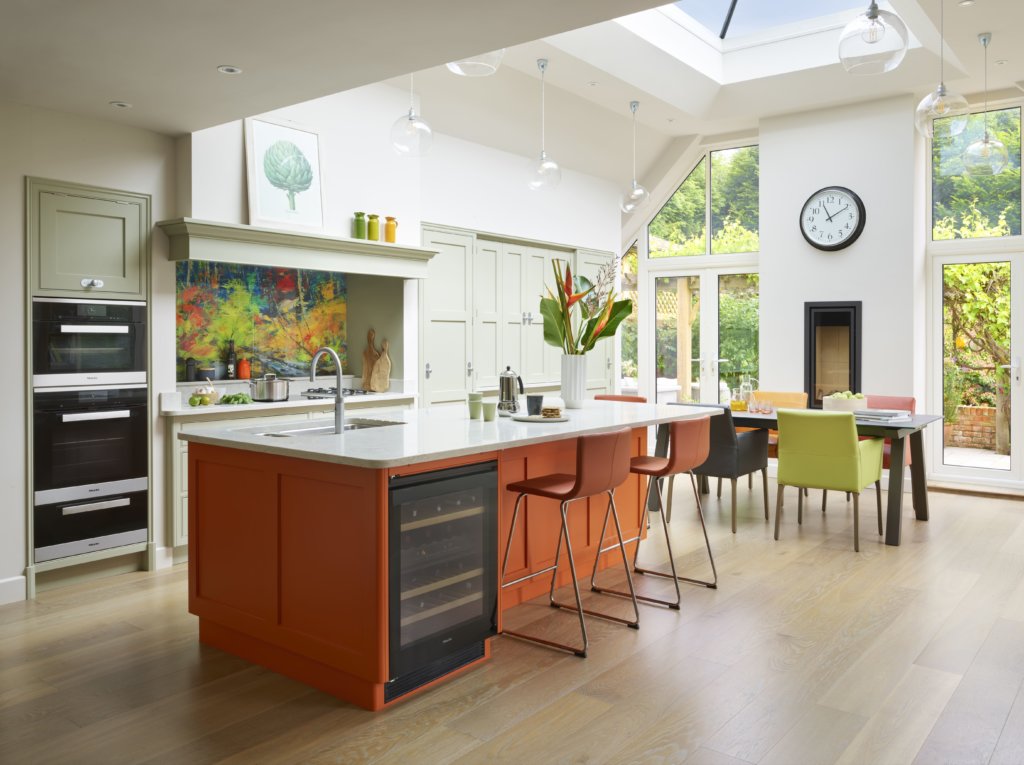
Q: Can you explain the reasons behind the choices and positioning of the cabinetry and work surfaces?
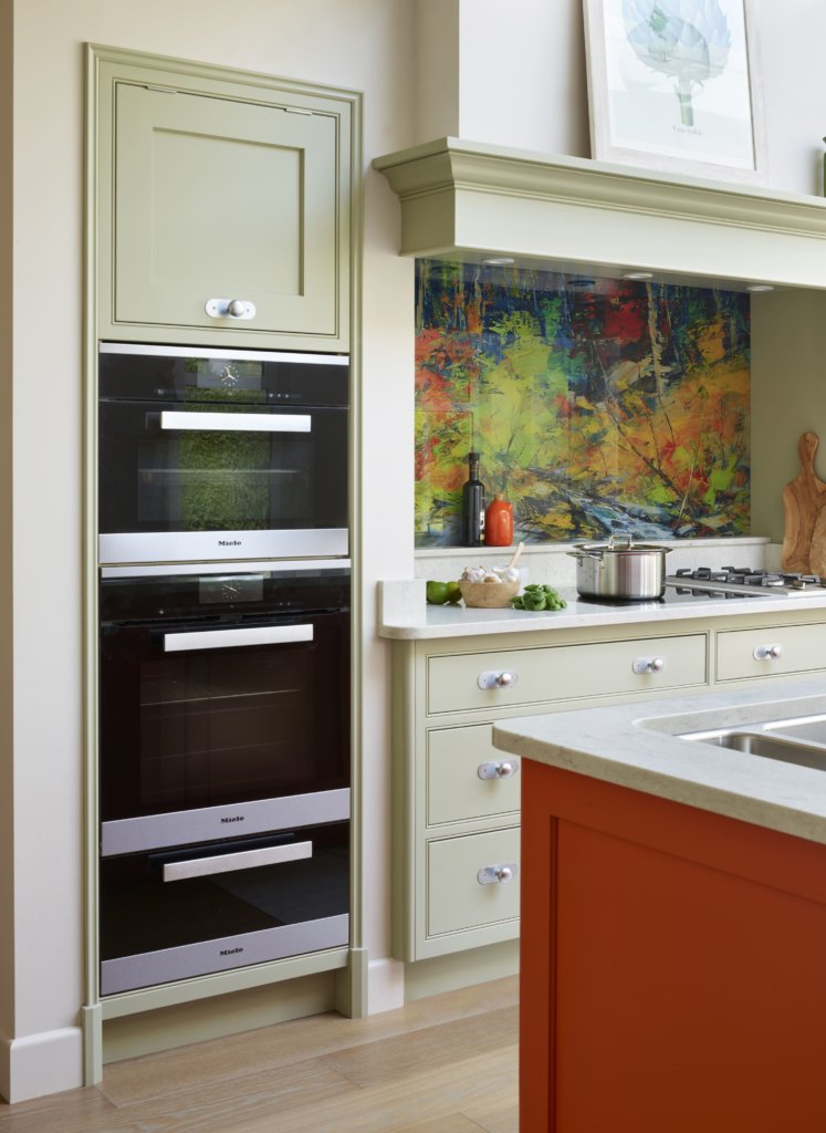
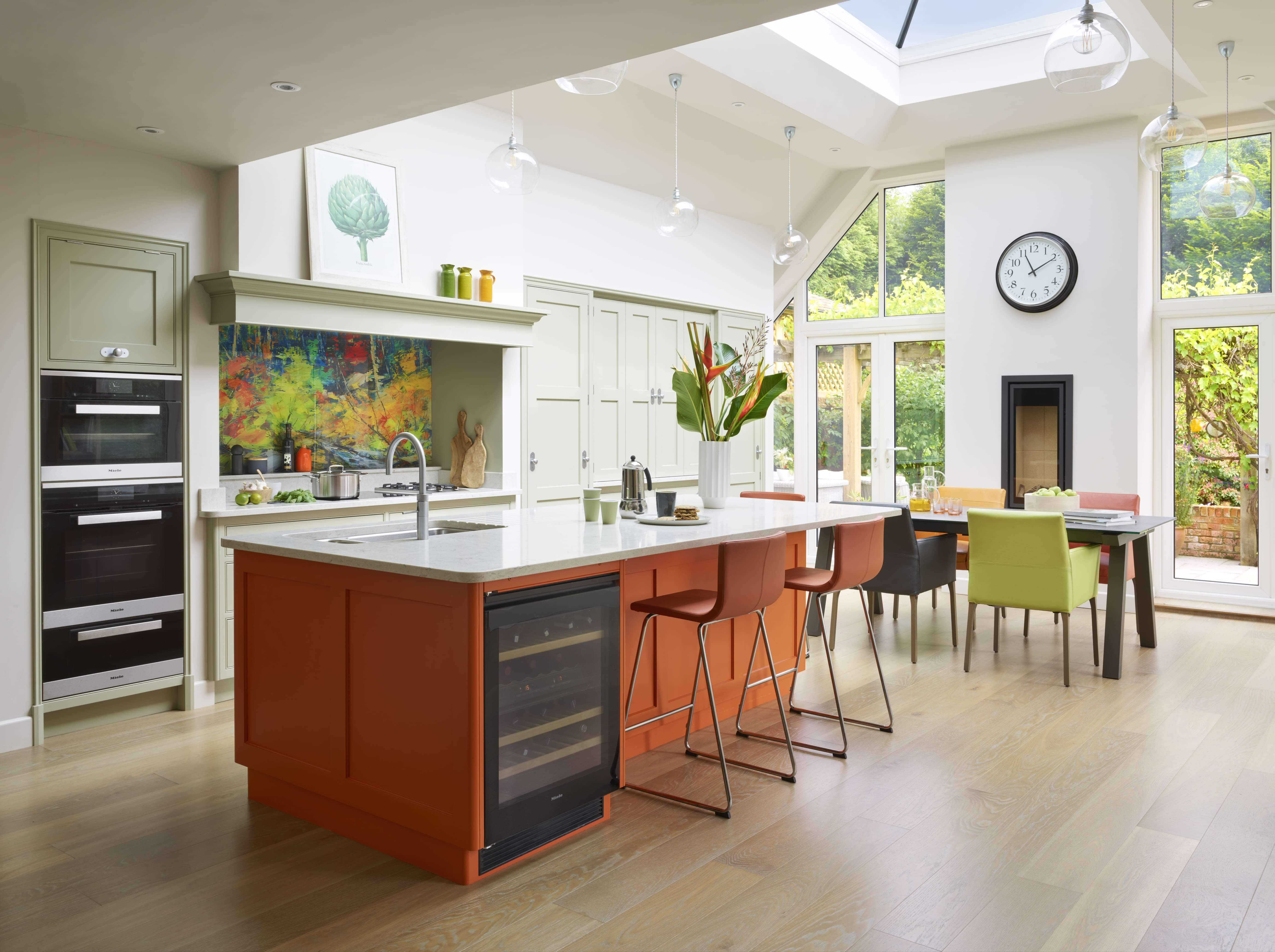
A: The clients were keen to have a simple door design to underline the classic contemporary feel. The cabinetry itself is very distinctly zoned, with purpose-fitted interiors. The larder unit to the right of the hob was a must-have right from the start, as were the large integrated fridge and freezer. This means that the cook is working in a zone which has a larder, generous hob space (gas and ceramic), three ovens, fridge/freezer, wine fridge, dishwasher and sink all just a step away from one another. It’s a set-up which even a professional cook might envy.
Another key element is the appliance cupboard adjacent to the kitchen table, with its coffee machine, microwave, boiling water tap etc. This allows guests to help themselves to hot drinks and simple breakfast essentials without involving the cook or getting involved in other kitchen prep!
The cabinetry is painted in a soft green inspired by the painting and the plain white quartz worktops act as a calm counterpoint to all the colour in this kitchen, vsually ‘grounding’ the design in the space.
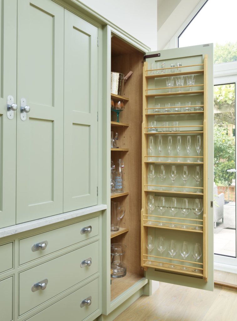
Q: What building and renovation work was involved?
A: The space for the new kitchen was within an area created by opening the old house up to the newly built extension, so there had not been a kitchen there before. Although the extension was new, it incorporates some features of the existing house including a redundant chimney breast, which we repurposed to provide a discreet housing for the fridge/freezer. The cooking zone is very clearly defined, with the ovens, hob, sink, batterie de cuisine and ingredient storage immediately accessible to the cook rather than straying into more social areas of the kitchen. I created a traditional ‘chimney’ area for the hob, but with deep drawers underneath for pans and other necessities, the actual working area stays uncluttered and purposeful.
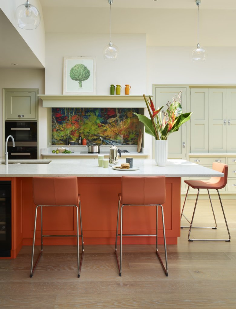
Q: Now that the project is finished, which aspects are you most pleased with?
A: It’s always a joy to design for a space with so much natural daylight and it was great to be able to site such a large, multi-purpose island right at the heart of the room, in line with the roof light above. The warm orange colour makes it all the more attractive as a central feature.
This is a very personal look, which means a great deal to our clients. Given how crucial a place the kitchen occupies in the physical and emotional life of a family home, I think more people should incorporate personal inspirations into their kitchen designs, to create something as strikingly individual as this project.
Q: What is your best advice for someone who is planning a new kitchen-dining-living area?
A: Look around for design inspirations from magazines, books, online resources and even friends’ kitchens. How do you want your kitchen to look and feel and how are you going to use it? Ask friends and family what they would add to or change about their kitchens and why. Arming yourself with this sort of background, including your list of ‘must haves’, will make it much easier when you start looking in kitchen showrooms. Visit a variety of showrooms to compare the quality of their products and their service levels. A kitchen is a big investment and it has to weather years of use. So … choose the very best quality you can afford and work with a kitchen designer who you really connect with.
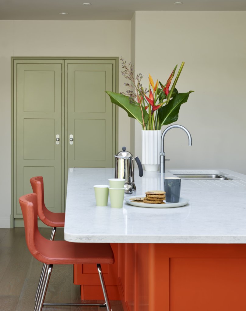
We Love: The sheer exuberance and colourful character of this kitchen, as well as its plentiful storage features and positioning of appliances
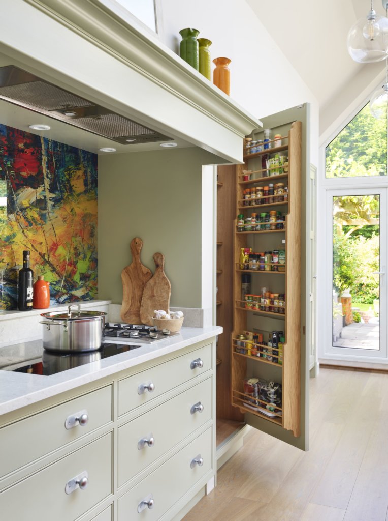
Bespoke cabinetry, brassware and Quartz work surfaces in Misty Carrara are by Martin Moore, 0845 180 0015 for showrooms, there are eight, including Notting Hill, Fulham and Muswell Hill in London. www.martinmoore.com
Appliances, supplied by Martin Moore, include: Integrated fridge and freezers by Liebherr, Steam oven, steam combination oven, Nespresso coffee machine Sous Chef, microwave, flush fit induction hob, gas hob and under counter wine conditioning refrigerator, all by Miele, stainless steel sink and accessories in polished chrome by Kohler, Fusion satin chrome tap by Quooker, all lighting, including LED for splash back, under-canopy lights and strip lighting to door rails, all from Martin Moore. Photography by Darren Chung



Leave a comment