Bath Kitchen Company: A crisp, uplifting and colourful kitchen design
By Linda Parker
James Horsfall, owner and designer at Bath Kitchen Company explained the reasoning, colour and material choices behind this beautifully bright and uplifting kitchen. Bath Kitchen Company offers a bespoke service, uses an eclectic range of materials, colours and finishes, and offers a complete design and installation service in Bath and the surrounding counties, including Somerset and Wiltshire.
Q: What were the design priorities as far as this particular kitchen was concerned?
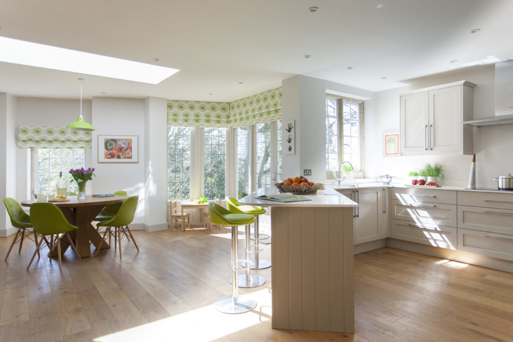
A: Our clients wanted a kitchen with a sense of fun and injections of colour that would add a sense of individuality, but which would still blend in with the surrounding countryside and traditional stone structure of the house. They wanted a fashionable kitchen, but one that would not date quickly and which would also be supremely practical, easy to run and easy to work in.
Q: How did you begin to answer the brief, as it’s a large space that had to accommodate a lot of specifics?
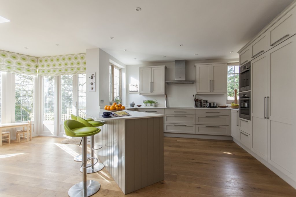
Our clients had been very decisive and applied for planning permission in plenty of time to be able to start work on the house immediately – their architect suggested transforming the existing ground floor space to create the ‘family and kitchen’ area, by combining three separate rooms, two corridors and an internal courtyard. So, the space we had to work with for the kitchen-dining-family was extremely generous and allowed plenty of creative thought and suggestions. The amount of space meant that we were conscious that areas would need to be ‘zoned’ to create a sense of order and purpose.
Q: What were your first thoughts, bearing in mind that there were three young children in the family, so a practical layout was always going to be vitally important?
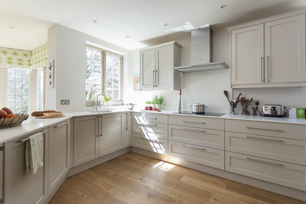
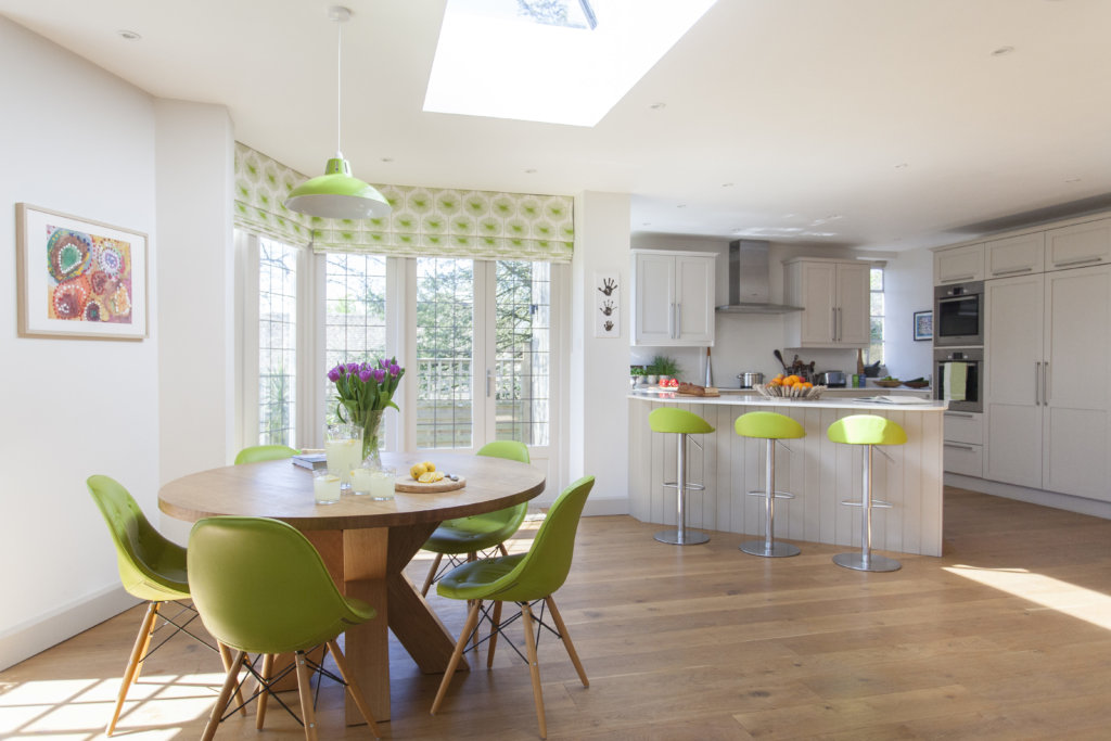
We realised that the kitchen had to be easy to work in – that’s a given, in any kitchen, but we also didn’t want it to be a ‘throughway’ that the children could rush through, and that made me consider a diagonal island that was a continuation of the window run of cabinets. This had a similar appeal to a freestanding island, as we could still have bar stools along the outer edge, but it also meant that the cooking and working area of the kitchen was neatly contained. The diagonal lines also added interest to the whole space, and would also become an interesting feature alongside the round table and angled bay.
Q: There was a lot of renovation work involved in this project, did it make it easier for you and your team?
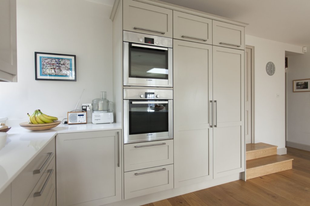
A: Yes, it did, as we had beautifully straight walls and new floors to work with! The owners had originally wanted to keep some of the original pine flooring in areas of the ground floor, but once the engineered oak was installed in the kitchen-living space, they decided to run it all through the ground floor, as it looked so good and using the original pine would have mean a lot of repair and reclamation. There was an existing Aga in the old kitchen, but the owners wanted to go for new multifunction ovens and built-in fridge and freezer, which meant that the cooking and prep area of the kitchen became visually very streamlined. The induction hob is positioned on a different wall to the ovens, so it meant that there was plenty of space for two people to cook and supervise at the same time!
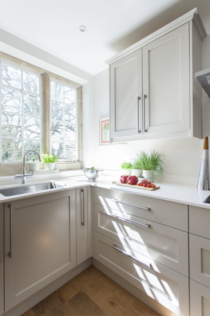
Q: The overall look is understated and neutral, how did you arrive at the subtle paint and surface colours?
A: The work surfaces are Pearl Quartz, and just 20mm thick, which emphasises the streamlined look; the cabinetry is maple, painted in Rolling Fog by Little Greene; we used three variations of the Rolling Fog shade to create a subtle scheme.
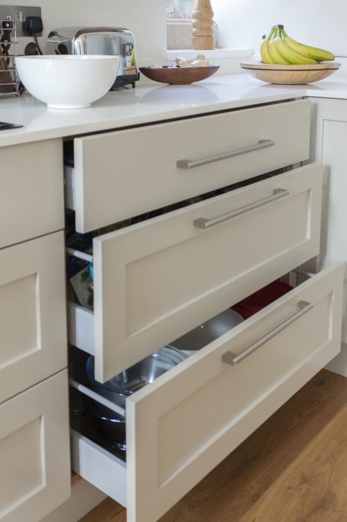
A: Although we had a big space to work with, it was always a priority to make sure that there was enough easily accessible storage, so we knew that drawers would be the solution. There’s a bank of nine drawers below the induction hob, so all pans and crockery can be kept in one space, and there are also two drawers beneath the ovens. All drawer and cabinet fittings are by Blum, which we use throughout our kitchens.
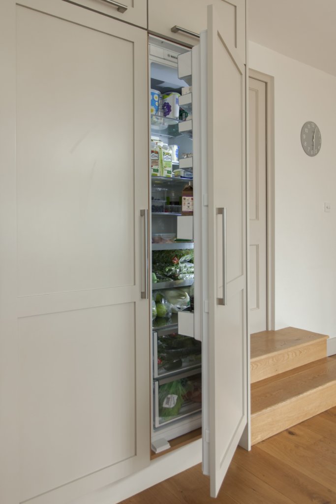
Q: Do you feel that the storage space has been maximised throughout the kitchen?
A: Yes indeed! The height of the ceilings allowed ‘top boxes’ to go above that bank of appliances, and a great space for storing items that aren’t used every day, and the standard double-door wall cupboards either side of the induction hob and extractor are just simple, logical and practical for items that are used all the time.
Q: What features of this kitchen do you think are particularly successful?
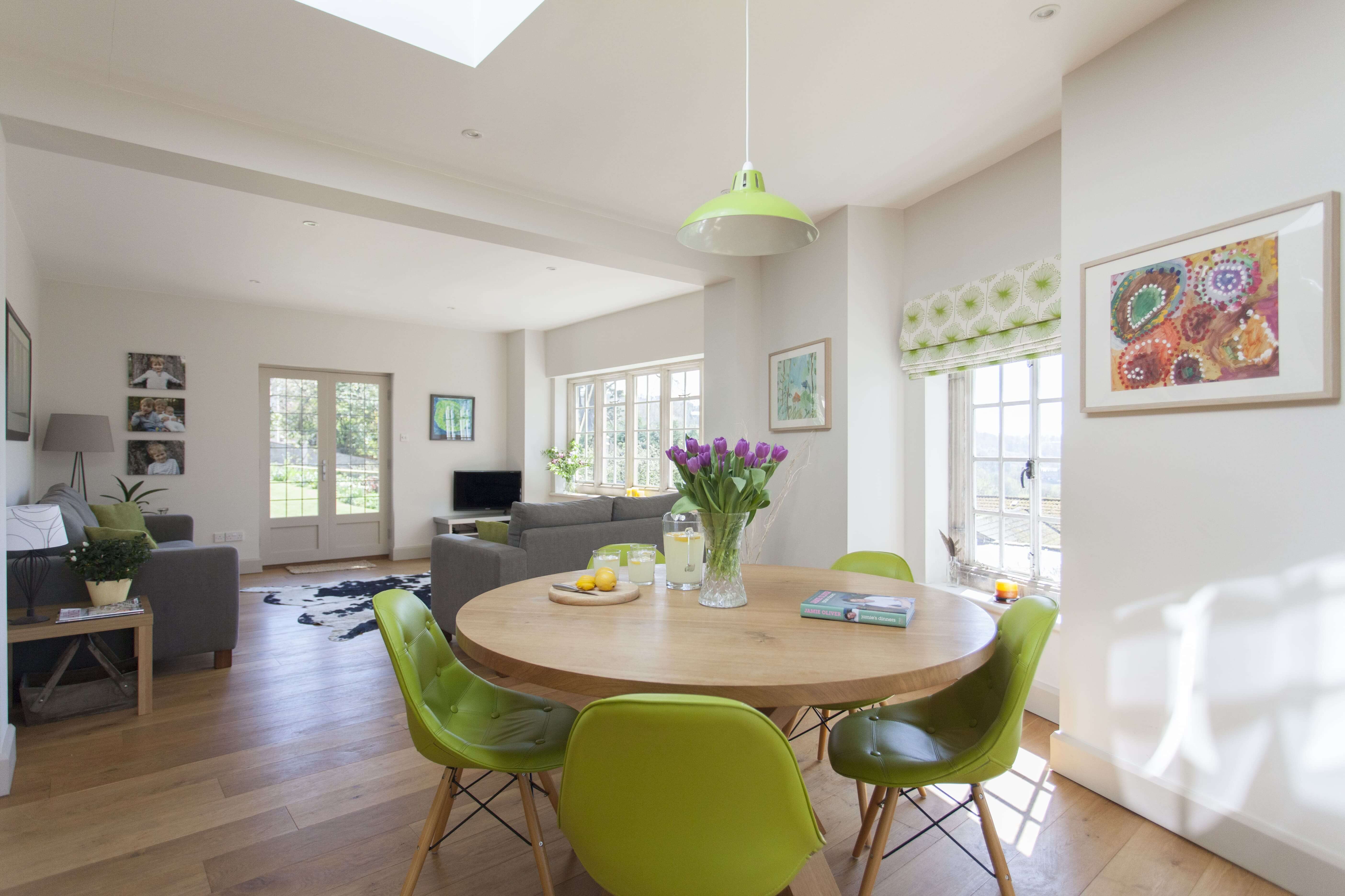
A: Personally, I’m pleased with the way we’ve combined three specific areas into one stylish, colourful and family-friendly room. The kitchen’s proximity to the French windows is gorgeous, and the round table sits beautifully in that angled area. The room is filled with light, and anyone working in the kitchen can keep an eye on any homework or studying going on, keep an eye on the living area, and also still enjoy all the wonderful views of the countryside. The whole project is a complete joy!
We Love: It’s difficult to pick out one particular thing, as the whole ground floor flows so well – but we do love the angled breakfast bar, and the clever way that each area has a lovely green outdoor view …
Cabinetry, supply and design, all by Bath Kitchen Company. 7-9 North Parade Buildings, Bath, BA1 1NS 01225 312003
Round dining table, Adventures In Furniture
Dining chairs, from a selection at Atlantic Shopping
Green pendant shade, Dove Mill



Leave a comment