Hub Favourites
By Linda Parker

These three spectacular kitchens are the top favourites from Daniele Brutto, co-founder of Hub Kitchens and his team.
By Linda Parker
This month we’re taking a look at three projects from Hub Kitchens. The look is sleek, streamlined and minimalist, a style that is perfectly illustrated in the following three kitchen projects, picked out as favourites of the design team – and, it has to be said, they’re three of our favourites too!
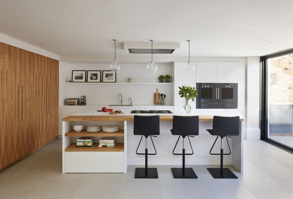
Daniele Brutto, co-founder of Hub Kitchens explains why this is his current favourite …
My favourite kitchen is our Gloucestershire project. I love the Olmo veneer we used in this kitchen, it has so much character and depth. I also love the Gaggenau oven set up which looks great against the white units and of course it functions so well. This would probably be my ideal cooking set up for my own kitchen. The seamless transition between Olmo breakfast bar and worktop also works great.
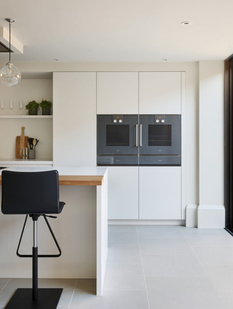
This is a pretty perfect built-in oven arrangement … highly efficient, but practical and unobtrusive at the same time.
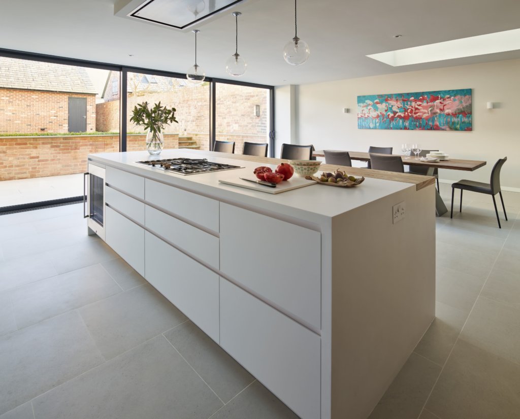
The island, featuring immaculate joins between white and timber surfaces, is dramatic and provides massive amounts of storage space.
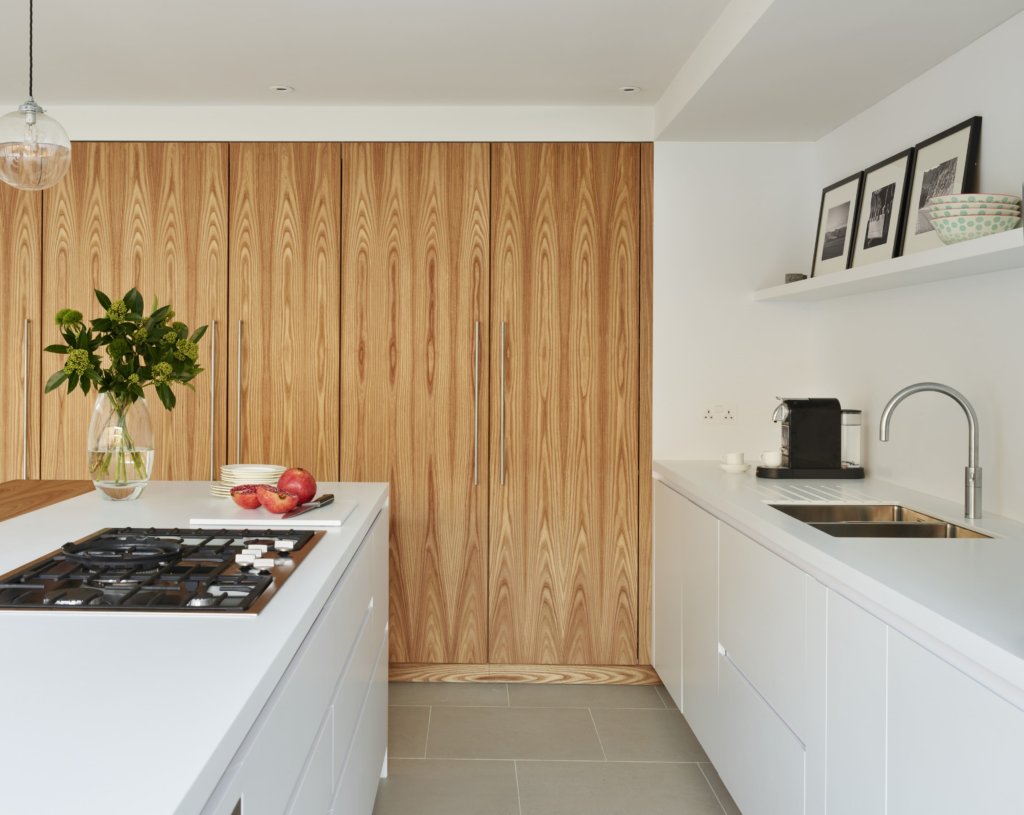
Full-height Olmo veneered doors look sleek and modern and of course, hide away all the necessities needed in a busy kitchen. (Photography by Darren Chung)
Kim Vanopstal, interior designer, Hub Kitchens, makes her choice …
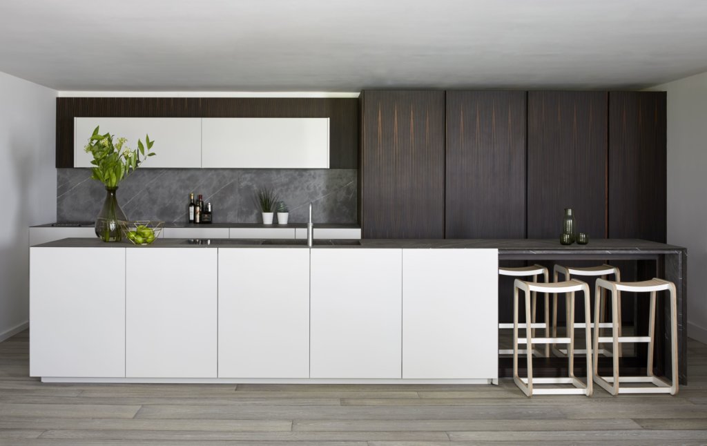
My favourite kitchen is the Sharpe project, mainly because of the contrasting mix of materials and the clean, minimal look. I love the stone worktop and how the veining runs through over the drainer area and into the sink. The timber veneered units have an interesting vein and have pocket doors which conceal the hidden appliances. I also really like the detail in the breakfast bar support and how the timber and the marble work together there.
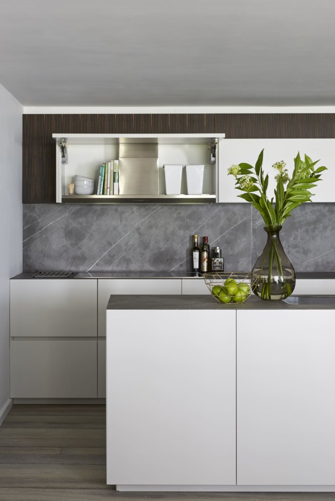
Veined stone splashbacks echo the sink and worksurfaces, a beautiful combination of natural materials and neutral tones.
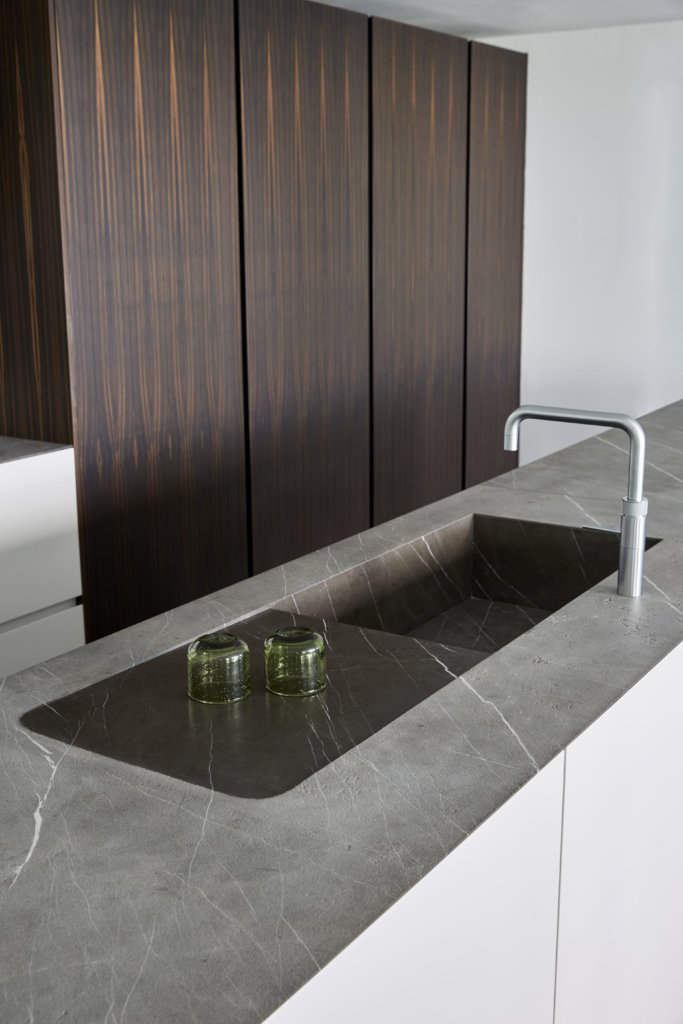
Crisp design lines and the curves shown within the pattern of the veneered doors are a great contrast. (Photography by Jake Fitzjones)
Alan Sutcliffe, Installation Manager, chose their Wandsworth kitchen …
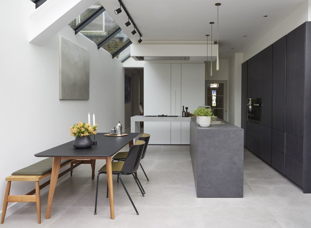
I think of our Wandsworth project very fondly, the client was outstanding and helped out with regards to ensuring the fitting went as smoothly as possible and in the best possible way. This is a surprisingly functional space which pushed the boundaries on material, textures and colours. It struck me as refreshing and balanced. I love the combination of the metallised lacquer mixed with ceramic, dark-lacquered oak veneer and heavily textured Italian resin. If you weren’t aware of it, you might miss the white matt-lacquered block of units comprising the stacked washing machine and dryer, pull-out larder and cloak cupboard – all packed into a floorspace less than two square metres!
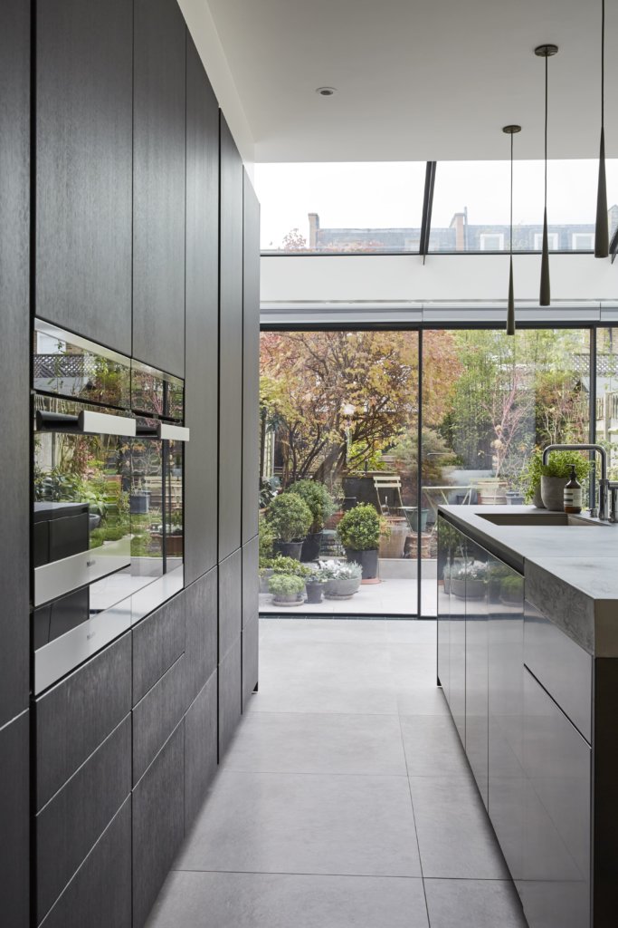
The white cabinets at the end of the kitchen hide appliances, larder and cloak cupboard – highly discreet and effective.
A spectacular end-to-end look at the kitchen through to the garden terrace shows how light floods through the whole space
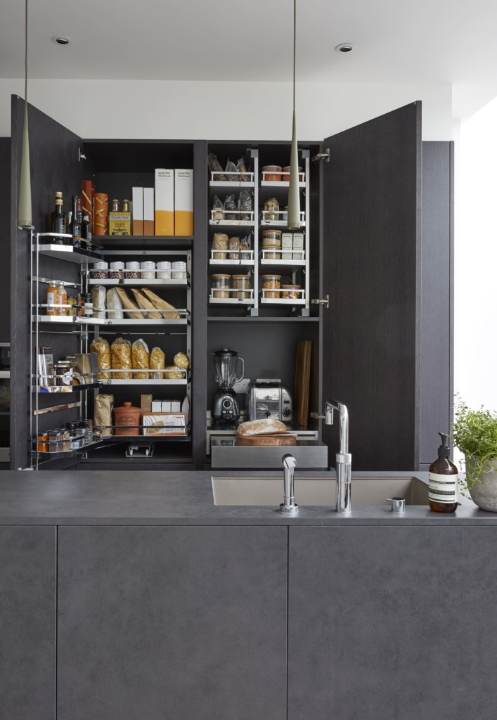
Masses of storage space makes this a very practical kitchen
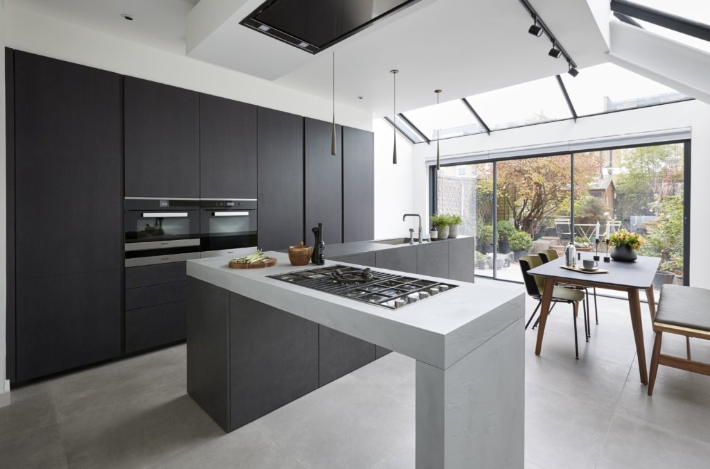
Cooking as theatre – just look at the positioning of the hob! (Photography by Jake Fitzjones)




Leave a comment