Cera Concretto and Fine Matt Lacquer White Kitchen from Alno by Halcyon Interiors
 The designer: Ashley Collins at Halcyon Interiors (www.alno.co.uk and www.halcyon-interiors.co.uk)
The story: Ashley originally designed and fitted out a utility area for the clients a year or so before, in their previous property. They contacted Ashley to say they were very happy with the service and could he meet them at their new property to go through initial ideas for a new kitchen project. The existing design was traditional and the clients wanted to move away from this to a more modern, sleek look. ‘Originally I met the clients at our Beaconsfield showroom,’ explains Ashley, ‘where we had the ceramic grey display with Gaggenau appliances, and they really loved the overall look. This formed the basis of my proposal. Halcyon Interiors have been trading since 1981 and we have showrooms in Wigmore Street, Beaconsfield and Hatch End. I have been a kitchen designer for 30 years, the last 20 with Halcyon Interiors.’
Designer Q&A:
Q) What was your brief from the client?
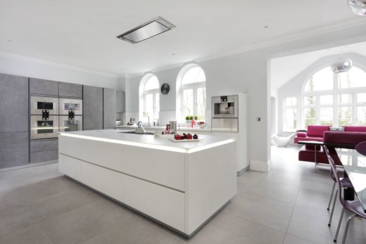
The brief was to have a practical working kitchen but as the space was quite large, the kitchen had to flow. They wanted a dining space as well as a TV seating area and they also required a large fridge freezer and wine fridge, as well as a coffee machine.
Q) How did you set about answering that brief?
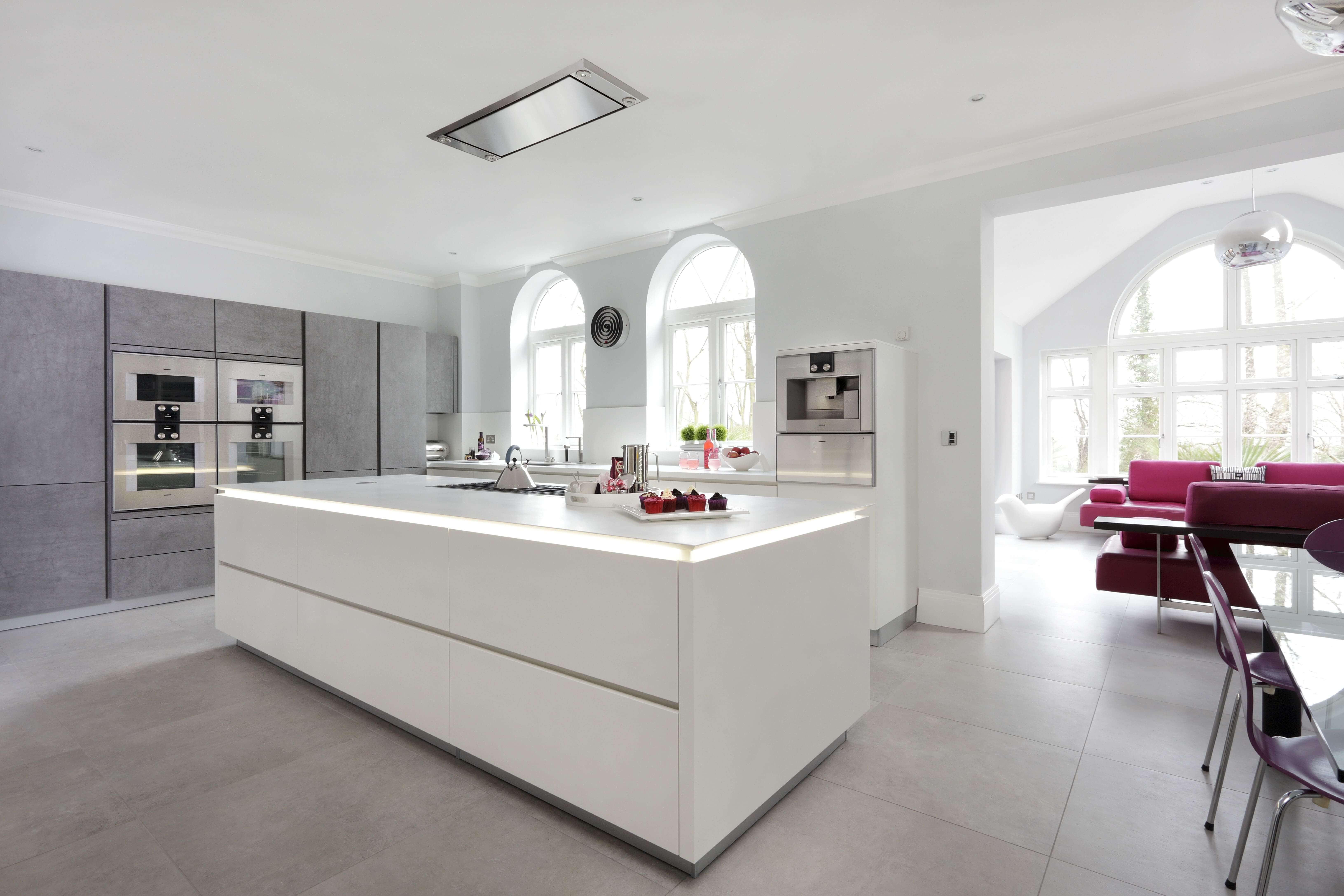
As the customer really liked our Beaconsfield display, and the focal point of the grey ceramic doors, I used this as the main design feature. With a large island in the middle, this made for a linking space for the different zones they required in the kitchen.
Q) Which products did you use and why?
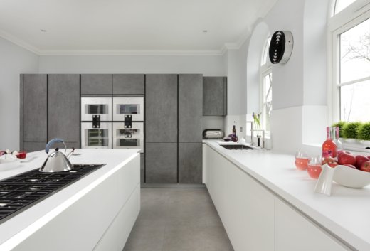
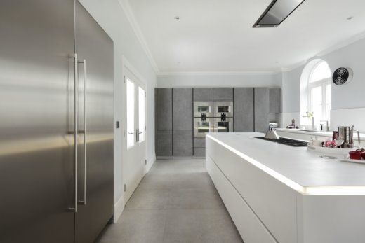
The clients wanted light grey floor tiles from the hall going into the kitchen, so this made the grey ceramic doors fit in well with the colour scheme, along with the white units to break things up and not be too industrial looking. I used Corian worktops with our infinity edge detail to make the island flow even more. I chose Gaggenau appliances, as they really liked the look, a Barrazza 1200mm panoramic hob on the island for a sleek look, along with a Westin flush ceiling hood, a Dornbracht matching square tap and boiling taps to complete the look.
Q) Was there any building/renovation work involved?
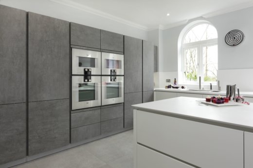
As well and fitting out a new utility space, we made a cloak cupboard larger so we could fit in a flush Gaggenau Vario Cool fridge freezer. This meant the appliances did not protrude into the room, taking up valuable space
Q) What elements do you think make the scheme so successful?
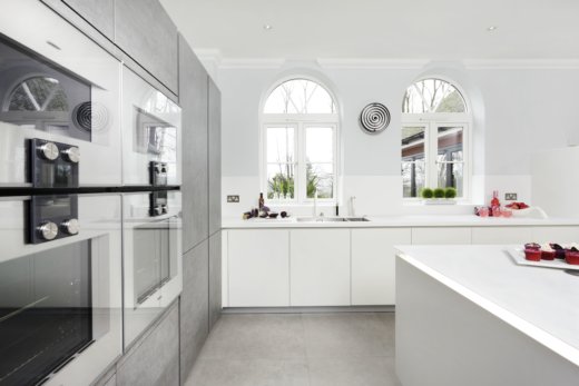
As the windows are nice features, I wanted to ensure the design did not detract from this, so I made sure we kept plenty of space around them. Also, as the space is light and airy, I think the ceramic grey doors really give it some warmth without being too industrial and without too much clinical white.
Q) Any advice for someone who may be planning a new kitchen?
If planning an open space think about the hallway floor leading to the kitchen, as this will have a big impact on the colour schemes you might be thinking of. Also, if the room has a north facing aspect leading to the garden, some gloss elements can give added reflection and light and if south facing, then matt doors can tone things down for the same reason.
The details:
Cera Concretto and fine matt lacquer white kitchen by Alno, www.alno.co.uk
Glacier White worktops by Corian, www.corian.co.uk
Appliances by Gaggenau and Barazza, www.gaggenau.co.uk and www.barazzasrl.it
Taps by Dornbracht, www.dornbracht.com
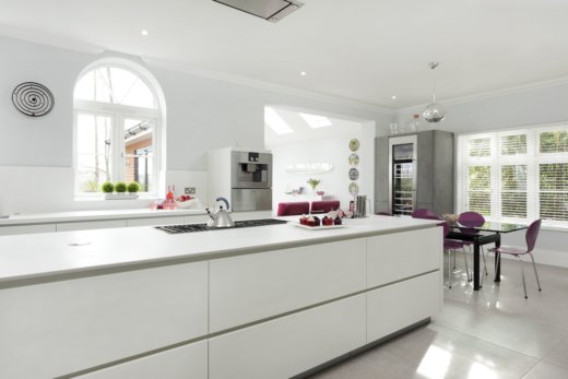
Hayley loves: how the industrial trend has been merged with a crisp white design for two looks in one space




Leave a comment