Bespoke Handmade Kitchen By Kitchens International
The story: Appreciating the high quality products of a designer kitchen but with a desire to achieve their own dream interior, Paul and Gillian Alexander visited Kitchens International when they decided to renew their kitchen. Paul, with his appreciation for quality and detail in terms of product, installation and the functionality of design; and Gillian, with a skill and passion for interior design, provided Senior Designer Kieron with not just a real challenge but also a very interesting and delightful project to work on.

The designer: Kevin Buchanan, Kitchens International, Aberdeen(www.kitchensinternational.co.uk)
Designer Q&A:
Q) What was the brief from the client?
As a fan of Pinterest, interior stylist Gillian produced a board of her favourite kitchen images and was able to send this to me as a starting point. Light colours, classic style, elegant marble and clean lines with a touch of inspiration from The Hamptons were the cornerstones of her brief while Paul, who works in the oil and gas industry, focussed on top quality, robust appliances to suit their mutual love of cooking and entertaining.
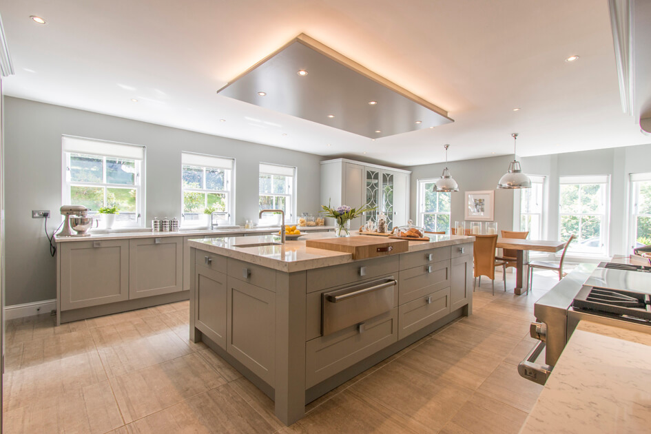
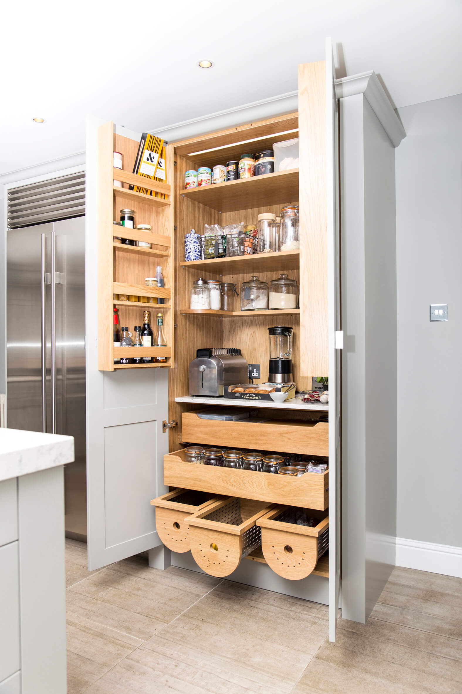
In essence, the space I had to work with was fantastic but in reality a little too small for the sense of grandeur that Gillian wanted to create, particularly with the ceiling height being too low. The proportion of the furniture then became absolutely critical and is a major success of the design. The weighty pantry and cooling wall taking position on the narrower wall at the end maintains the maximum sense of width to the room while the feature mantle, making use of reflective materials opposite the windows at the cleaning zone, further enhances the sense of width.
Taller furniture, again positioned to create the ambience and function of the dining zone whilst retaining a connection to the kitchen, makes use of stunning glazed units. Careful consideration of the proportions and position of the furniture not just in relation to the space but also between one section of furniture to the next was critical. The end result is a space that has a very big feel with strong, weighty features giving all the subtle features and presence that Gillian craved in a way that enhances the space rather that diminishes it.
Q) How did you set about answering that brief?
Given the large size of the room, I concentrated on proportion as much as layout. We wanted to achieve a sense of grandeur, so it was important that the furniture suited the scale of the room. Although the footprint of the room is large, the ceiling height is lower than the lofty Georgian rooms for which this style of furniture was originally designed. The weighty pantry and cooling cabinetry occupies one wall at the end of the room, providing a balance to the sleek sink run and simple overmantel opposite. Furniture stops short of the ceiling to allow uplighters to wash across the top and boost the sense of space. This prevents a sense of the ceiling bearing down on top of the kitchen.
A modern interpretation of the traditional batterie de cuisine, the ceiling feature gives the island a sense of location, while walls painted the same colour as the cabinetry create a sense of harmony. But it is the elegance of the tall cupboards in the dining area, designed by Gillian and myself, that Gillian enjoys the most.
Q) Which products did you use and why?
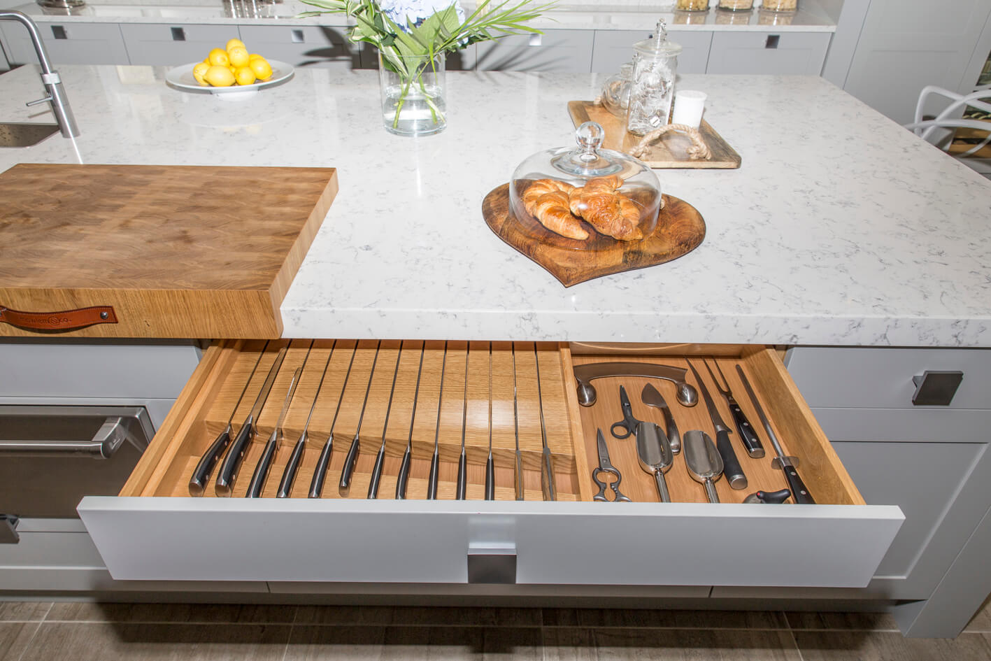
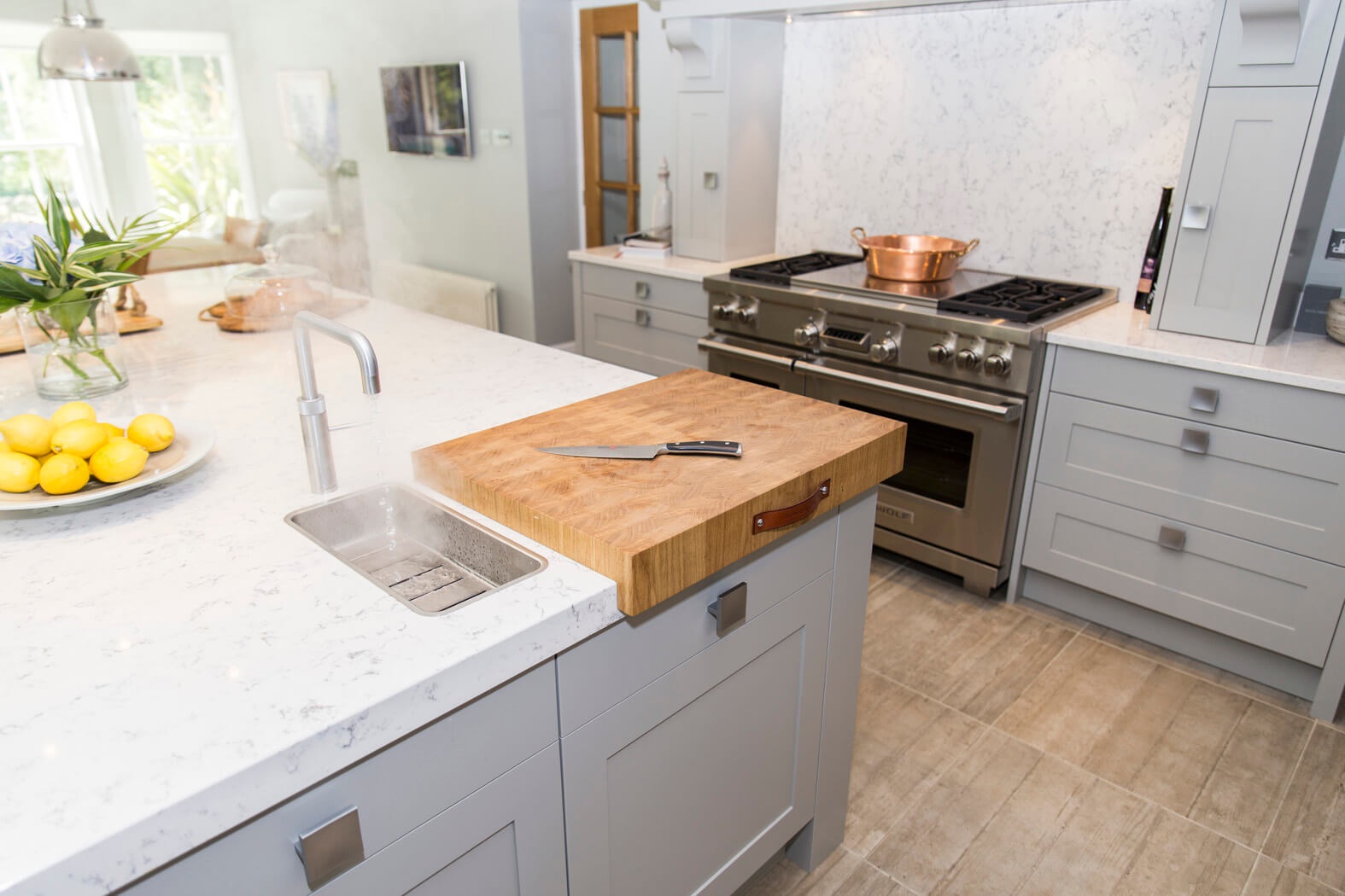
The units are a handmade collection painted in Farrow and Ball’s Lamp Room Grey, which was also selected for the walls as it reacts well with the light, giving a balance of light and shadow that is just right. The contrasting elements were warm timber and lots of copper accents.
Q) What elements do you think make the scheme so successful?
The success of this design lies in time as much as it does in creative flair. We go to a greater level of detail in all our kitchens than most folks locally, and when you are working on a bespoke, classic design that amount of time ramps up again. I probably spent in the region of 25 hours working on the design in meetings with Gillian and Paul, then about 60 more on the drawing and detailing. And that doesn’t include survey, order processing, project management and installation.
Q) Any advice for someone who may be planning a new kitchen?
Choose a kitchen designer who you can work easily with and who understands your brief. Spend time on the design stage – when this is right the whole kitchen will work.
The details:
Worktops by Silestone, www.silestone.co.uk
Appliances by Sub-Zero, Wolf and Siemens, www.subzero-wolf.co.uk and www.siemens-home.bsh-group.com
Extractor, sink and taps by Blanco, www.blanco-germany.com
Boiling water tap by Quooker, www.quooker.co.uk
Lighting by Original BTC, www.originalbtc.com
Flooring by Aberdeen Tile, www.aberdeentile.co.uk
Dining table by Annie Mo’s, www.anniemos.com
Dining chairs by Dargie Design, www.dargiedesign.co.uk
Hayley loves: The sense of style and personality that comes through with this design
Gillian Alexander, Interiors Stylist 07927 519494 or gillianalexander893@btinternet.com



Leave a comment