In-Frame Shaker – by Heaven & Stubbs
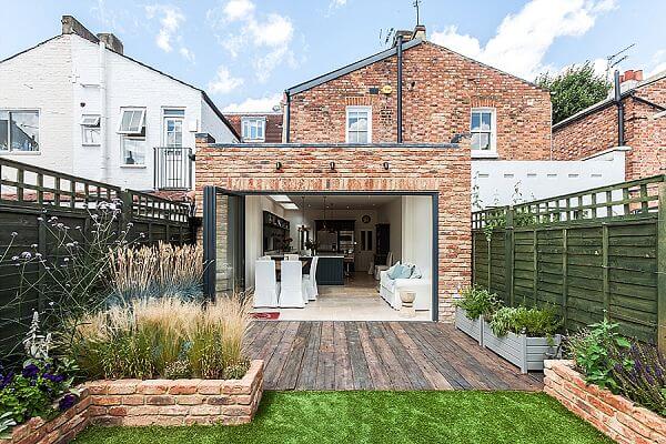
The story: For this project, Heaven & Stubbs worked closely with the interior designer homeowner of a London Victorian terraced house. An associate company of Heaven & Stubbs designed and built a single story extension in matching London stock brick, which doubled the
kitchen space. Its bi-fold door design opens it up onto a decked sun terrace, ideal for dinner parties and alfresco dining.
 The designer: Howard Stubbs, designer and co-founder of Heaven & Stubbs (www.heavenandstubbs.com)
Designer Q&A:
Q) What was the brief from the client?
The client is an established interior designer, so it was very much a case of working closely with her to interpret the brief. She wanted a light, open plan socialising kitchen with plenty of cooking capacity and storage from what was a relatively small space.
Q) How did you set about answering that brief?
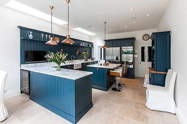
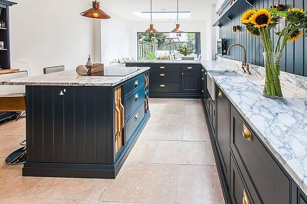
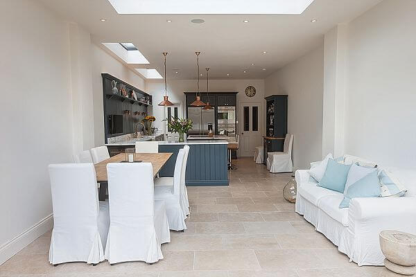
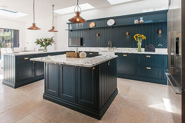
A sister company of Heaven & Stubbs worked with me to design a single story extension in matching London stock brick, which effectively doubled the floor space. Terraced houses have the tendency to be dark, particularly when extensions are added. We ensured, through the use of bi-fold doors and glazed roof panels, that the space was light and airy. Bespoke, custom-sized cabinetry meant that the space never looked crowded or closed in. A return on the base units acts as a visual divide between the cooking and socialising area while creating more cupboard storage and worktop. Bespoke cabinet design and size flexibility also meant that a small island was possible. Whilst only small, the island packs a punch since it is home to the induction hob, a breakfast bar, three deep drawers and slide-out oak chopping boards and trays.
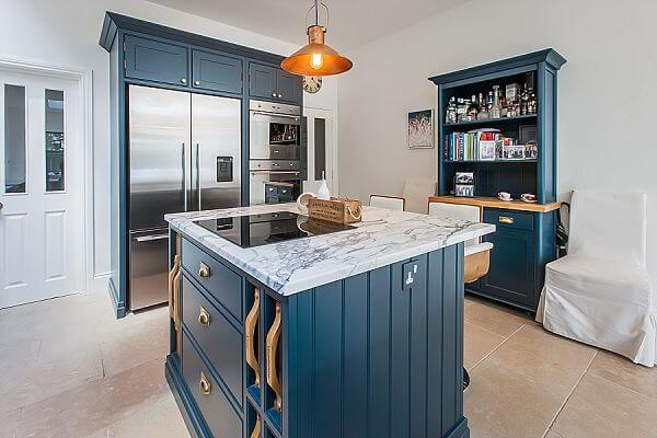
The homeowner wanted a furniture design that gave a nod to the traditional architecture and period of the property but with contemporary 21st century touches that are in tune with today’s lifestyle and the owner’s tastes. For example, modern stainless steel integrated appliances and slender, plain edged Arabascato worktops work perfectly with the traditional Shaker door cabinetry whilst the light open plan design makes the whole space a pleasant place to socialise and relax as well as cook.
Q) Which products did you use and why?
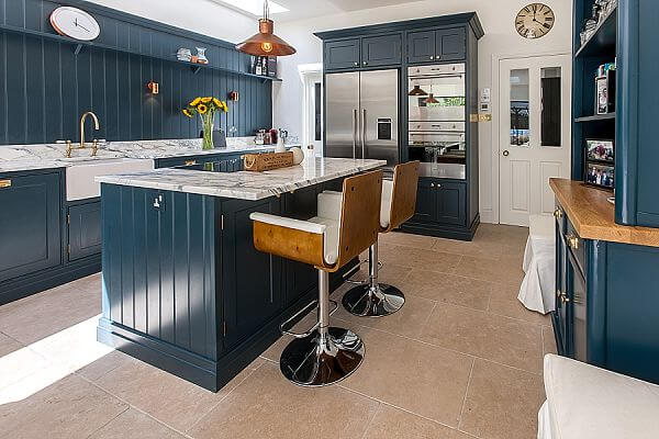
Arabascasto marble was chosen by the homeowner and provides a wonderful contrast to the Farrow & Ball Hague Blue furniture. The tongue and groove wall cladding adds definition, depth and visual interest, picking up on the tongue and groove design detail on the base cabinets end and side panels.
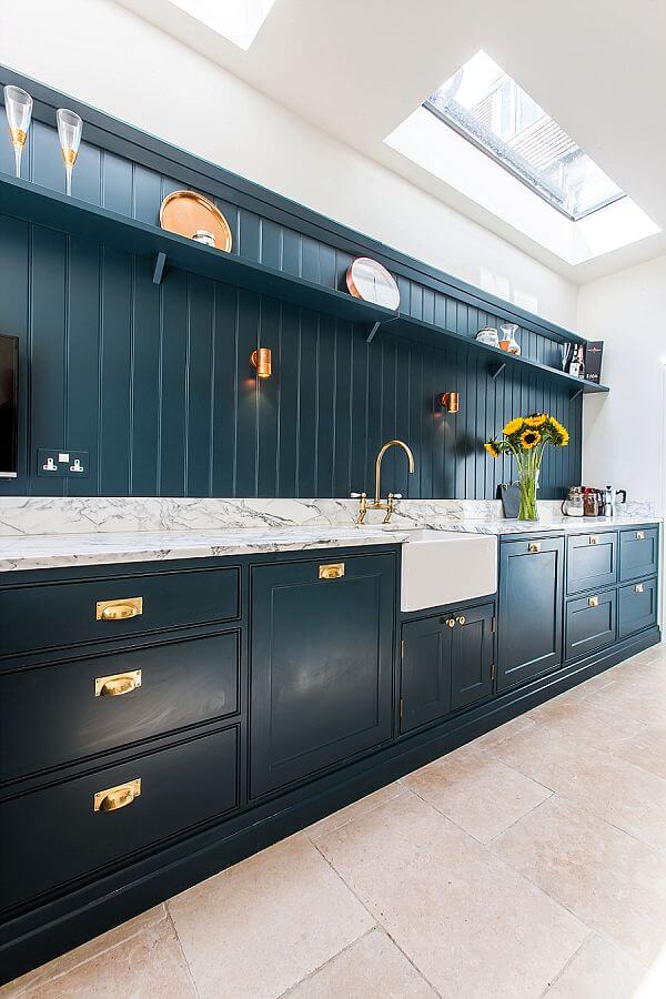
Blending traditional with modern design continues with the accessories and appliances. High performance integrated cookers, a refrigerator and induction hob give the homeowner maximum performance yet work with the traditional touches such as the Belfast sink and copper handles and light fittings.
Q) What elements do you think make the scheme so successful?
Despite the extension, the space is still relatively small. However, clever building design (with plenty of glazing) and especially scaled bespoke cabinetry make the space feel light, airy and in truth, much bigger than it actually is.
Q) Any advice for someone who may be planning a new kitchen?
For small spaces, don’t be afraid to investigate bespoke manufacturers. Bespoke handmade cabinetry doesn’t have to be expensive; particularly if you stay away from the prestigious, trophy brands. There are many good smaller companies offering an excellent service – online research together with reputation is key. Such a service will make a smaller space really work rather than compromising the result with off the shelf standard sized furniture, which can often run at a similar cost.
The details:
Solid timber bespoke cabinetry painted in Farrow & Ball Hague Blue and Arabascato Marble worktops by Heaven & Stubbs, www.heavenandstubbs.com
Building Works by UJ Developments, www.ujdevelopments.co.uk
Appliances by Neff, Smeg and Fisher & Paykel, www.neff.co.uk, www.smeguk.com and www.fisherpaykel.com
Sink by Astini, www.astini.co.uk
Tap by Abode, www.abodedesigns.co.uk
Handles by Armac Martin, www.martin.co.uk
Hayley loves: The rich blue colour, which looks stunning teamed with the cool white marble and antique style copper




Leave a comment