1909 Partridge Grey and Charcoal Kitchen – By The Malvern Kitchen Studio
 The story: This Victorian townhouse was being renovated, so the kitchen was just part of the transformation to this family home. The plan was to extend the existing kitchen by opening up into what was a conservatory to allow for a social and relaxation area. Functionality of this new space was crucial and central to the client’s brief.
The designer: Gary Williams of The Malvern Kitchen Studio (www.themalvernkitchenstudio.co.uk)
Designer Q&A:
Q) What was the brief from the client?
The existing kitchen was a typical 80s style within a traditional sized Victorian townhouse – too small and impractical to meet the needs of the ever-busy family. The doors were wooden, panelled and dark, causing the room to feel oppressive and uninviting.
The clients are a busy family with plenty of activity in the existing kitchen centred around entertaining, homework and study with two beloved family dogs and a cat. The kitchen needed to facilitate the activities of all members – sometimes all at once. So defining areas, which complemented each other while minimising impact, was vital.

Q) How did you set about answering that brief?
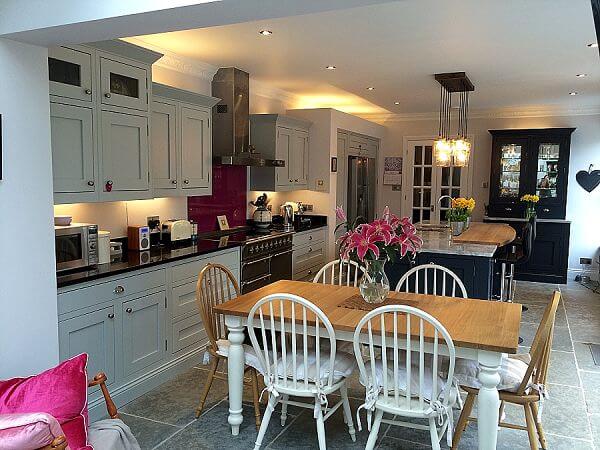
As the room was being expanded, this gave me much more scope to meet the need for defining each area. The danger here is that each area can feel separated, so it was vital to blend and complement colour schemes and textures to help the design flow.
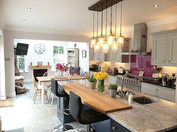
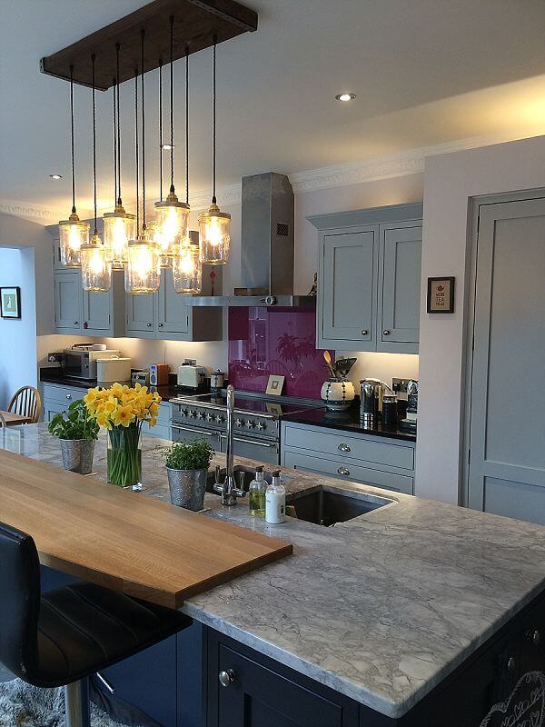
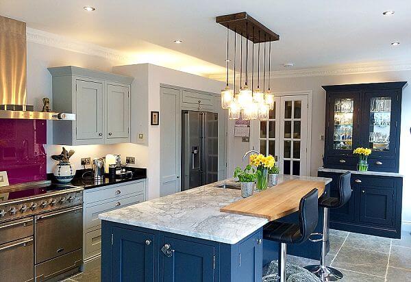
An island always provides a focal point and natural meeting space within the kitchen. I wanted my client to have her natural working triangle without the rest of the family impacting upon her space, so I incorporated a wooden section into the granite opposite the sink, encouraging guests and family members to sit there. Leaving space further into the kitchen allowed for the client’s own table and a snug-style space for after dinner entertaining.
The 1909 range lends itself perfectly to a bespoke look so it was simple to incorporate my clients’ wishes for both a sympathetic style to the rest of the property and a ‘freestanding’ dresser, which complemented the fitted kitchen, using the same door styles.
Q) Was there any building/renovation work involved?
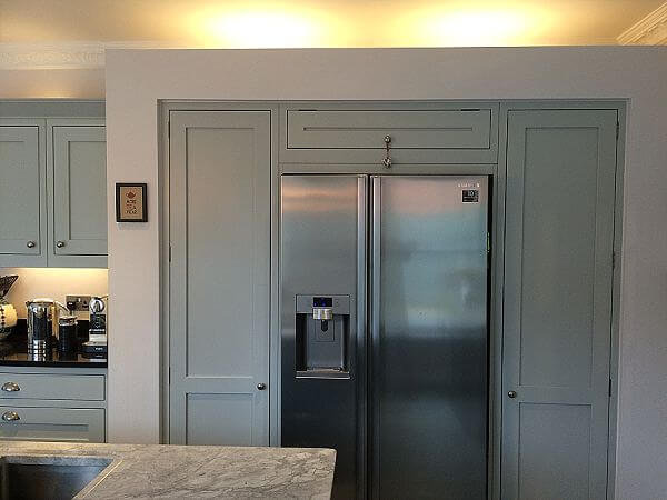
Windows were removed and relocated. A stud wall boxing section was built to incorporate an American-style fridge freezer to make it appear less obtrusive as you enter the room, as this is a thoroughly modern appliance and could have disrupted the theme had it not been blended into the background.
Q) Which products did you use and why?
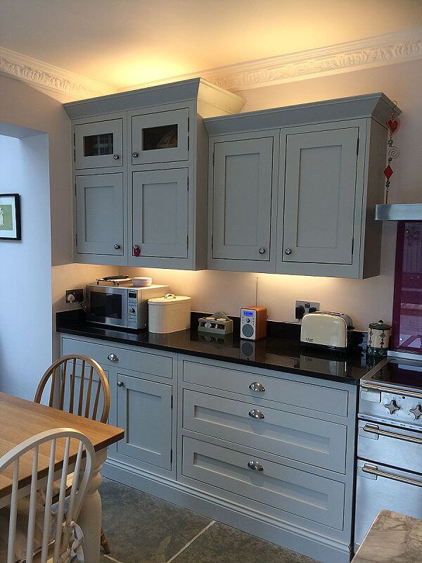
The 1909 In-Frame shaker range is a classic and bespoke look and was chosen in two colours – Partridge Grey and Charcoal. The two colours build depth into the design, as well as making a feature of the island and dresser and blend perfectly with the tones in the natural stone flooring. The Bianca Eclipsia granite on the island worktop blends the colour scheme by reflecting the partridge grey of the base and wall units, which are topped by Angolan Black granite. The section of Prime Oak defines a practical seating area opposite the natural working triangle and helps ensure uninterrupted prep space. The cerise splashback adds a bolt of warmth and blends with the soft furnishings of the table and seating area, again blending the scheme from one end of the room to the other.
Q) What elements do you think make the scheme so successful?
I love the fact that room feels so much more inviting due to the colour scheme, which draws you into the room. It was also really satisfying knowing that my clients want to use the space all the time and virtually live in this room. I firmly believe that’s down to understanding completely – before pen hits paper – how your clients want to live in and use the space.
Defining areas without obvious separation enhances the flow of the room so for instance, the wooden work section on the island means the client can still work but be included in the social activity in the room. Finally, the 1909 door range is thoroughly in keeping with the style of the house, which although providing my clients with a brand new kitchen, is still sympathetic to its original style with the corner posts, moulded plinths and wooden drawer boxes.
Q) Any advice for someone who may be planning a new kitchen?
Consider why you are changing the kitchen – what works, what doesn’t, what do you love, what drives you mad. Consider how you use/want to use the space throughout the cycle of a day – and how that might differ at weekends or special occasions and build these events into the design. If possible, find a pivotal point to work around. For instance, you really want granite worktops or you must incorporate an island in the scheme. Spend time talking with your designer – get to know them, see designs they’ve already done and talk to former clients. Build up a colour chart of textures and tones you want to incorporate in the room. How is your family/lifestyle likely to change – build in potential to the room. Take advantage of effective storage solutions to make your life easier. Don’t be afraid to ask your designer to provide you with as many options as possible before you commit to a design. A CAD drawing is far easier – and cheaper – to change than your kitchen in a few years if you’ve gone off the colour or the design simply doesn’t work for you. Don’t feel pressurised into making decisions – take your time to consider different designs, colours and textures until every cupboard has a purpose and a reason for being sited where it is.
The details:
In-Frame Shaker kitchen in Partridge Grey and Charcoal by 1909, www.1909kitchens.co.uk
Aventos hinges and runners by Blum, www.blum.com
Worktops by The Granite Company, www.thegranitecompany.co.uk
Appliances by Rangemaster and Samsung, www.rangemaster.co.uk and www.samsung.com
Sink and tap by Franke, www.franke.com
Pendant lighting by Illumination Lighting, www.illuminationlighting.co.uk
Flooring by Mandarin Stone, www.mandarinstone.com
Hayley loves: The way this kitchen looks like it’s made to be lived in and loved, with plenty of colour, textures and feel appeal.




Leave a comment